Brand Development
Photoshop - Illustrator
Concept Development | Branding | Social Media | Advertising

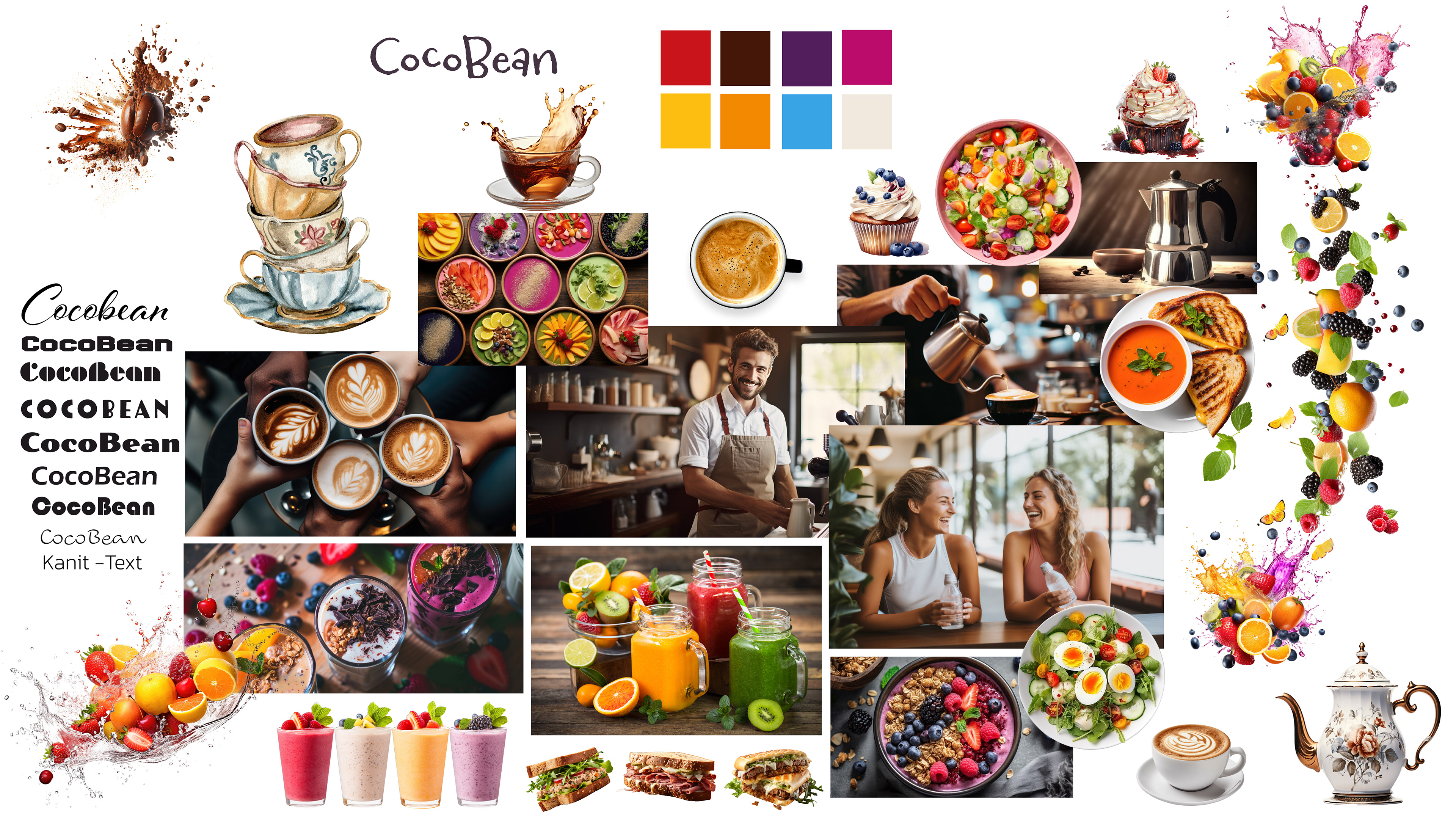
The CocoBean moodboard shows a mix of style, comfort, and healthy living. The colors — deep brown, cream, and gold — feel rich but calm. Soft chairs, marble tables, and pretty lights pair with ideas for organic, vegan, and creative dishes, making a space that’s good for both body and mind.

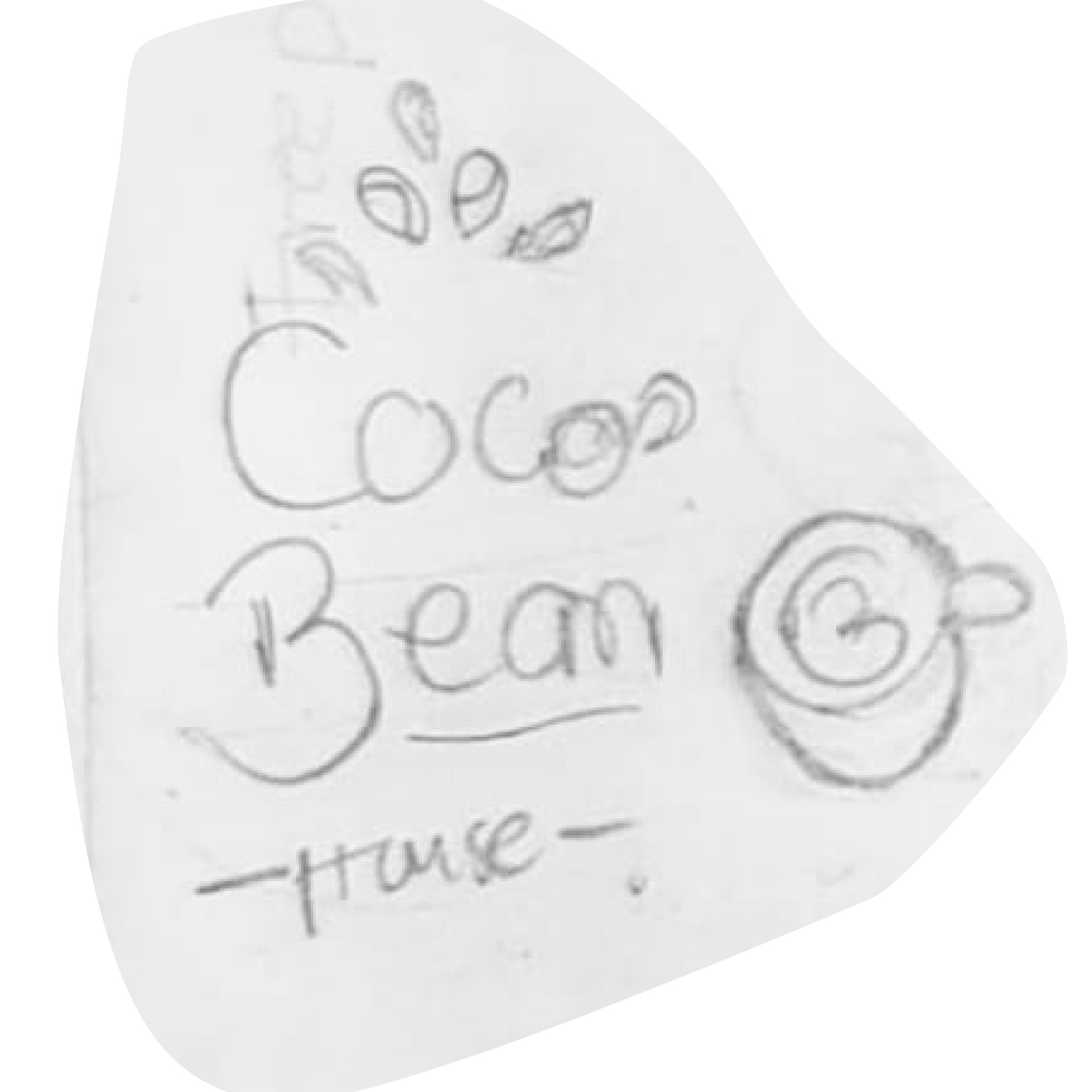
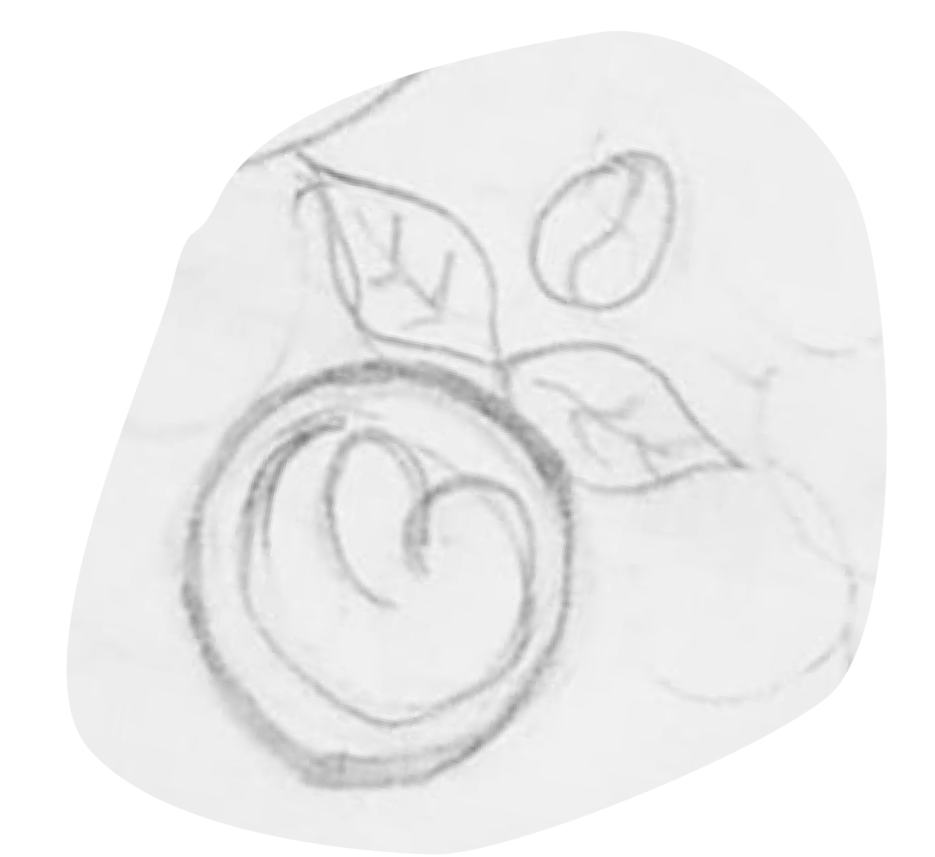
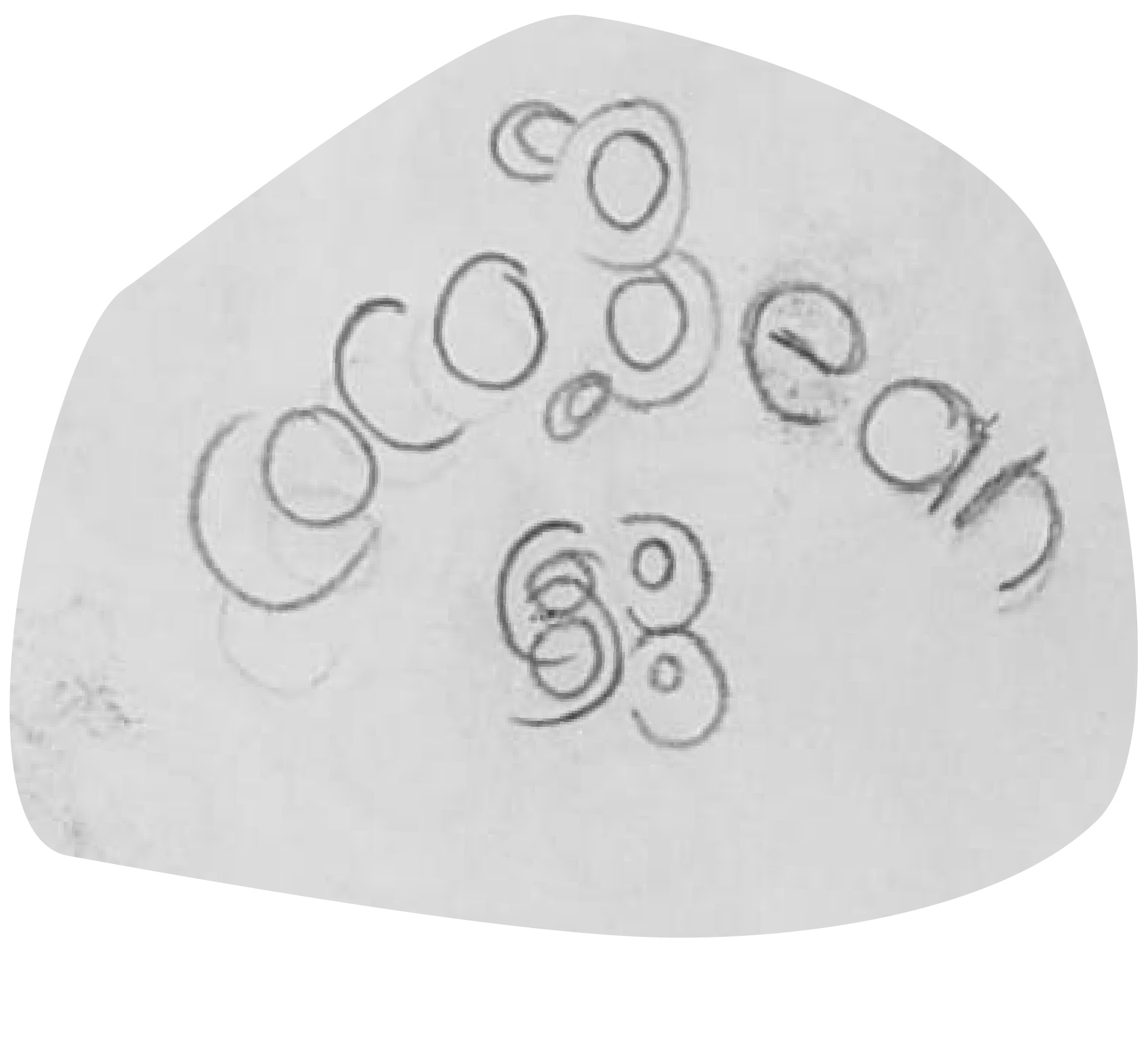
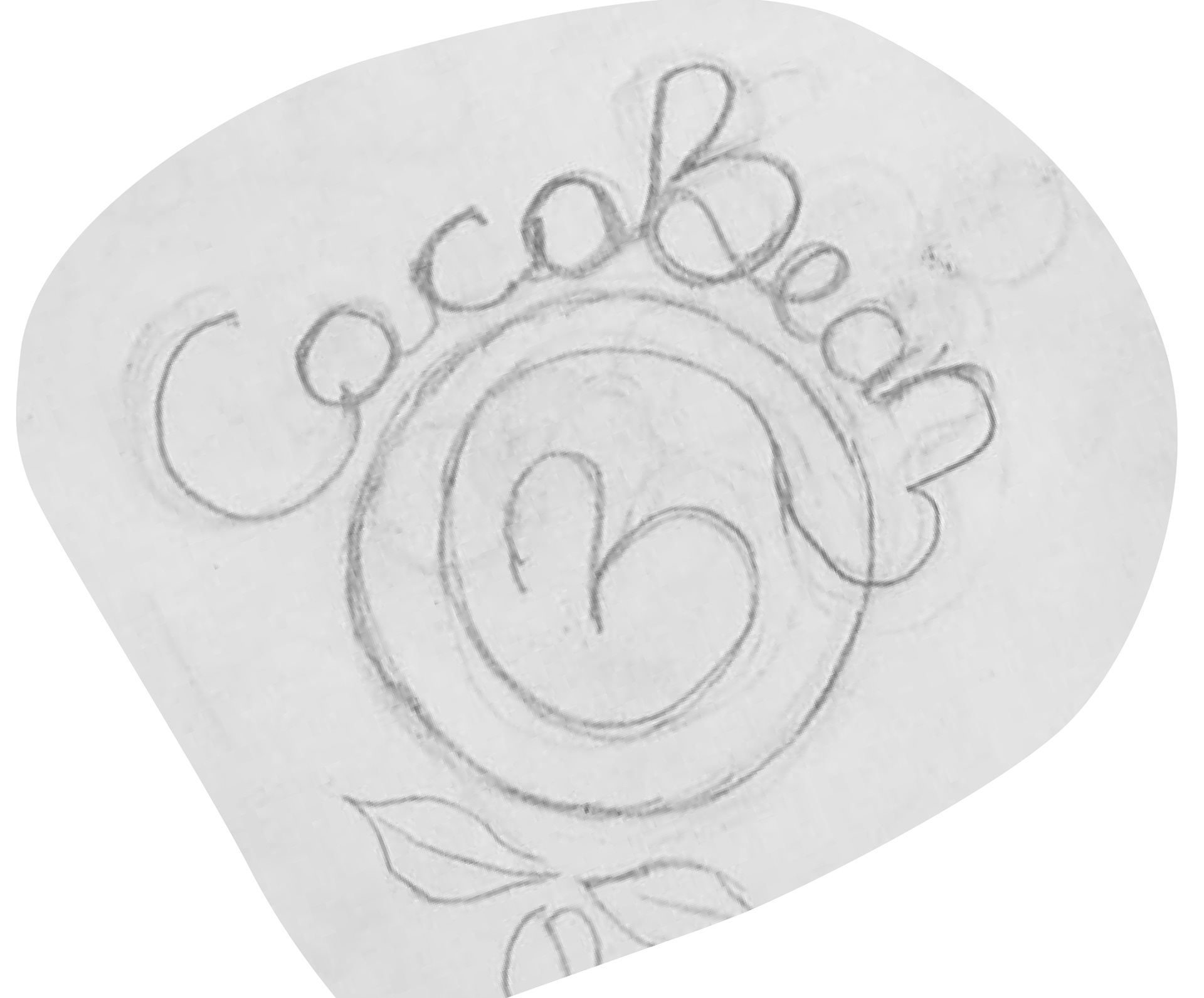
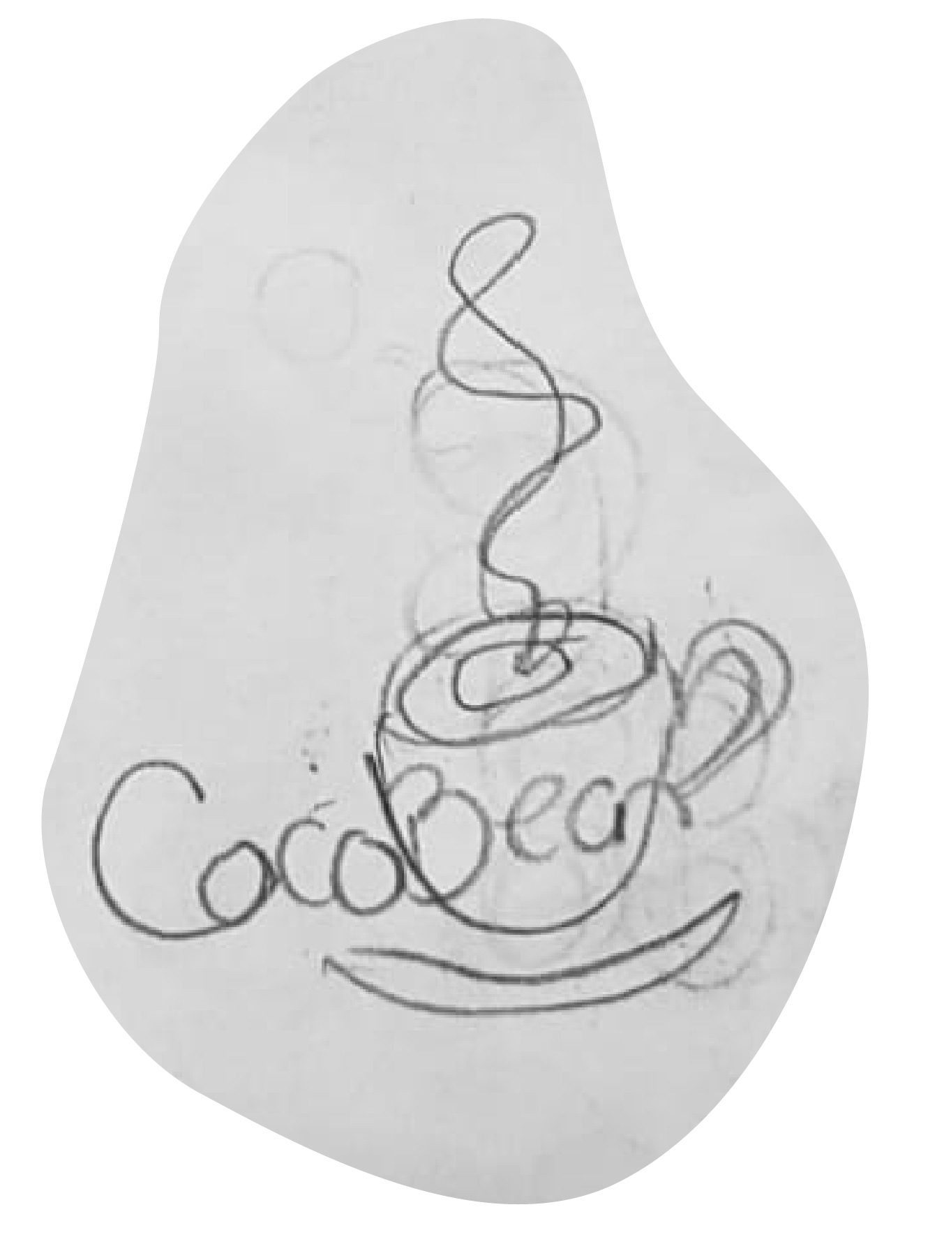
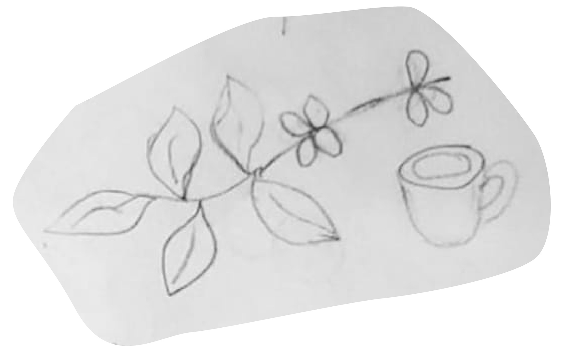
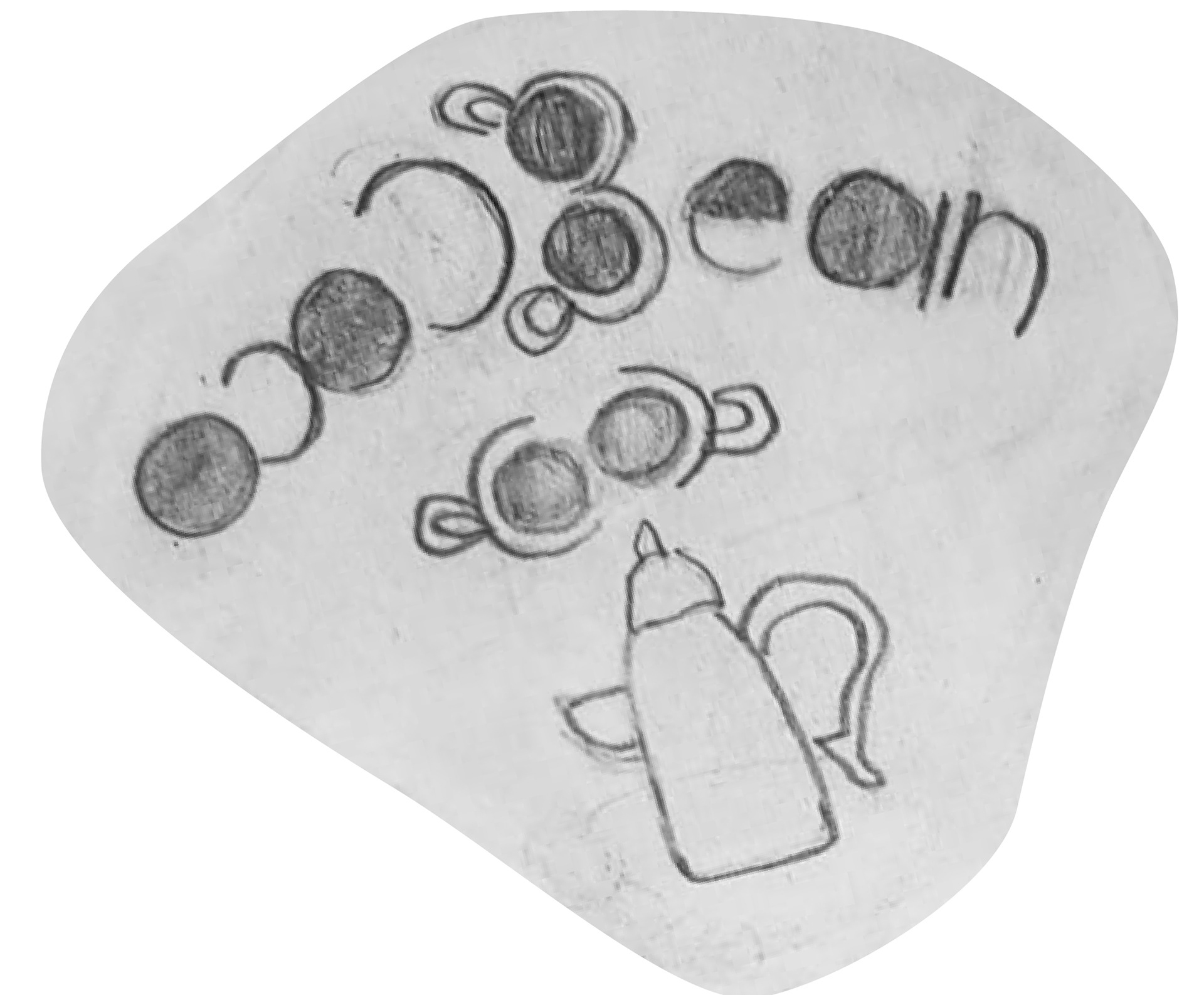
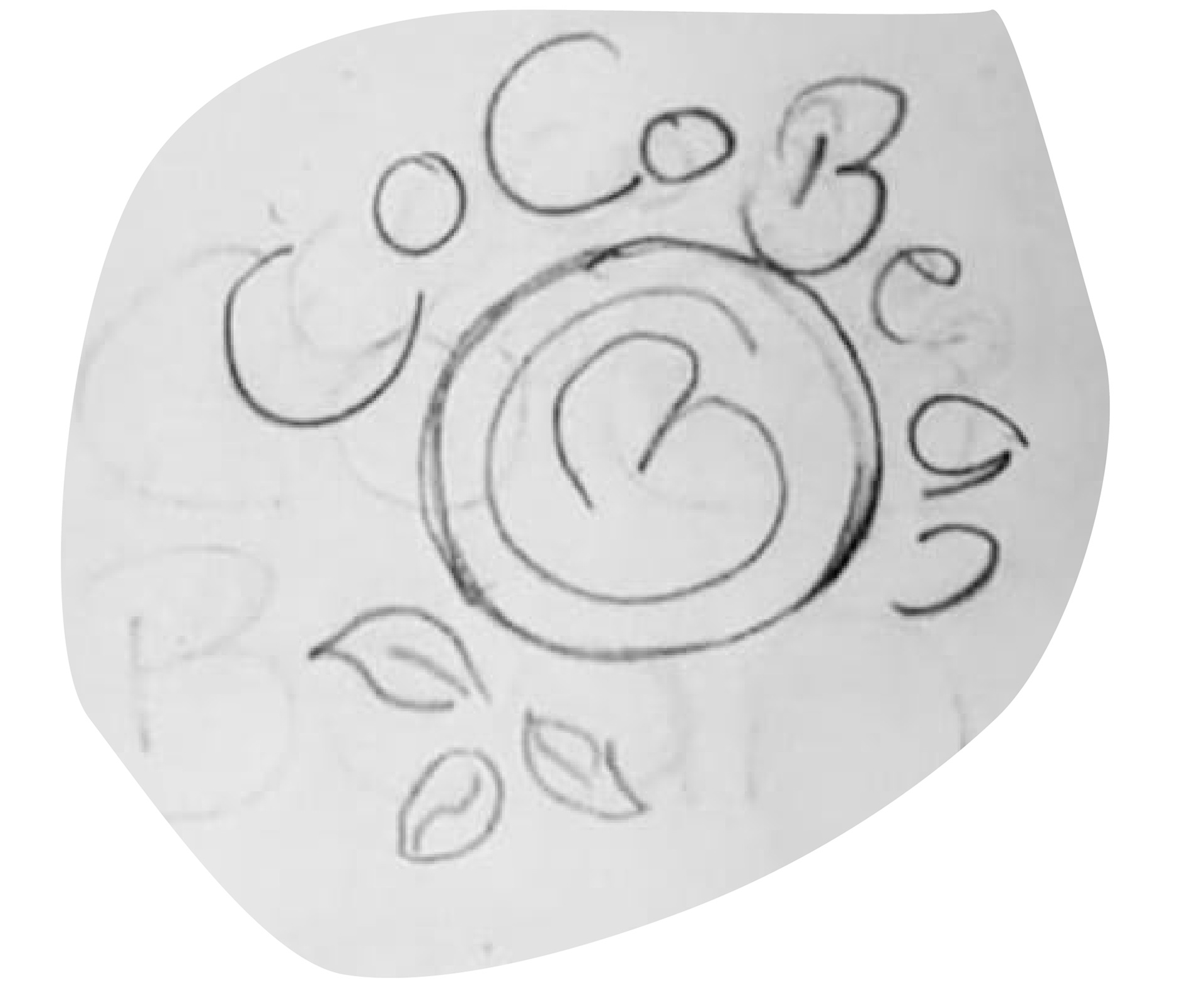
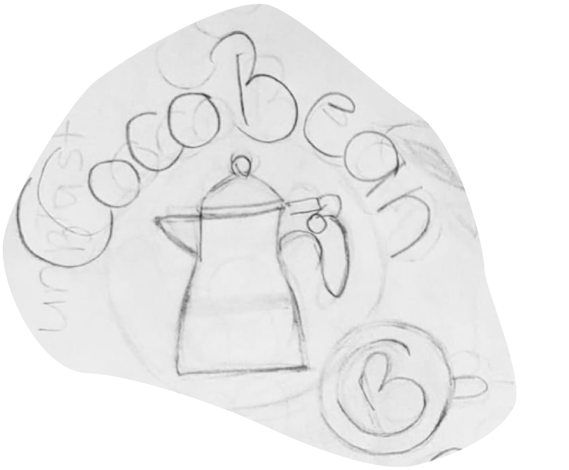
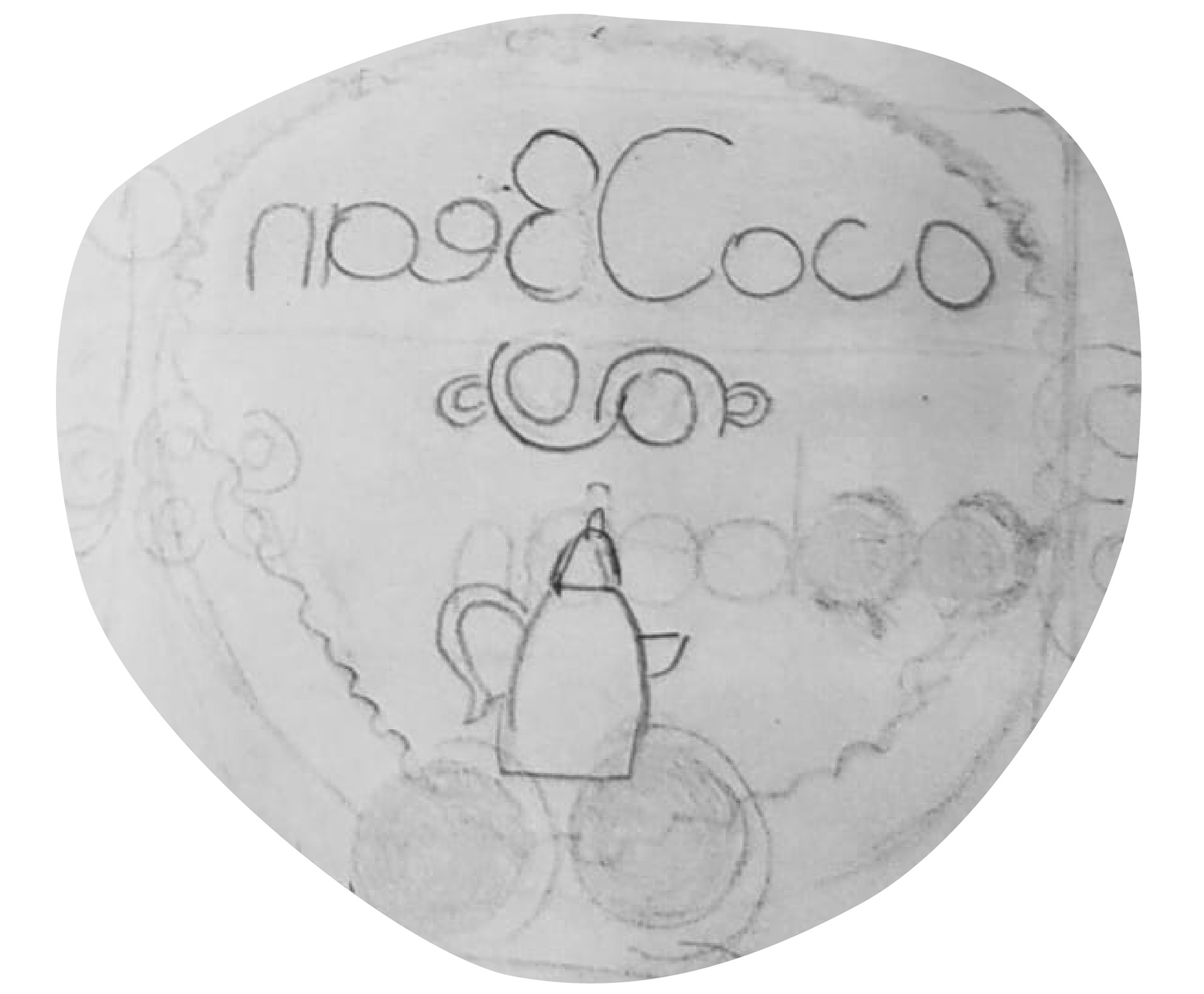
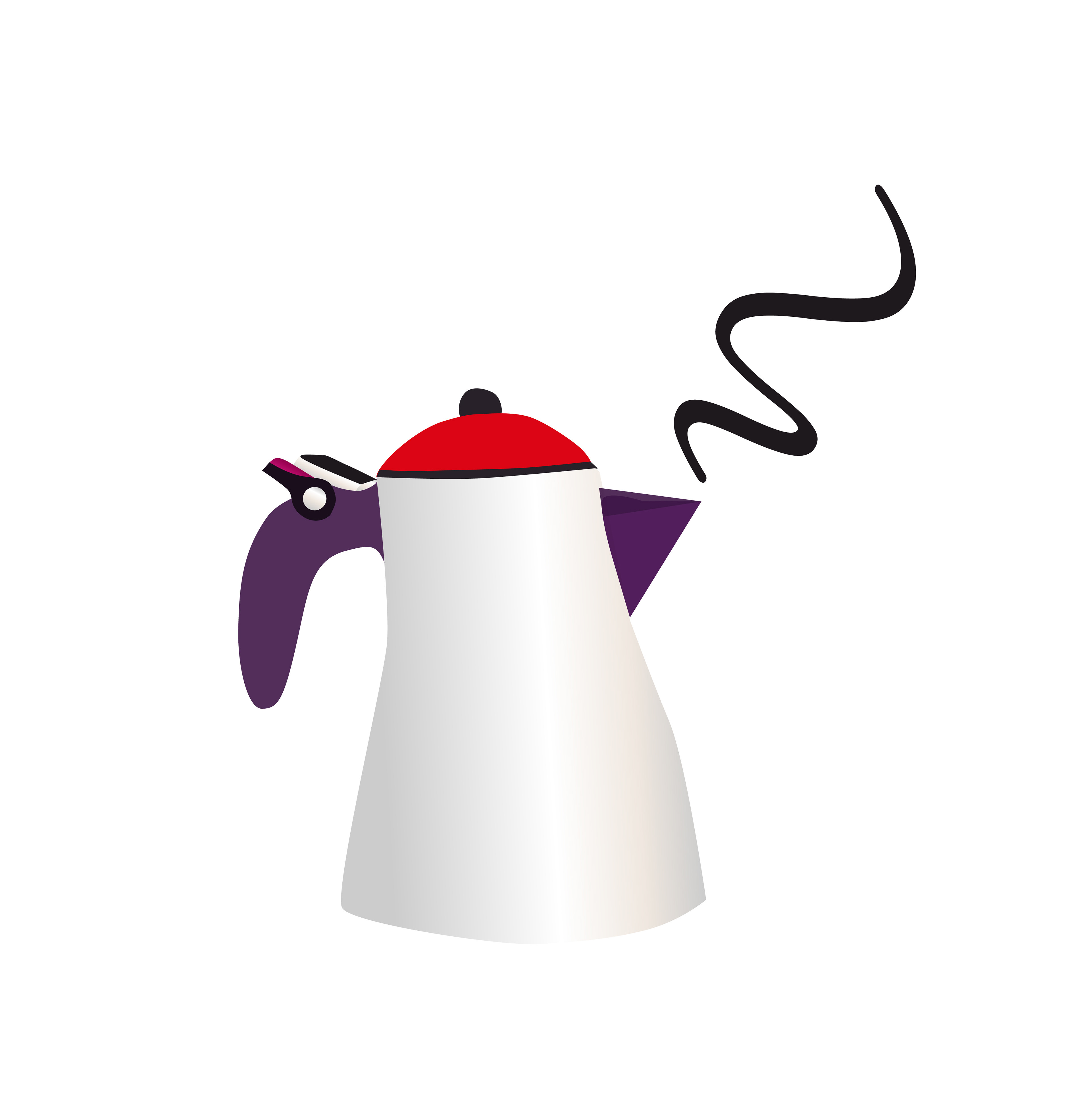
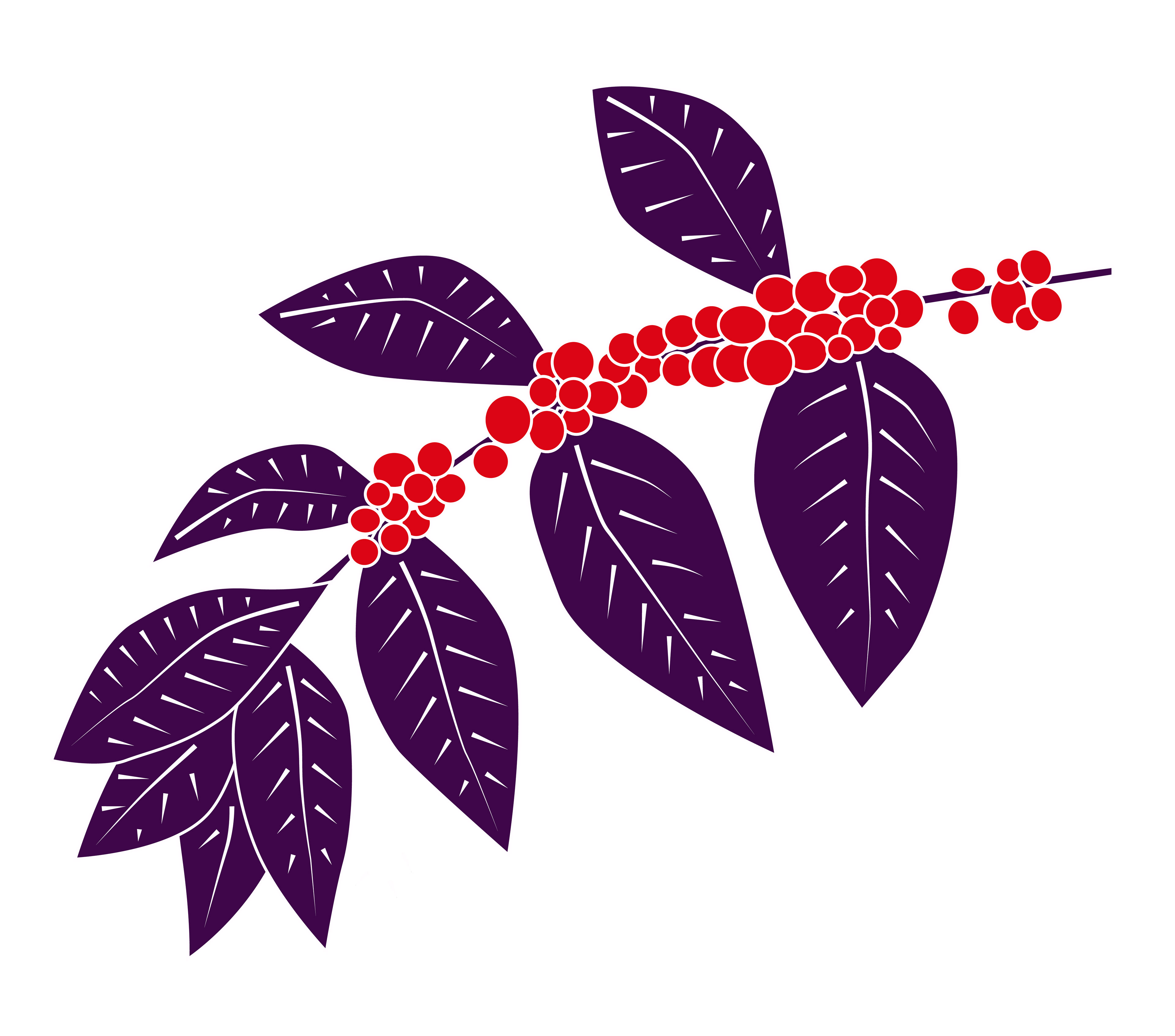
In my CocoBean sketches, I show the brand’s style in a creative way. I draw coffee cups, pots, and coco beans, each with its own story. Soft lines and light shading give a warm, familiar feeling, celebrating coffee culture and showing care for quality and the planet. Each sketch tells the journey from farm to cup and the charm of CocoBean.

I’ve put together a color palette that feels balanced and inviting. Dark browns add warmth, purples bring depth and luxury, silver gives a modern shine, and pink-orange adds energy and creativity. White ties it all together, keeping it bright and fresh.


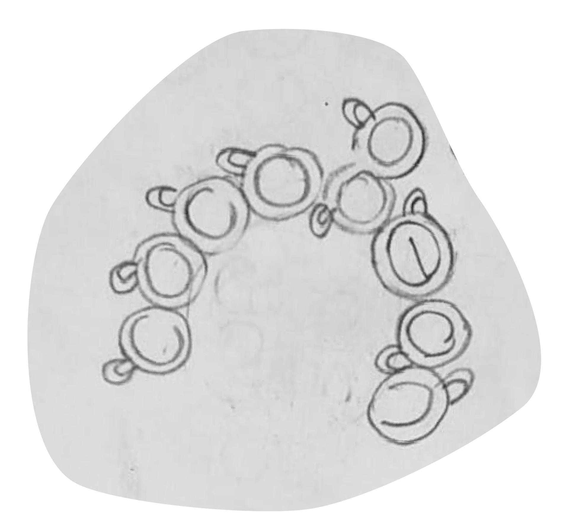
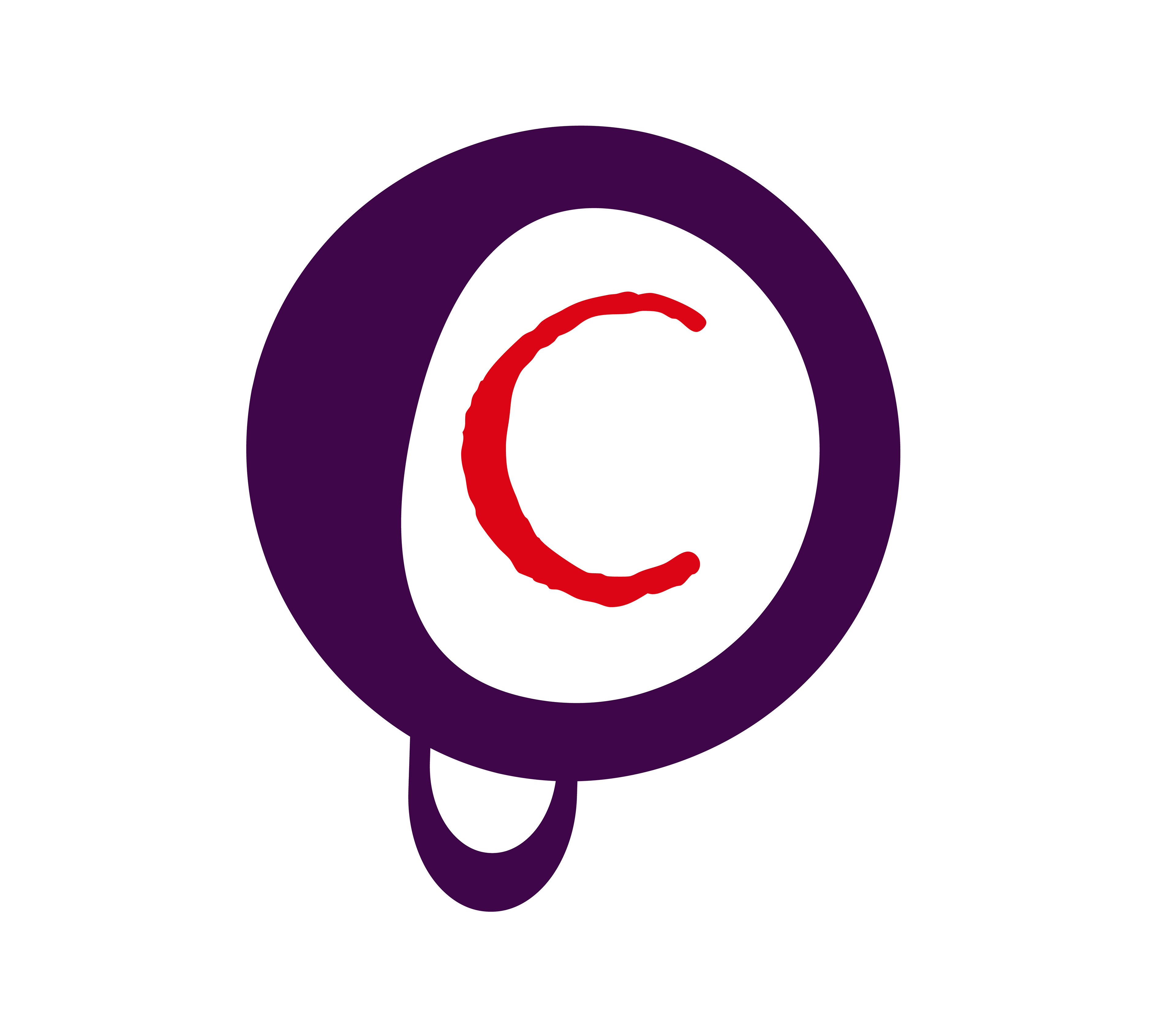
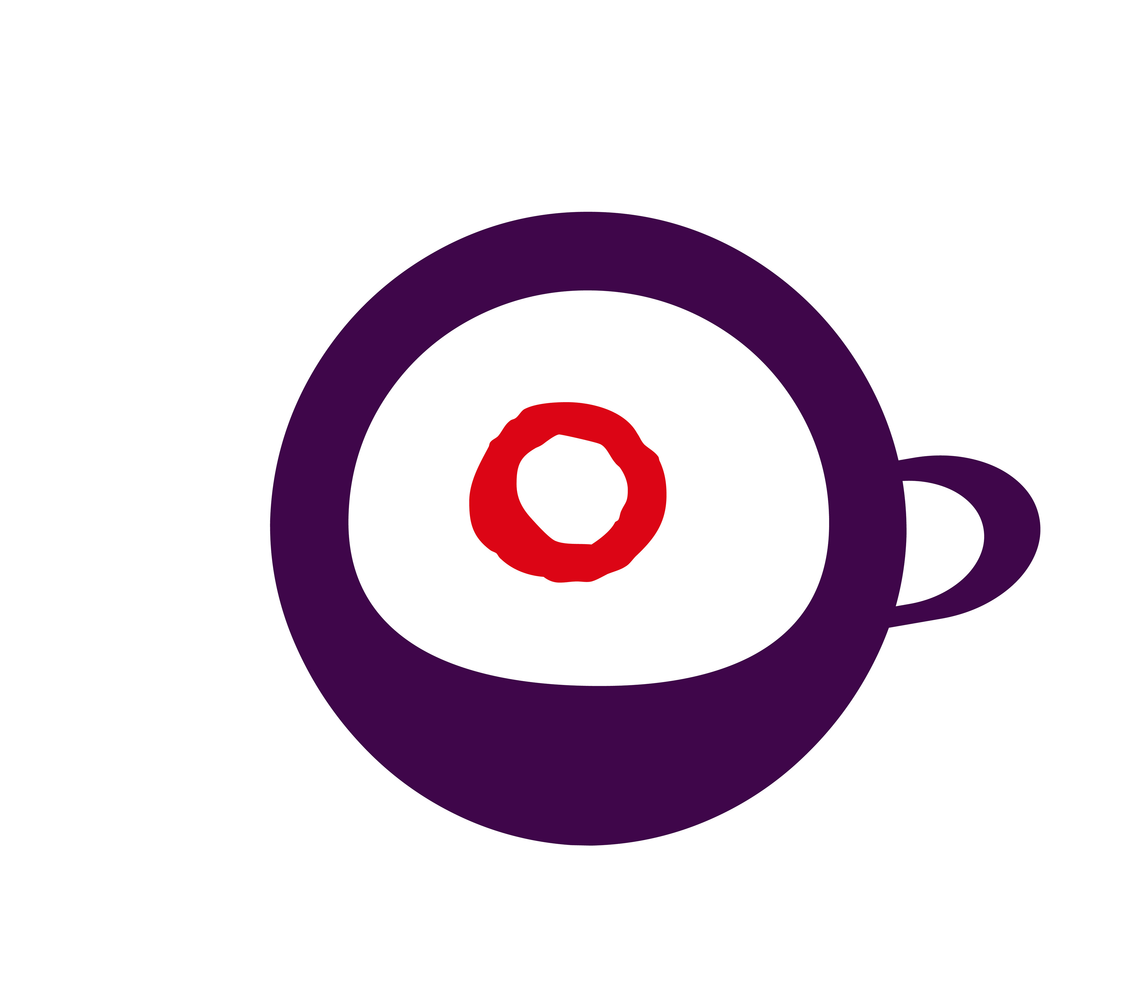
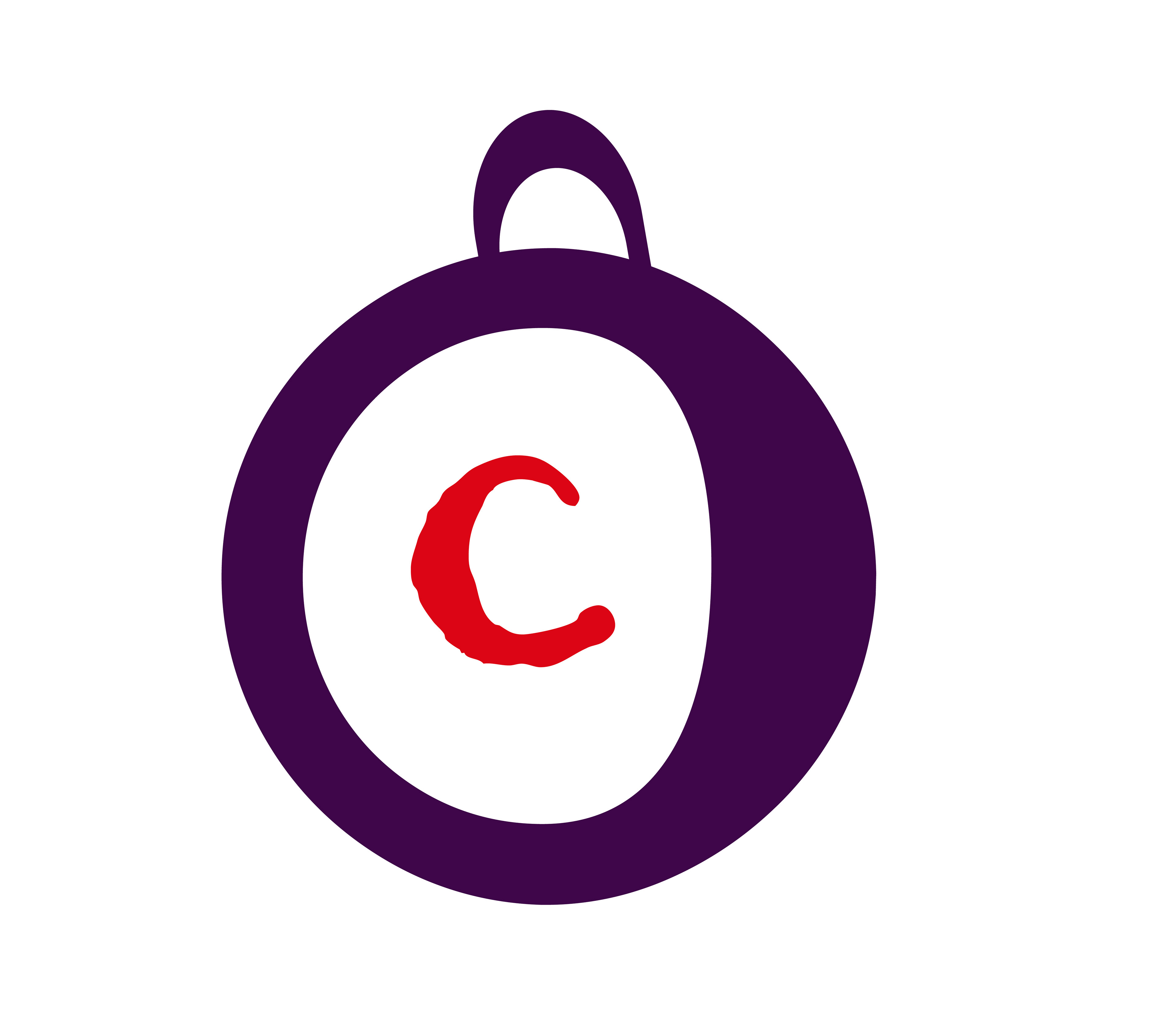
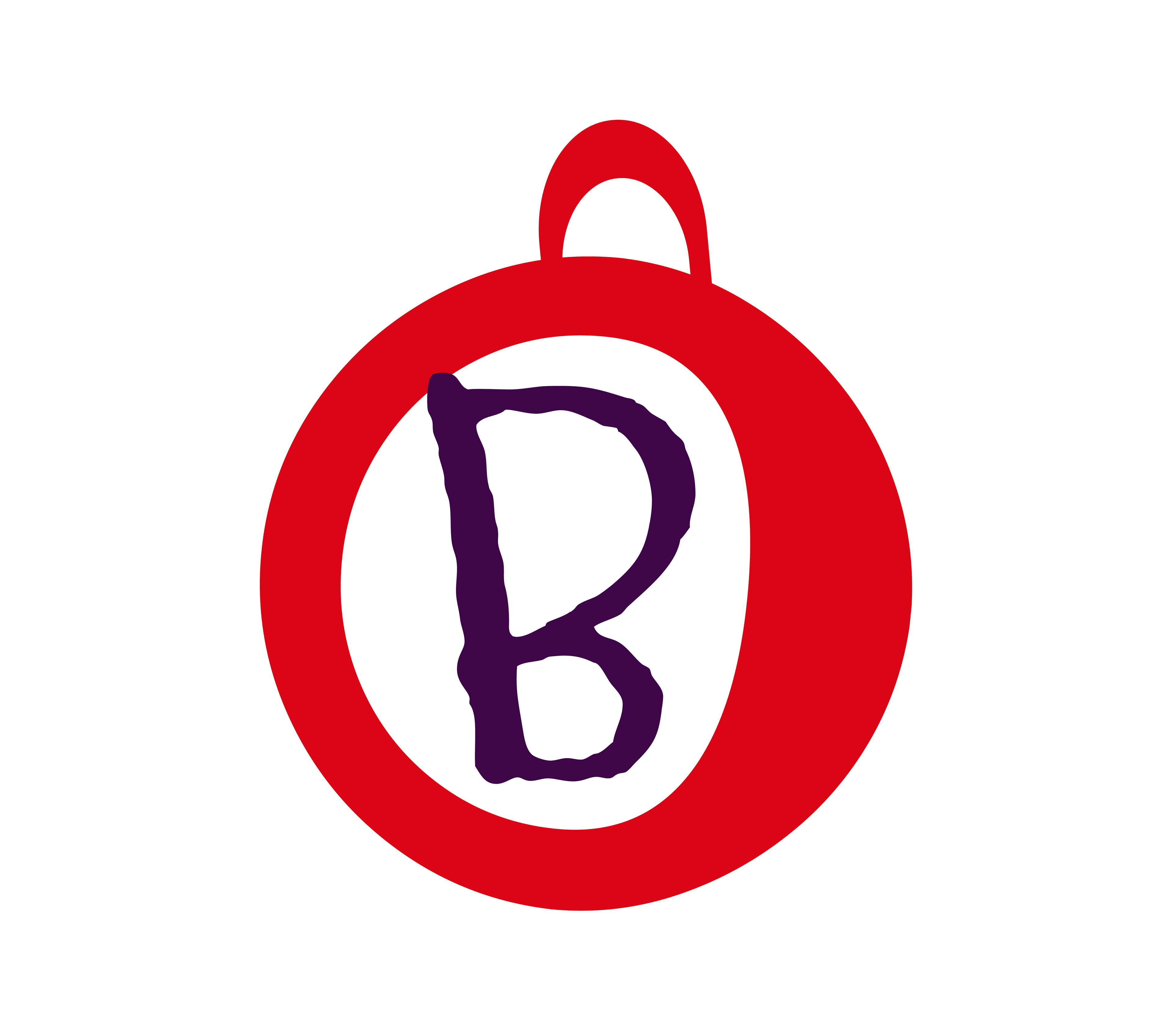
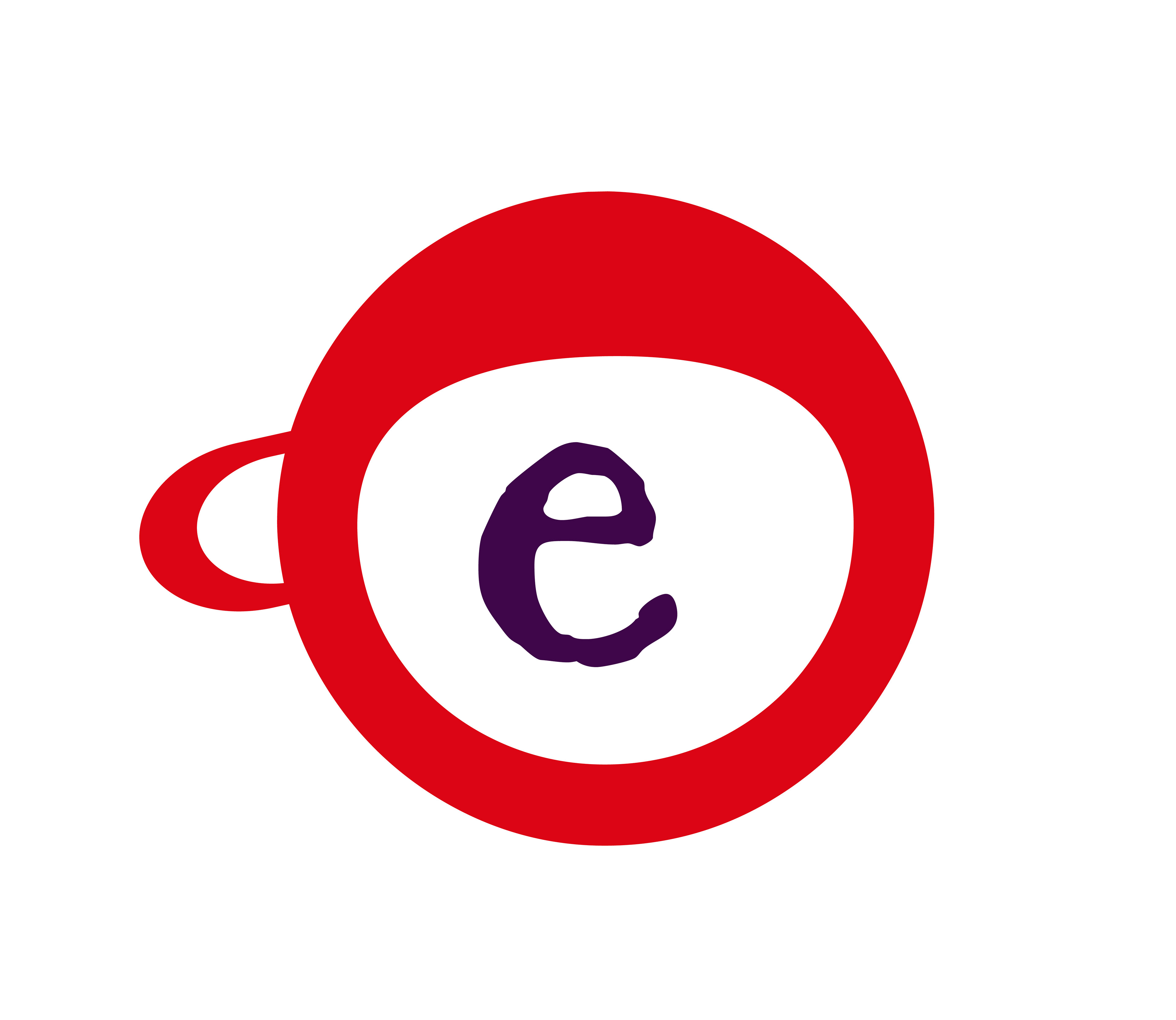
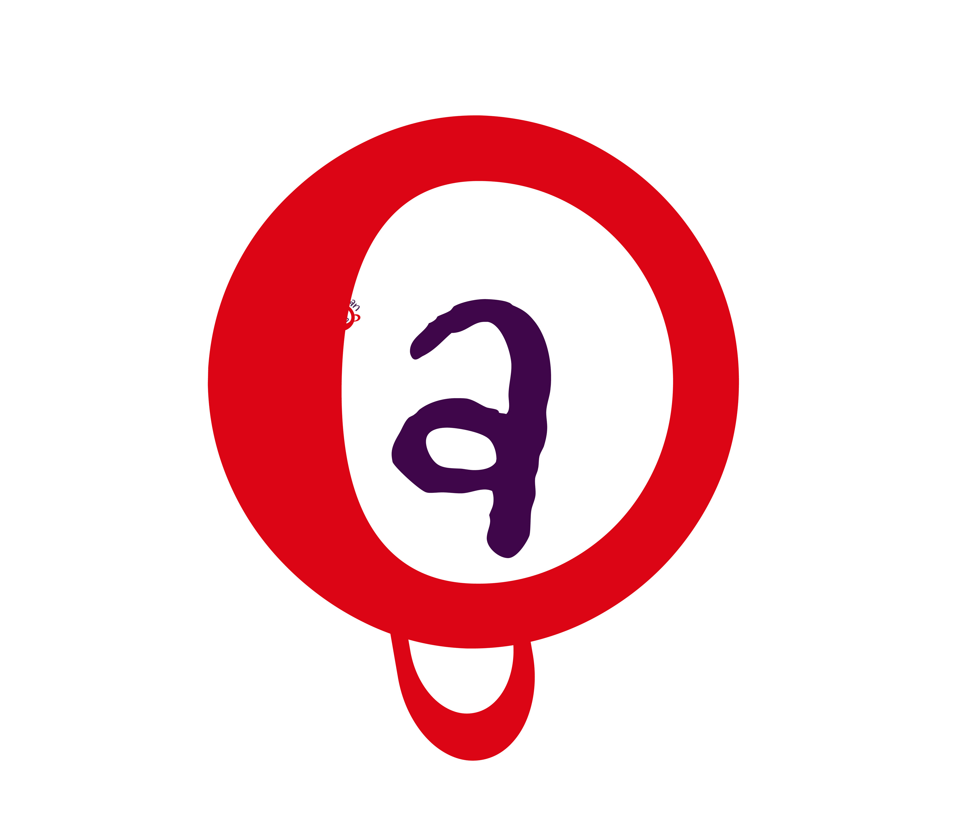
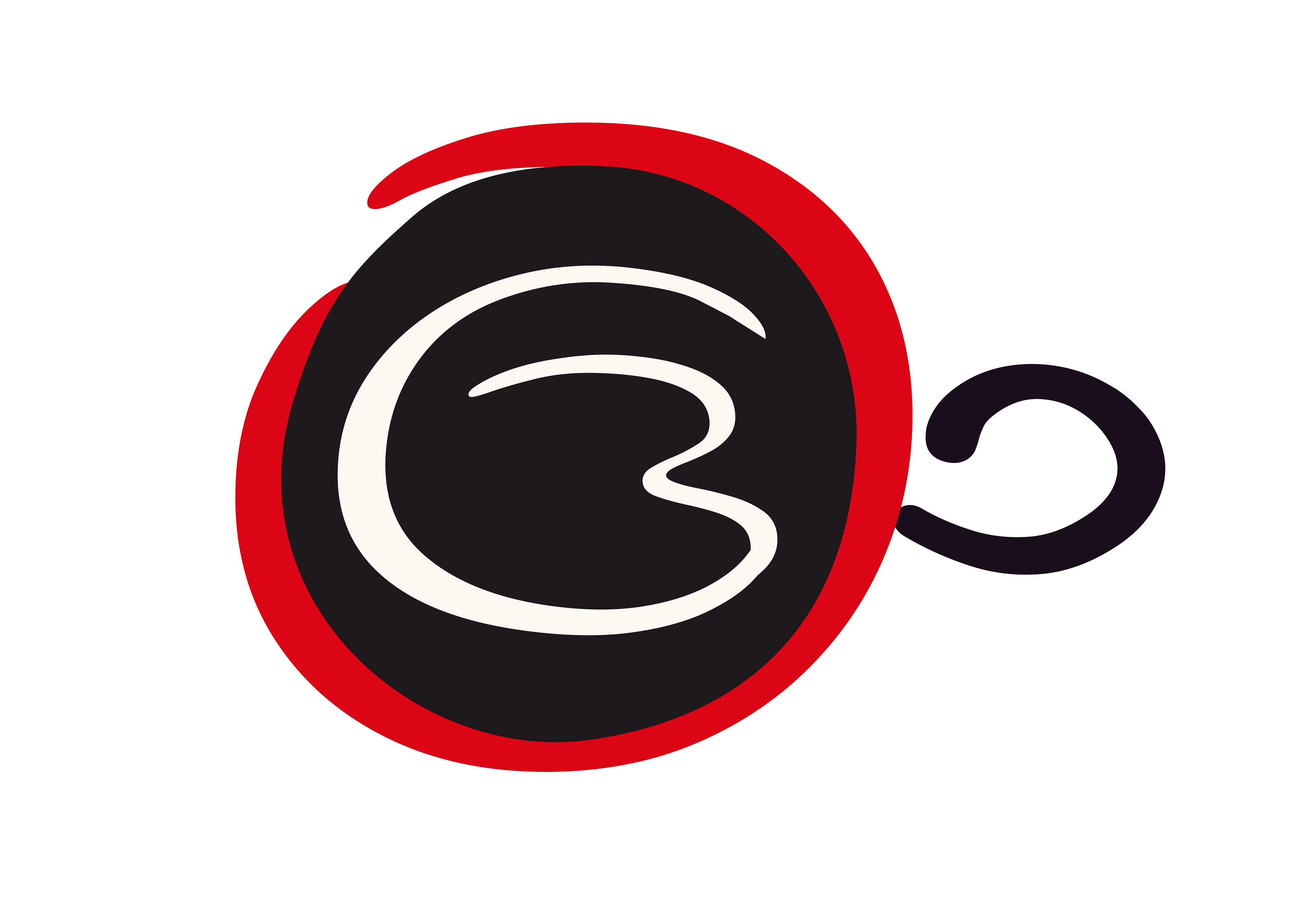
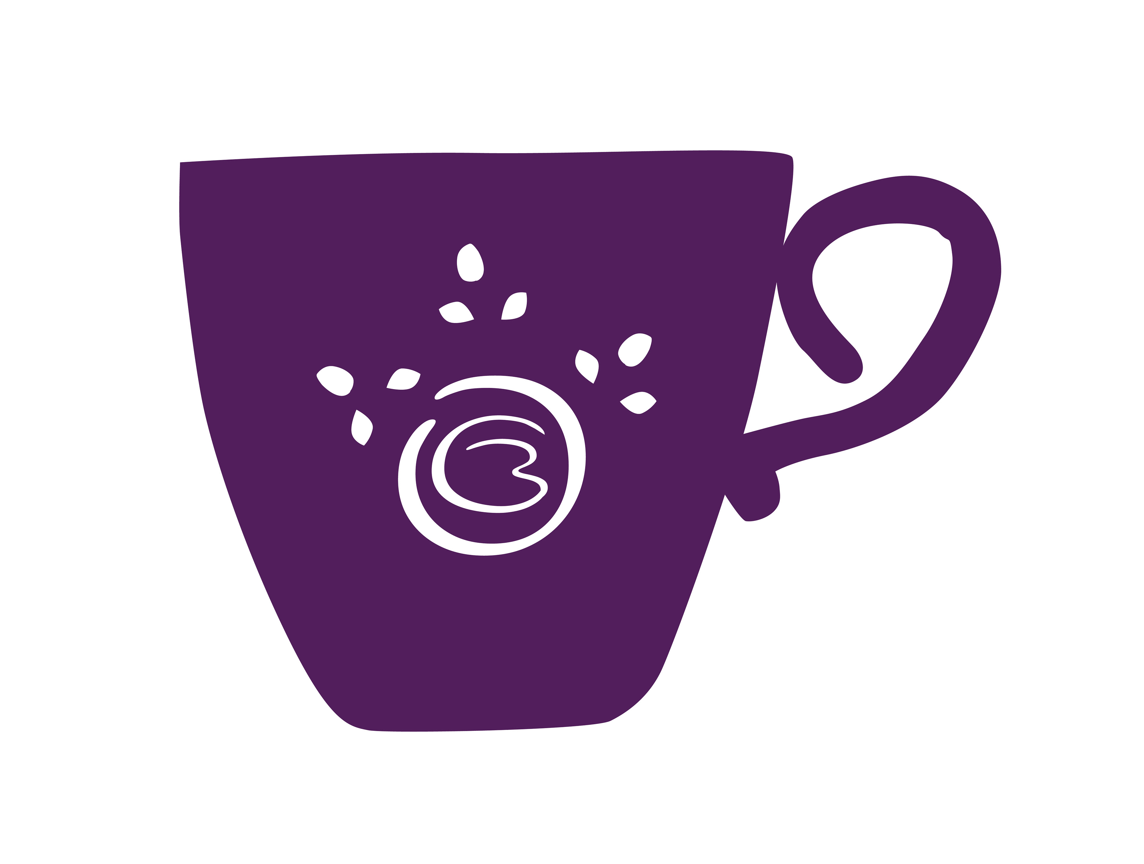
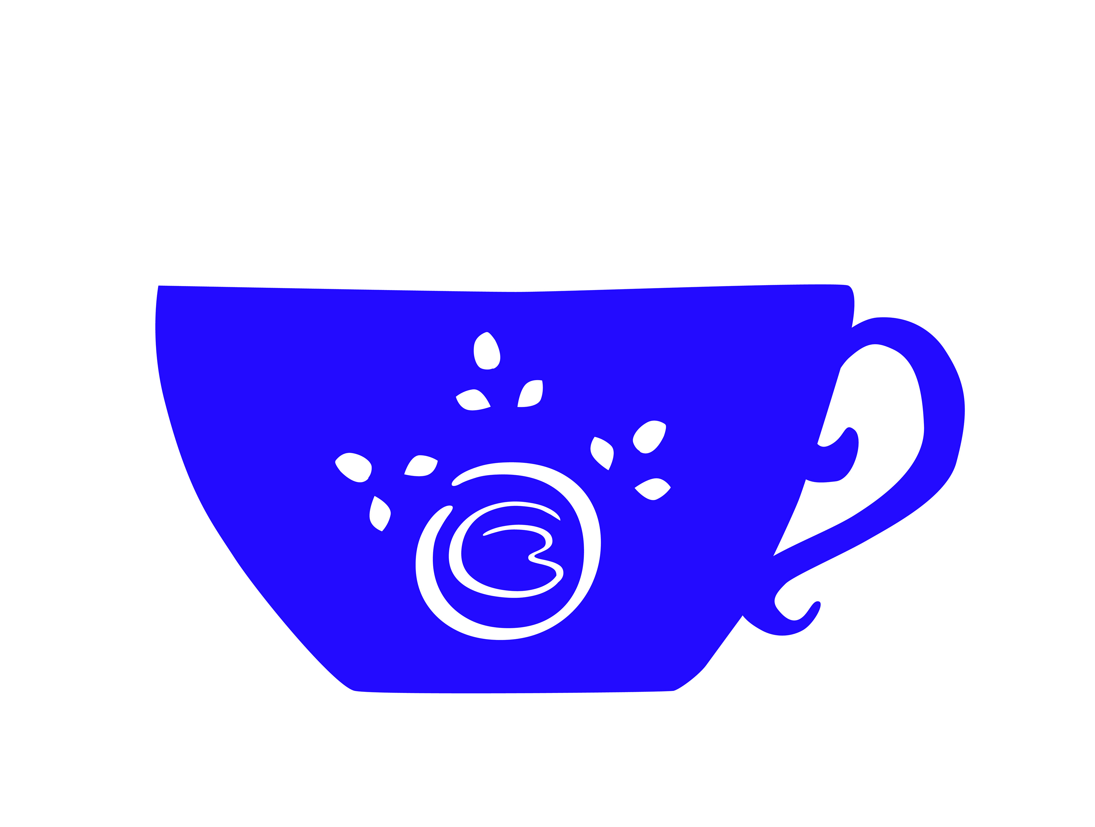
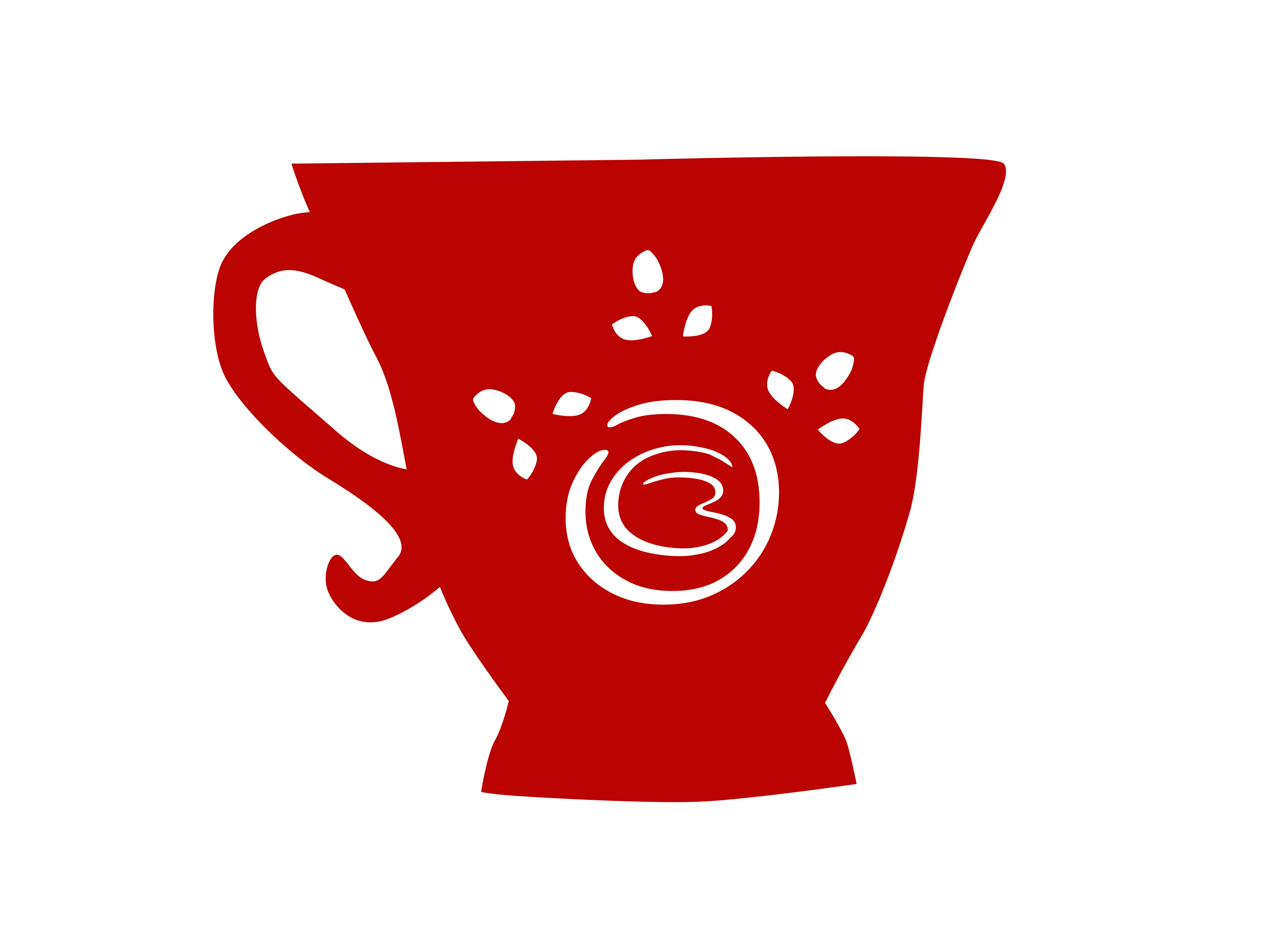
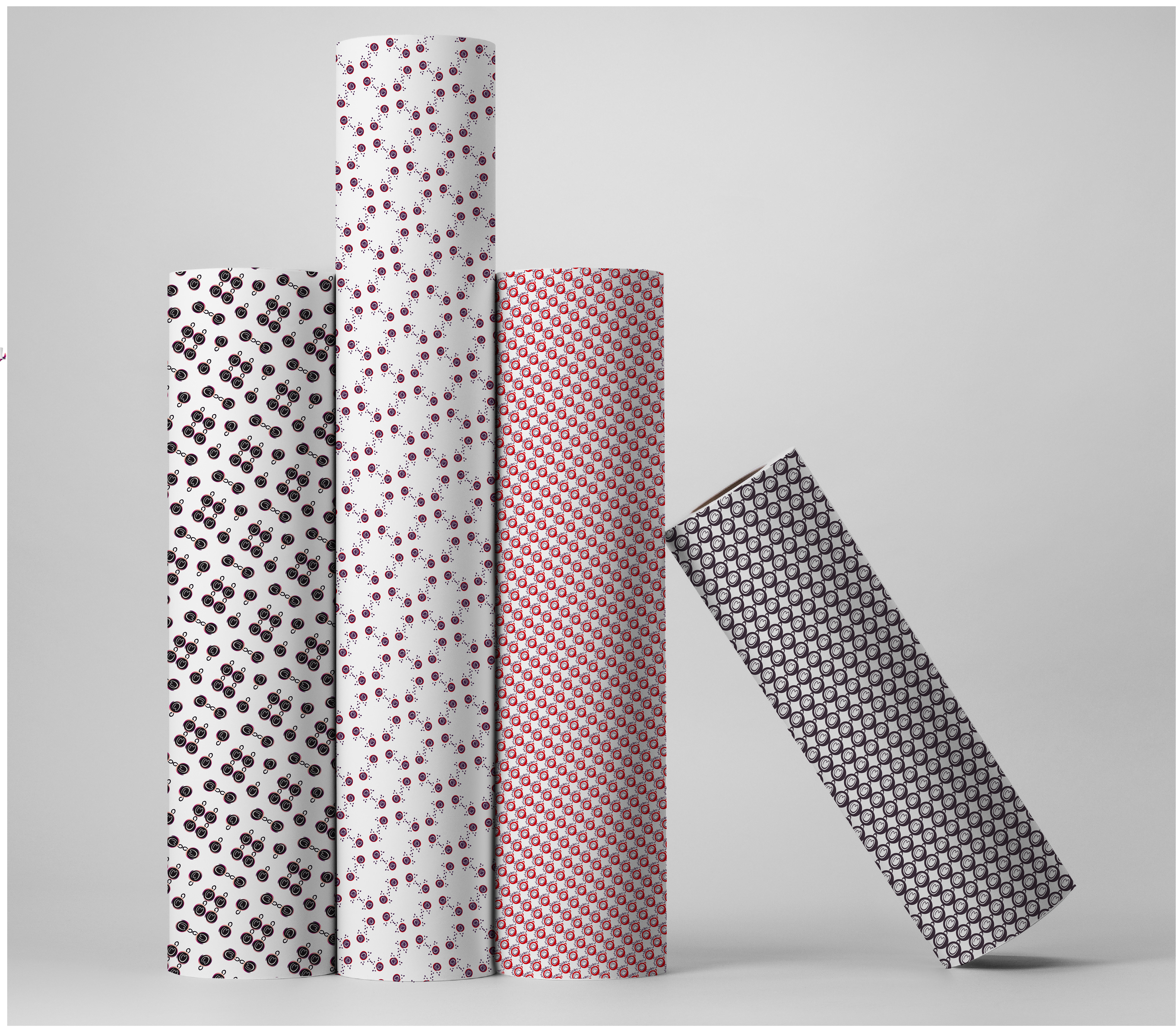
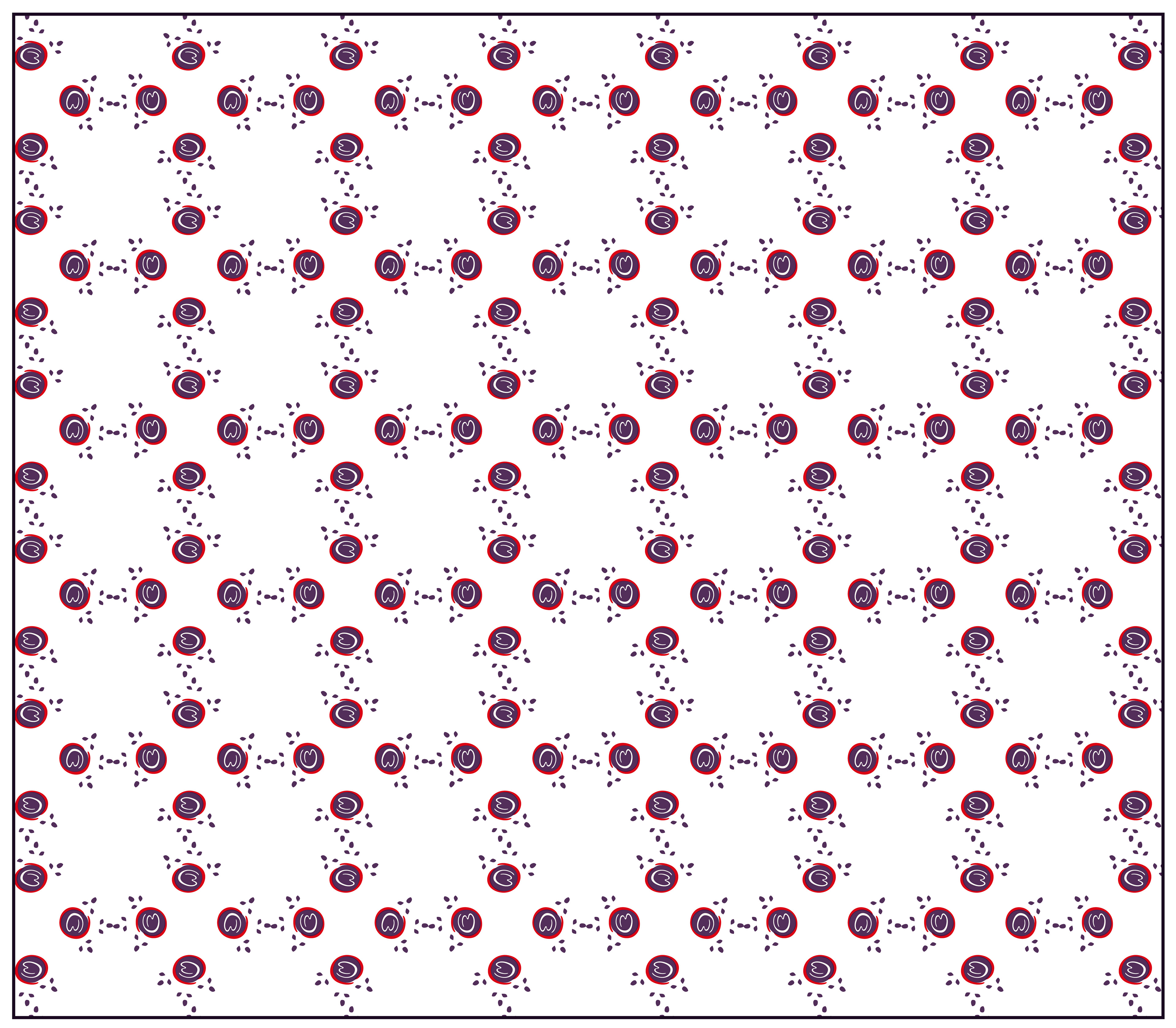
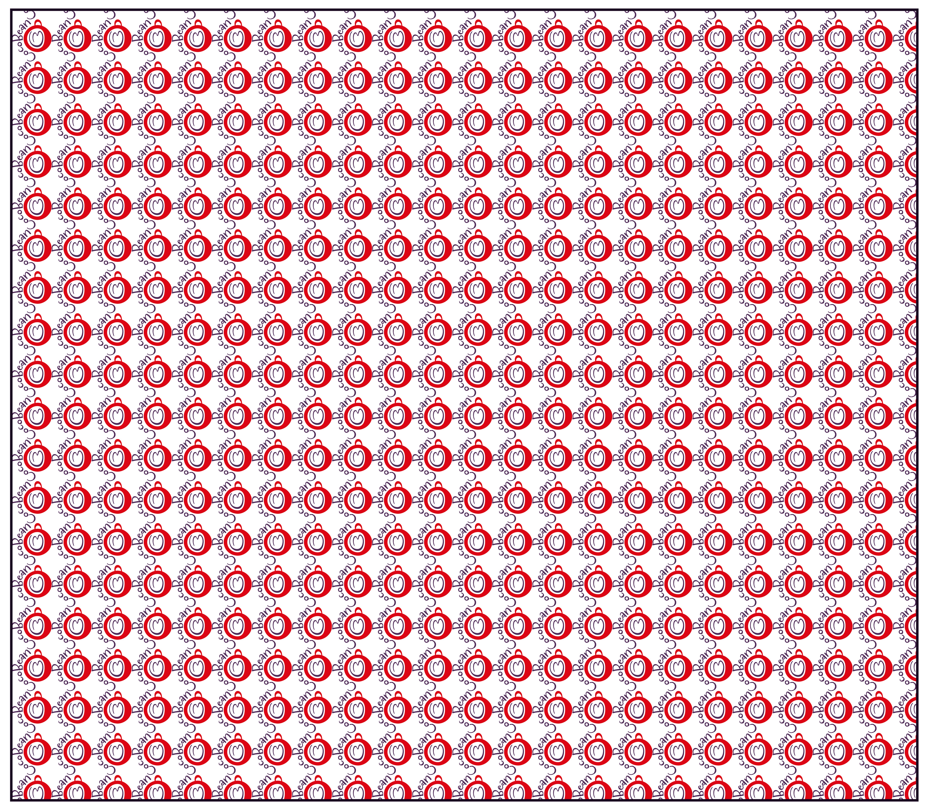
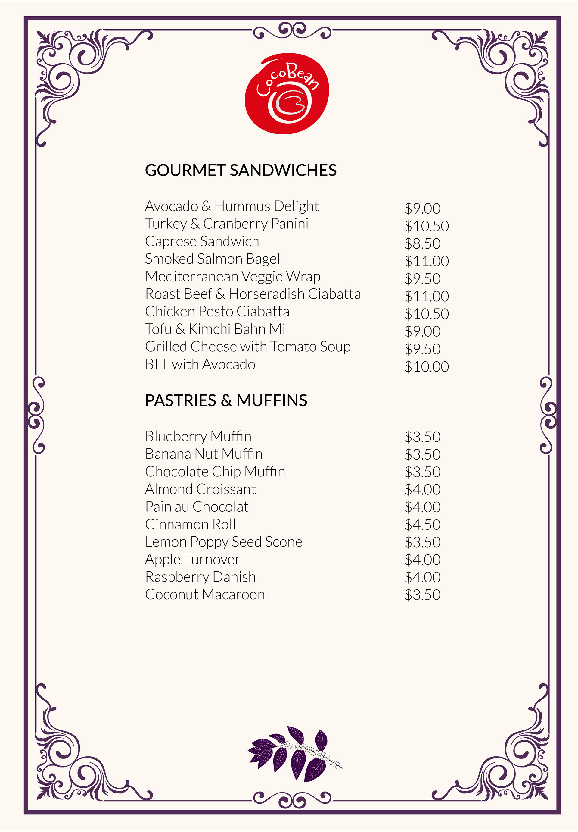
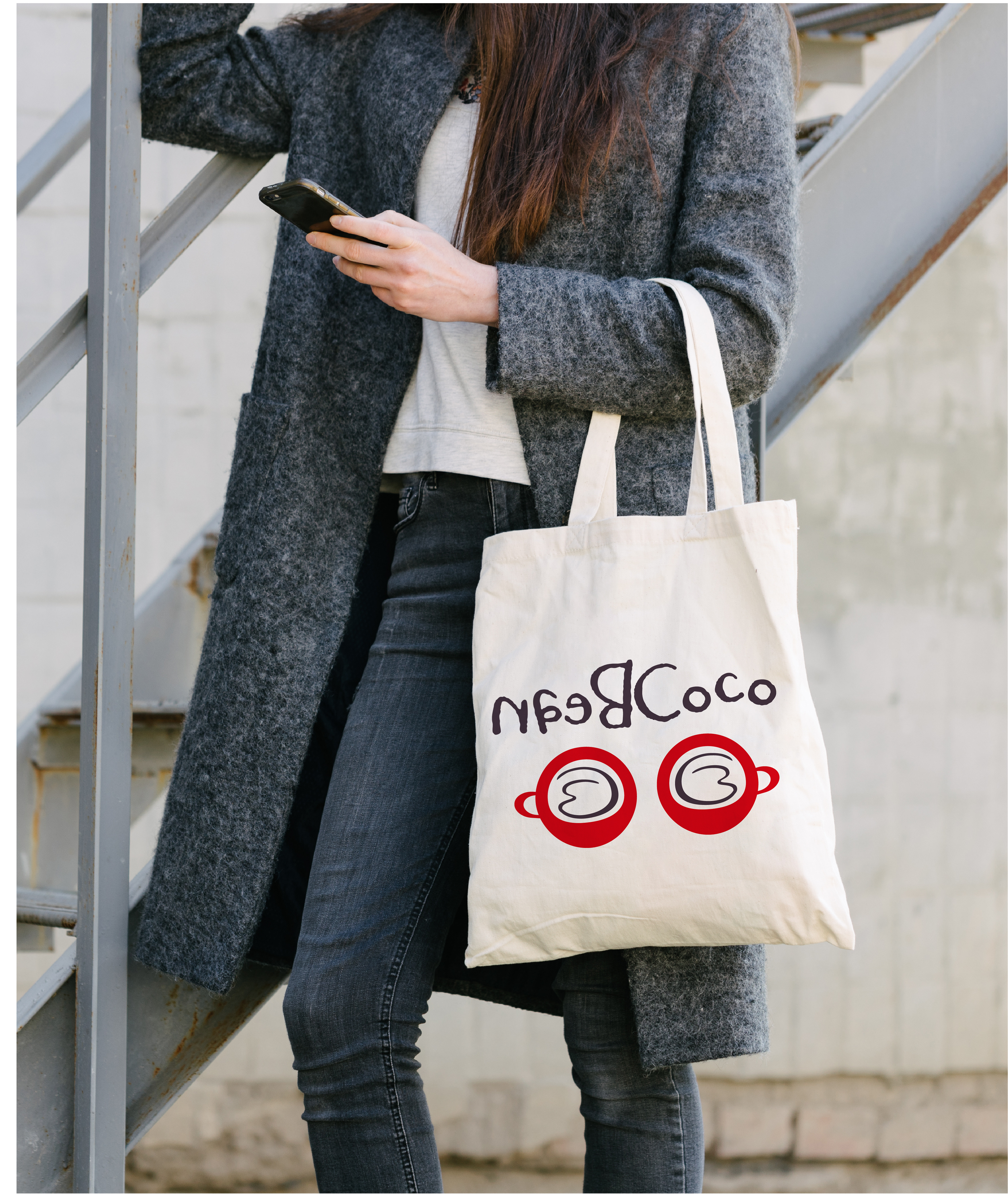
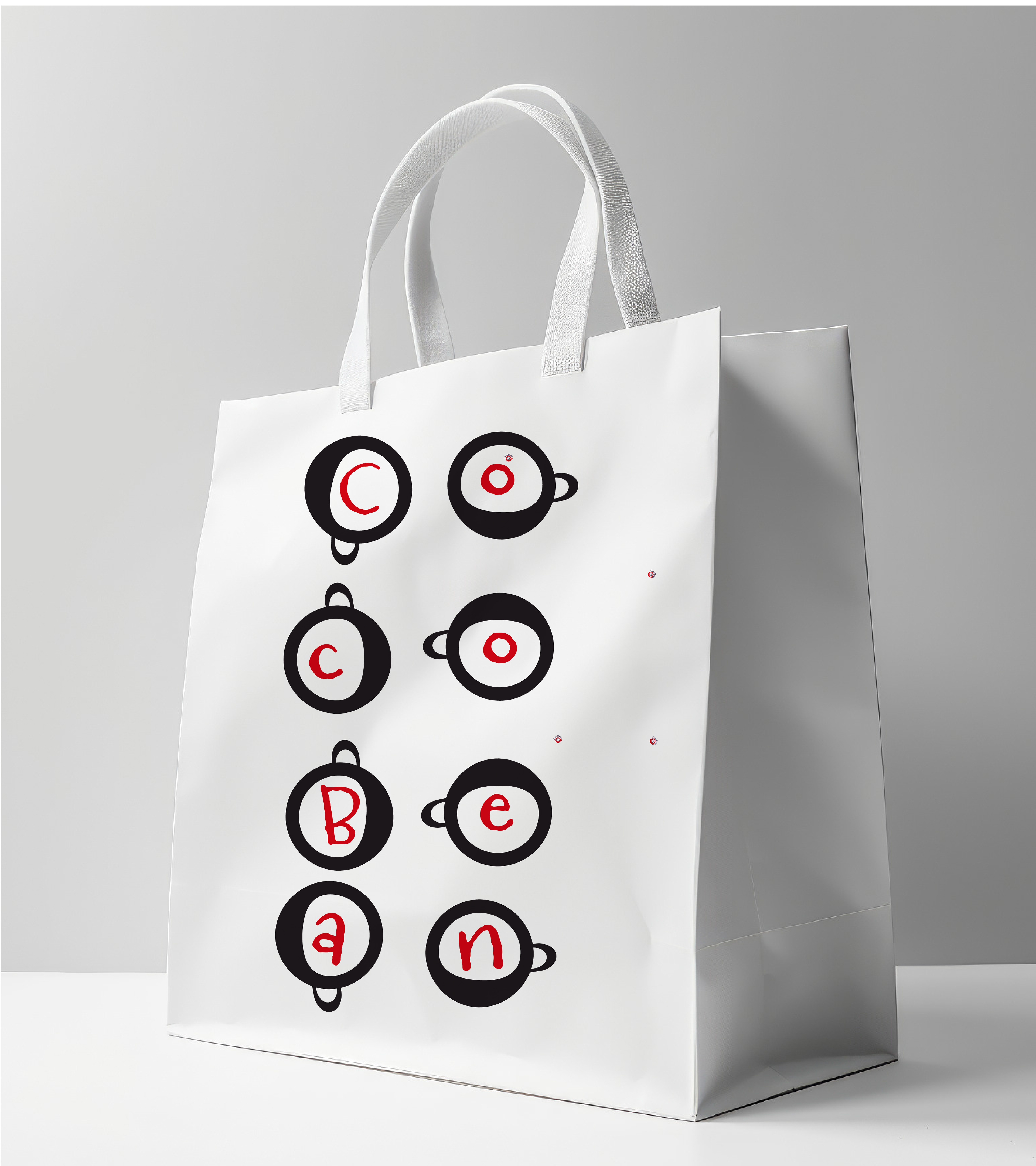
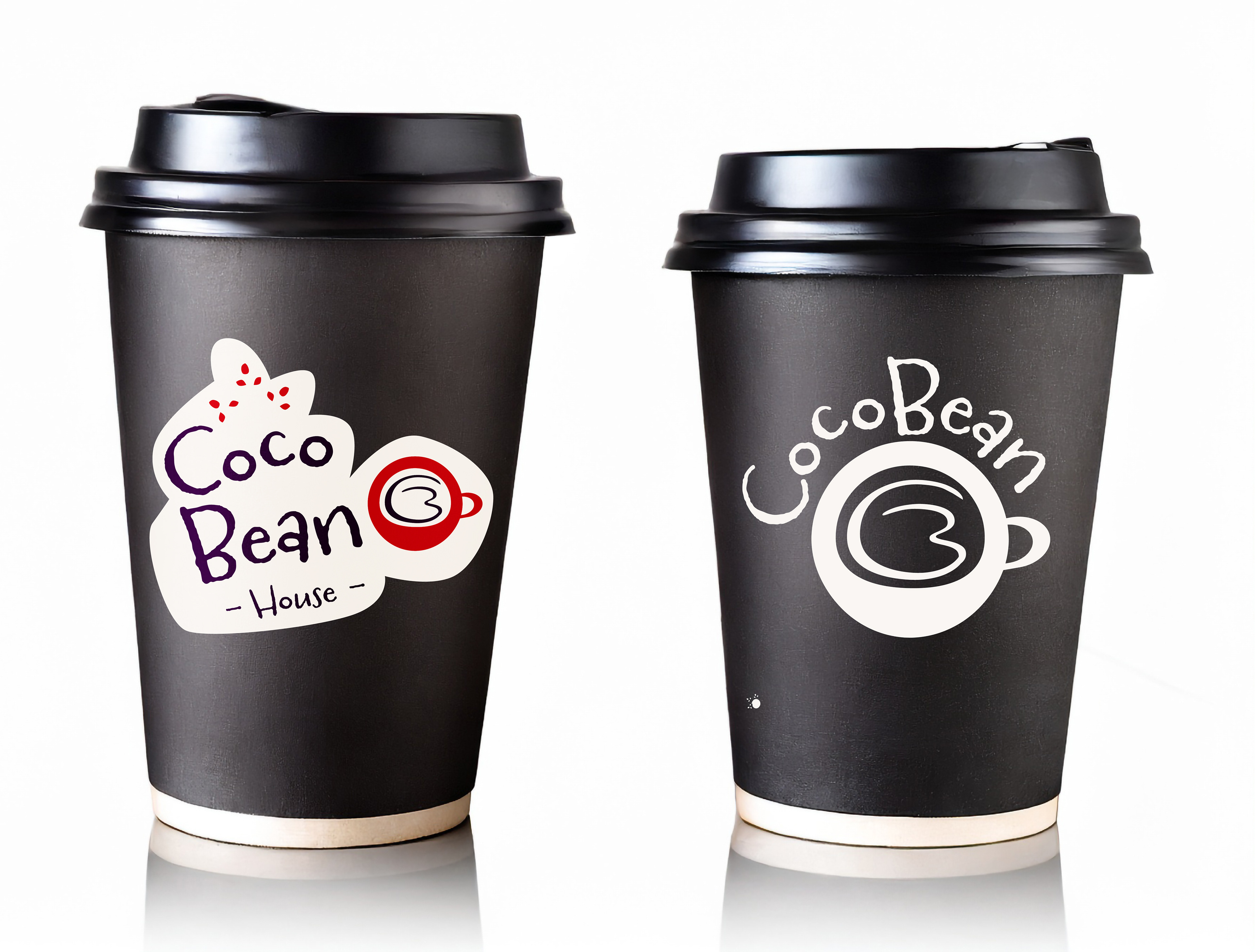
I’ve designed a set of artwork and patterns that show CocoBean’s personality. From fun coffee pots and cups to cute coffee beans, each piece adds charm to the brand. The coffee cups even use the logo’s “O” as the cup top and “CB” as foam, mixing creativity with brand recognition. These designs work across everything—from posters to packaging—making CocoBean’s brand feel lively and inviting.
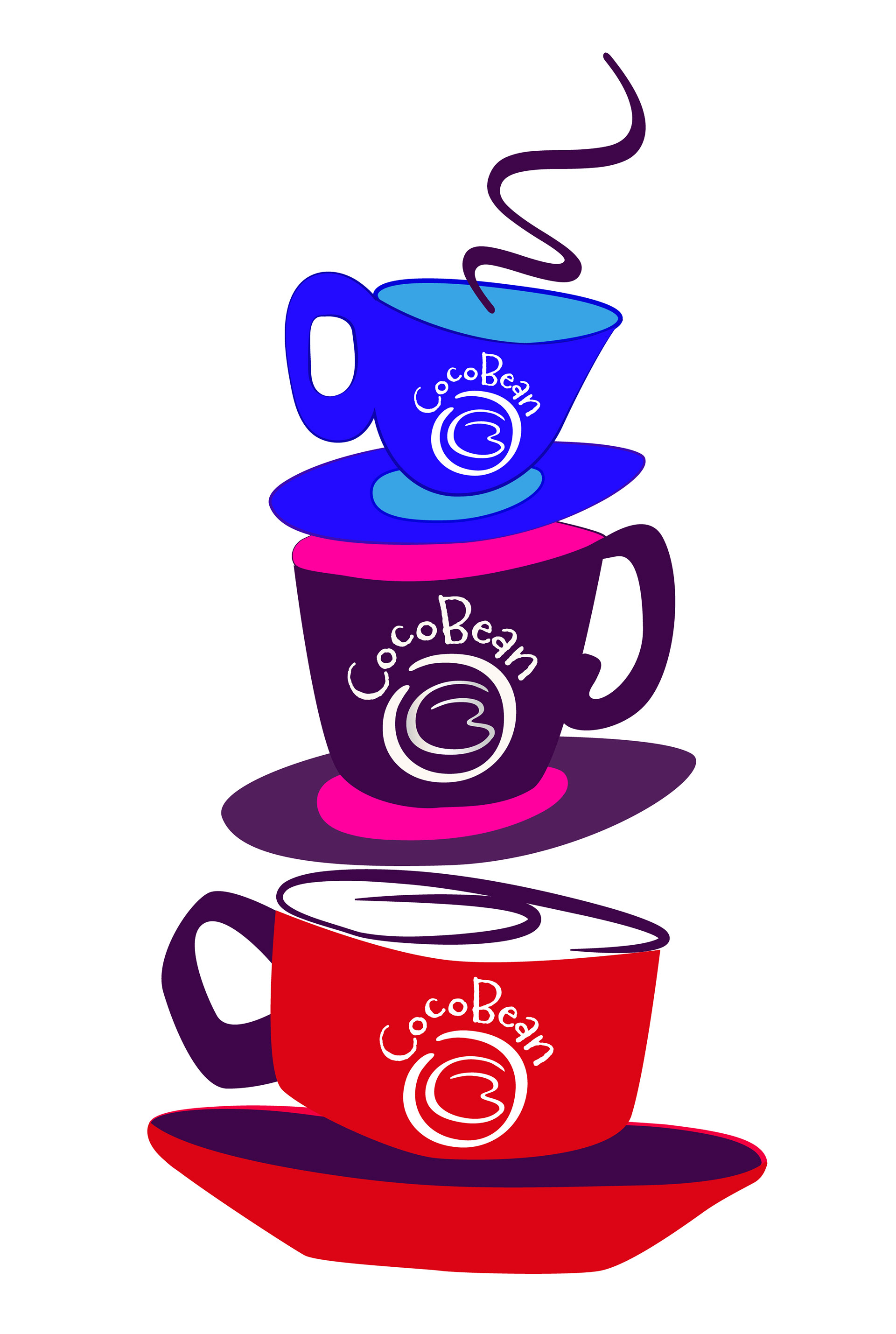


The patterns I’ve made can be used all over our coffee diner—from sandwich wraps to paper bags and other packaging. They add elegance and charm, making our food look even better and adding to the cozy, stylish feel of CocoBean. Each one helps show off the brand’s personality.


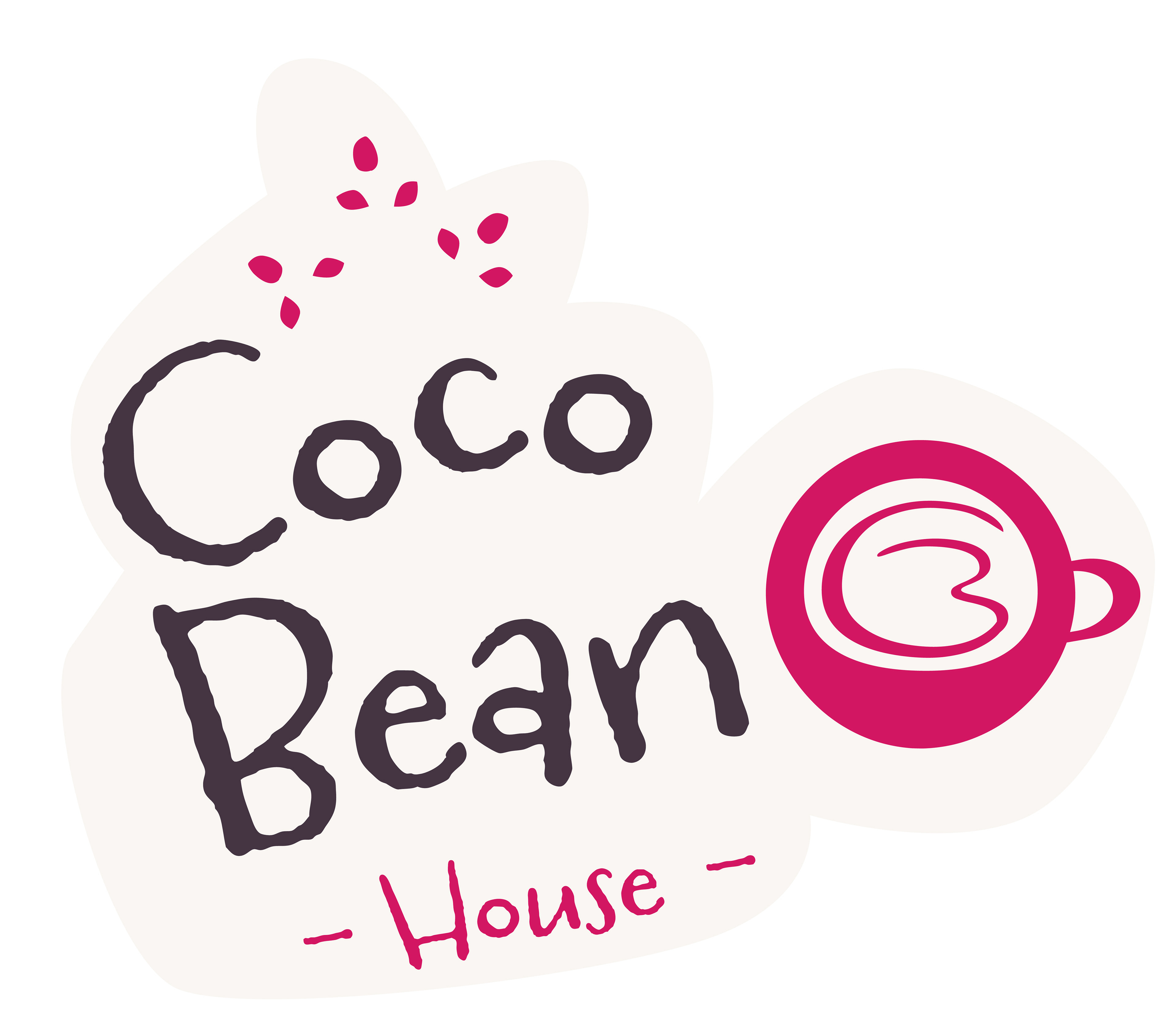
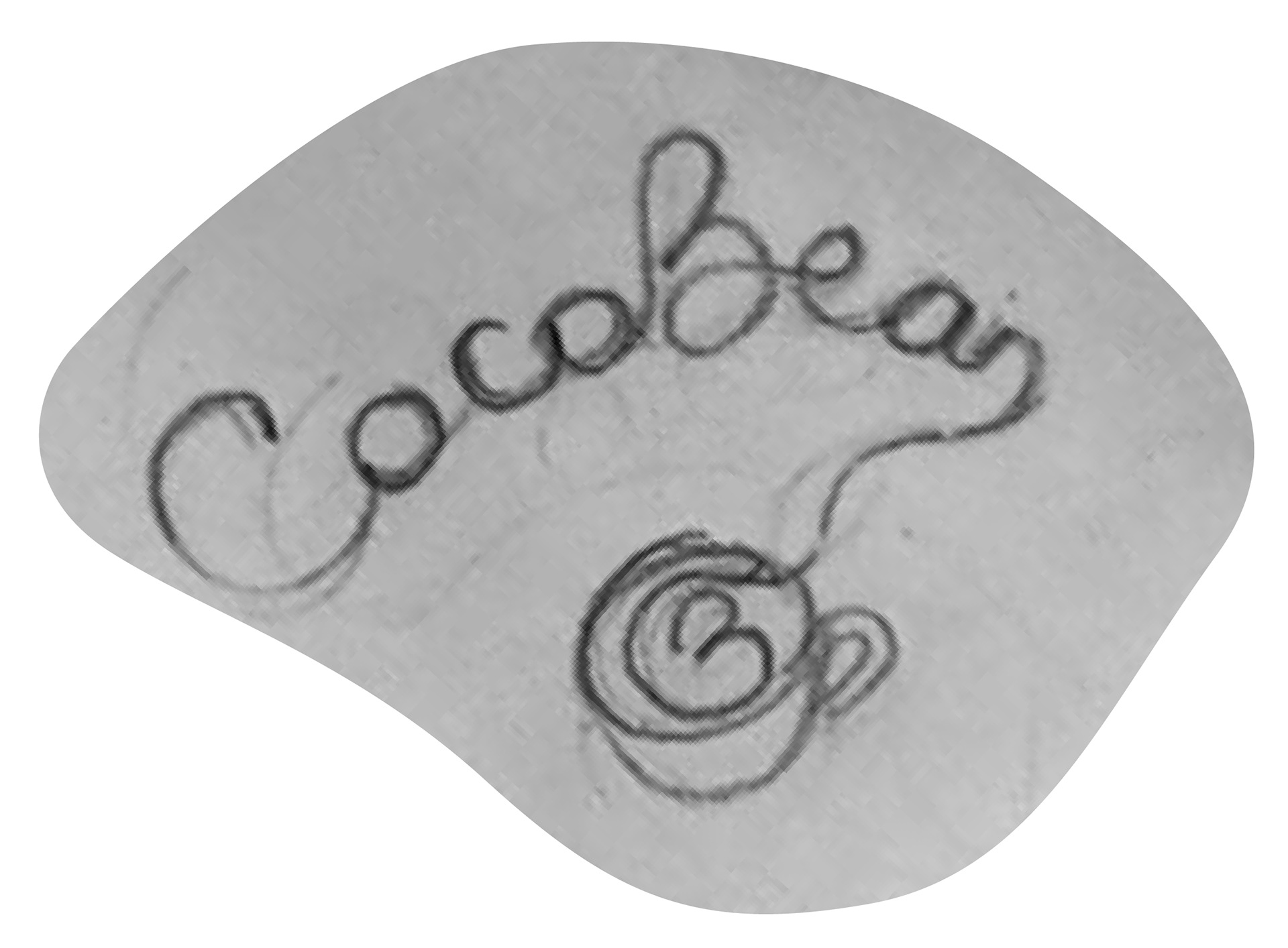
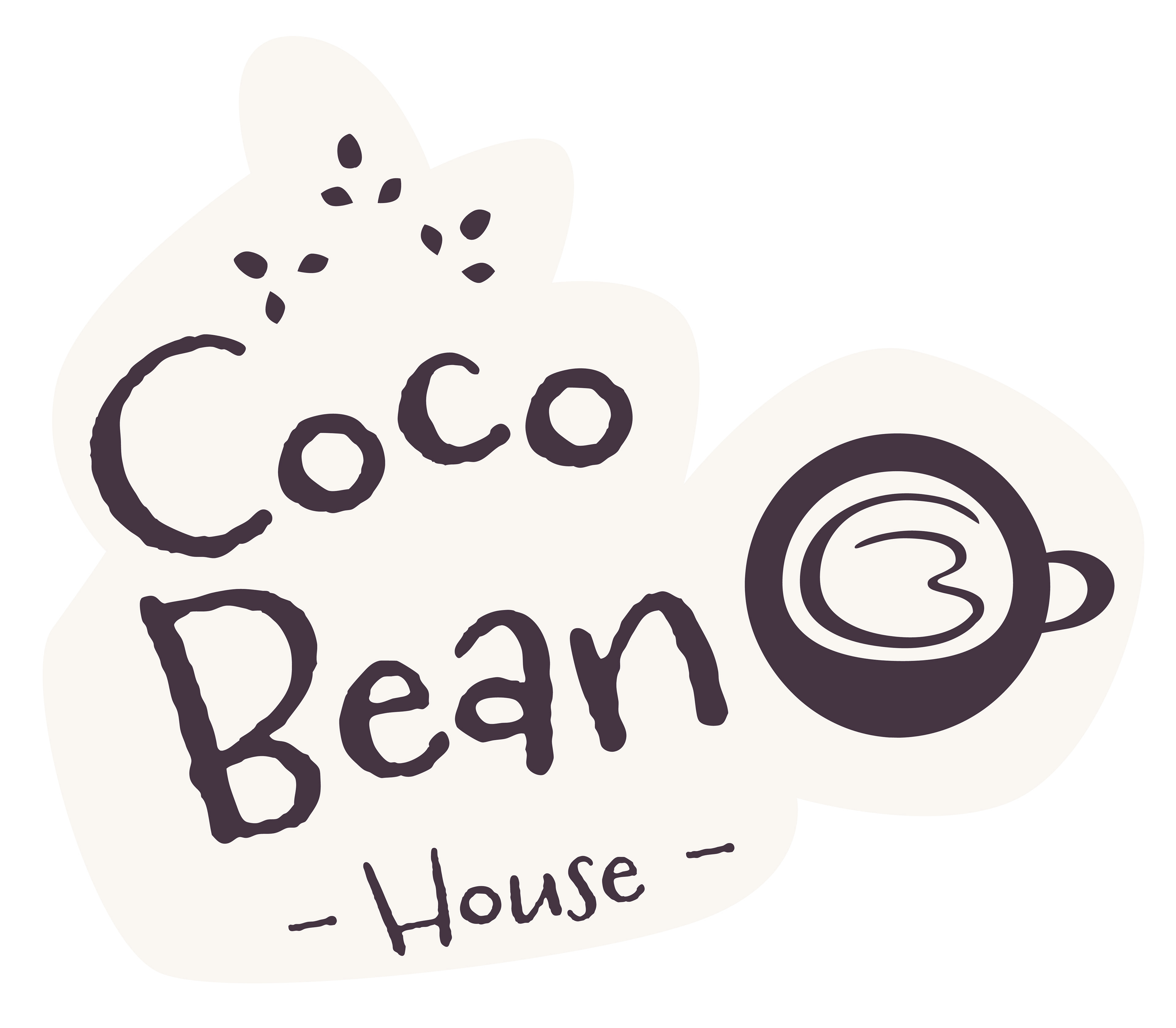
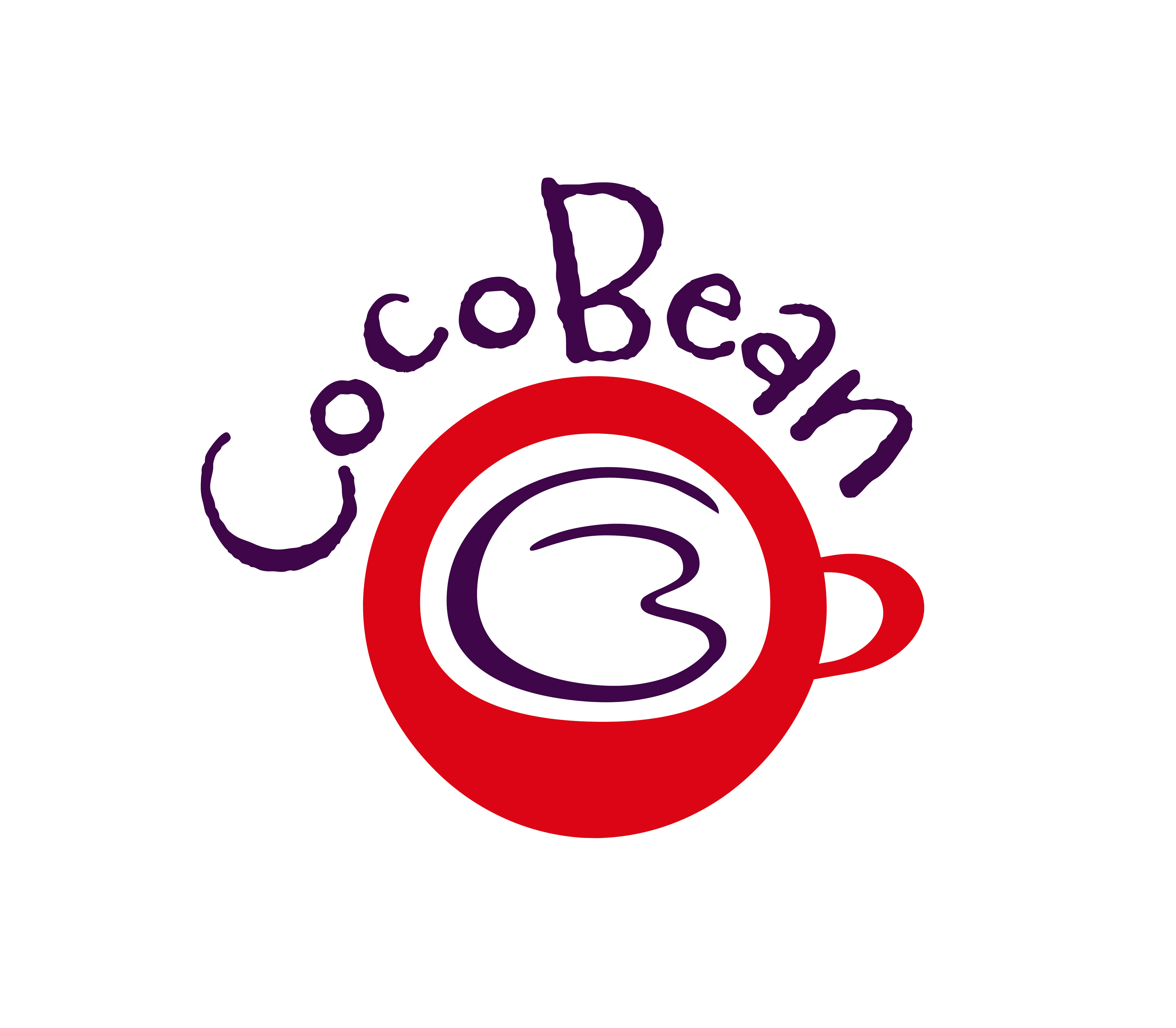
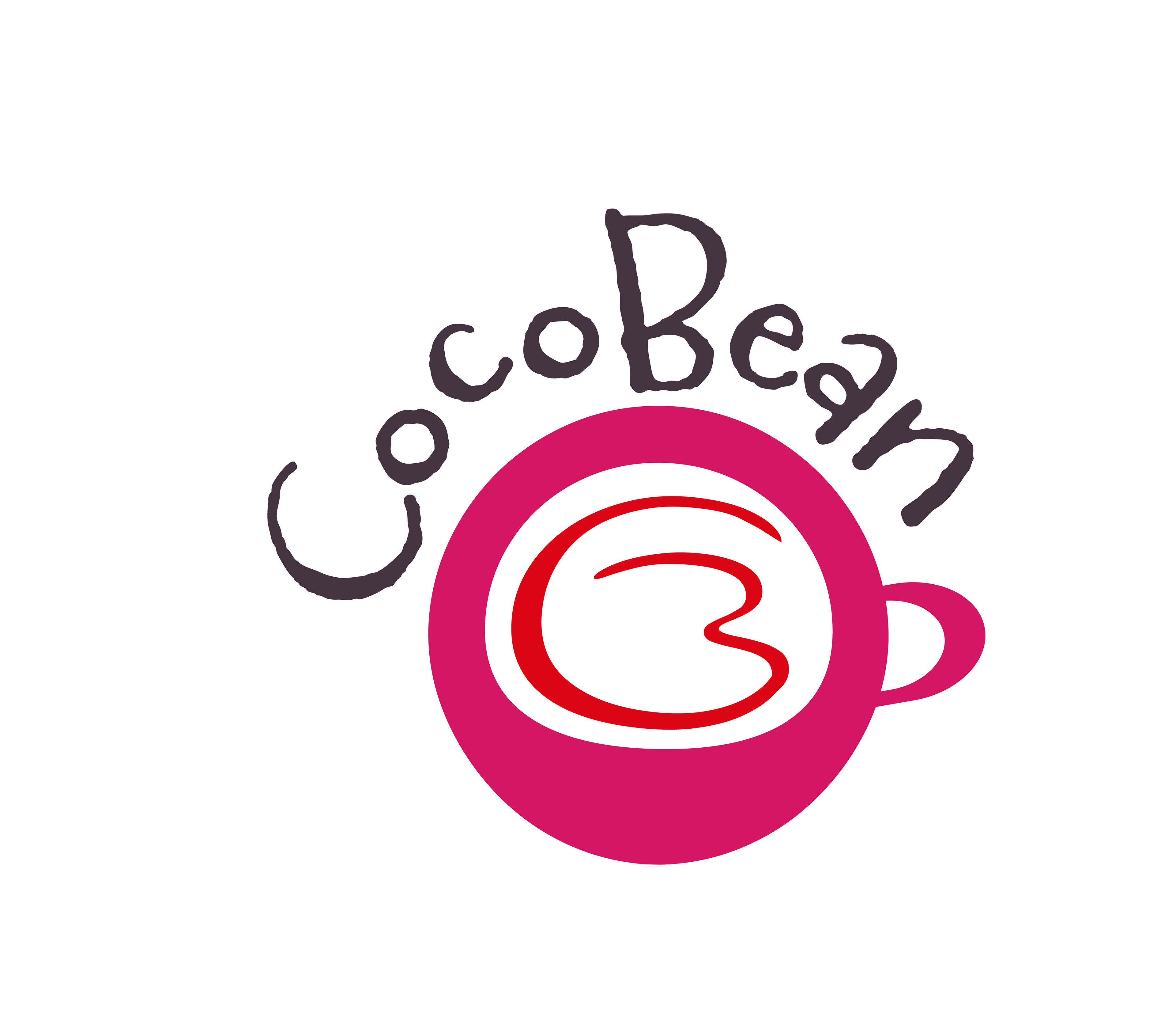
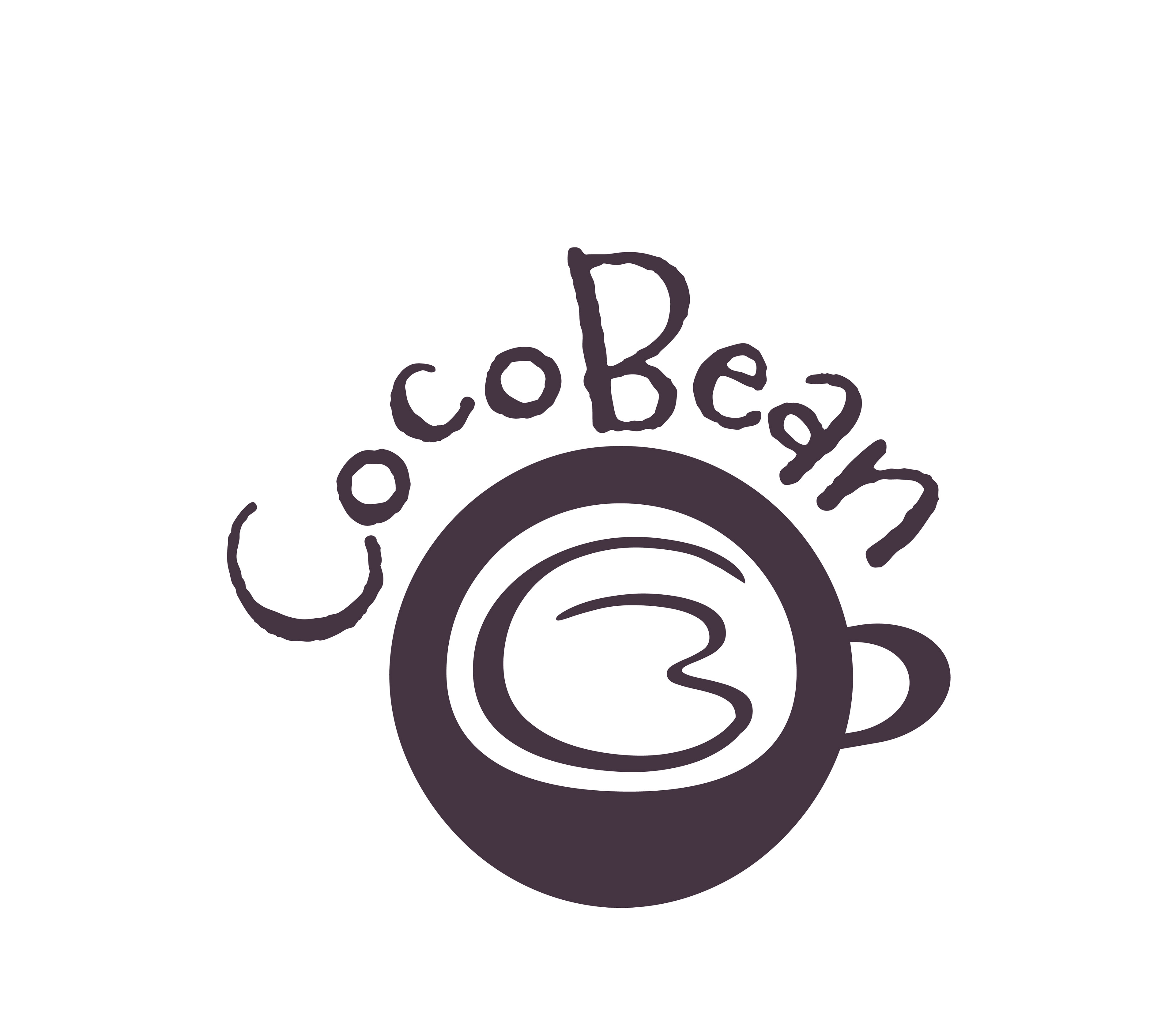
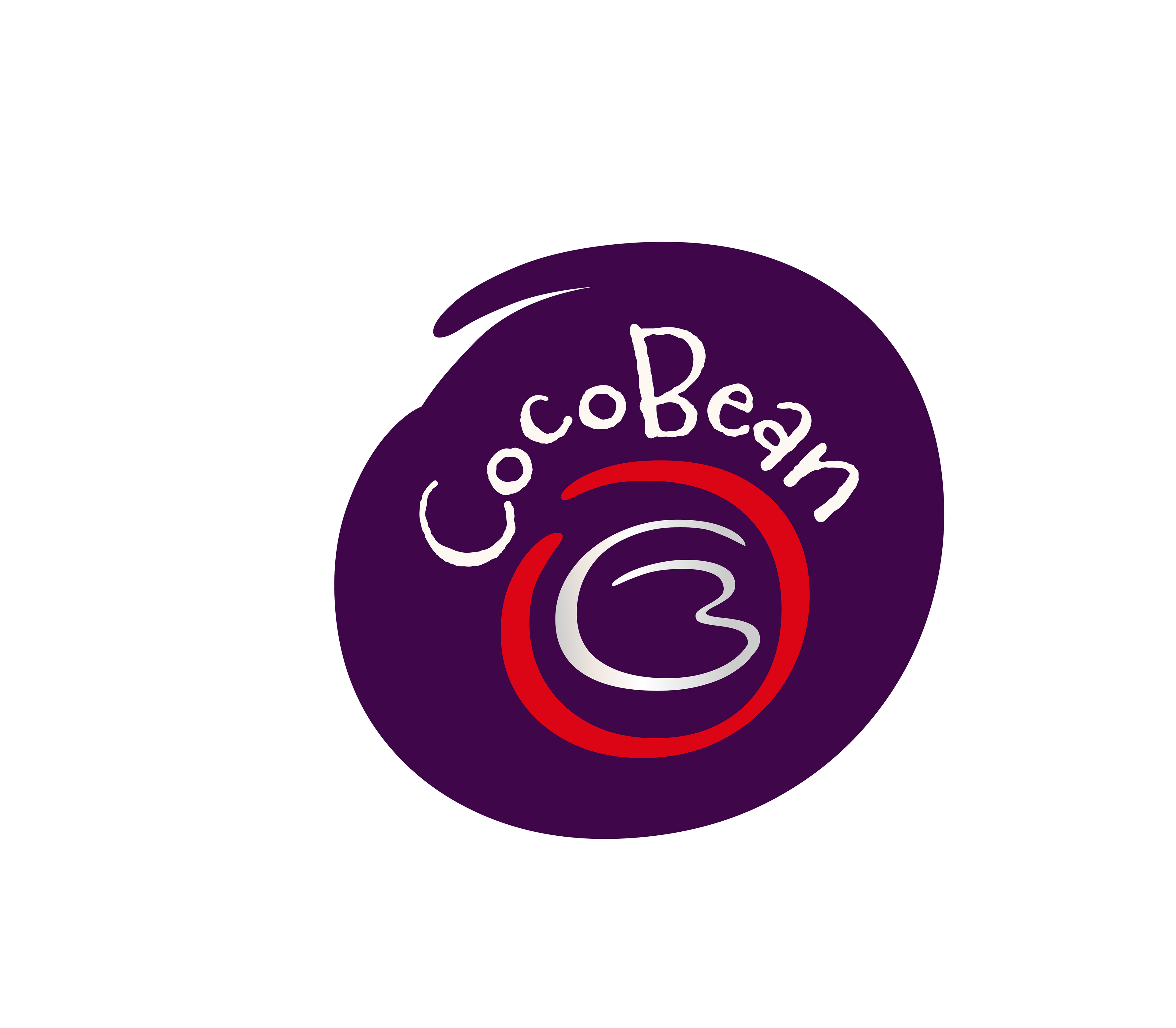
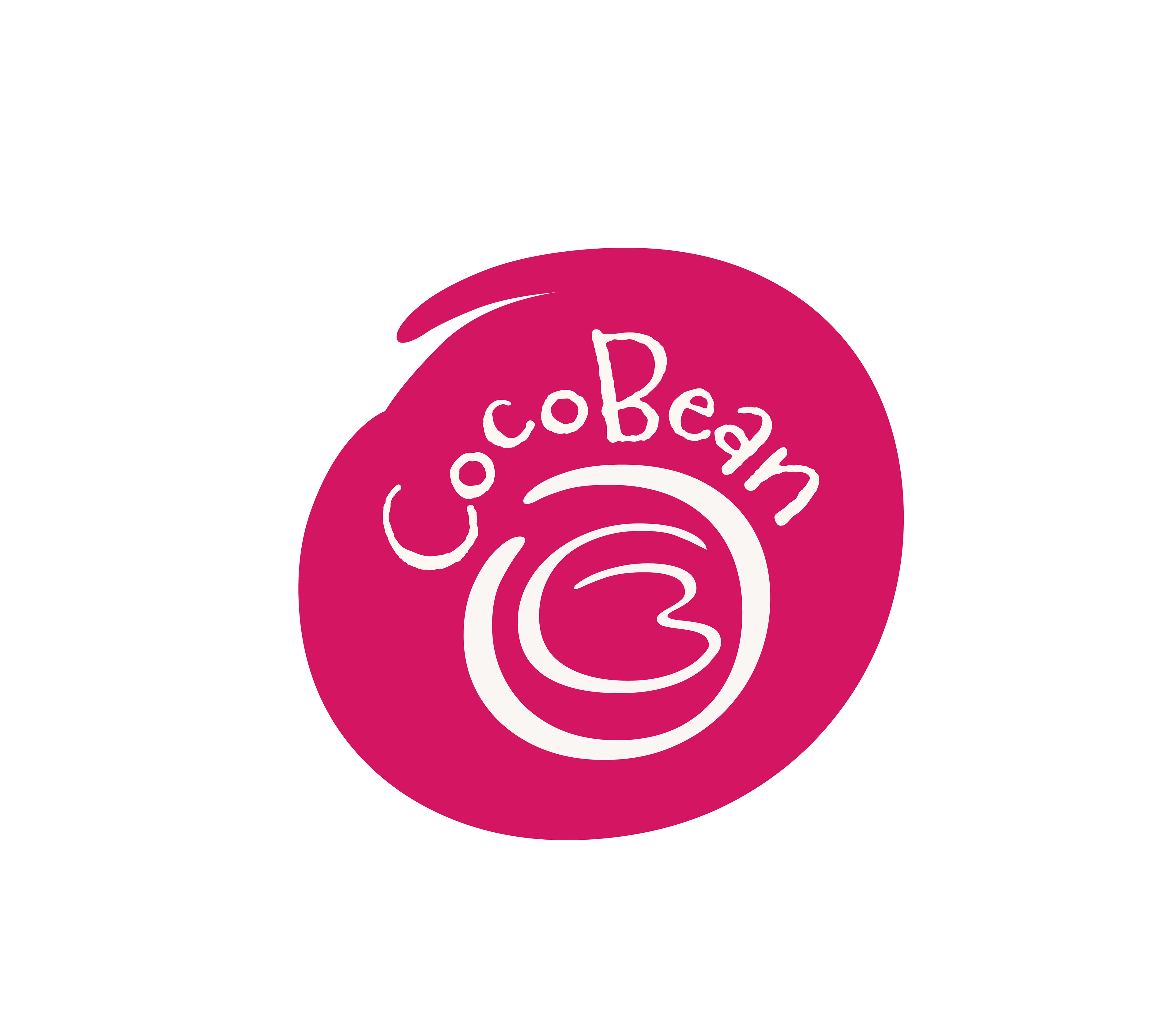
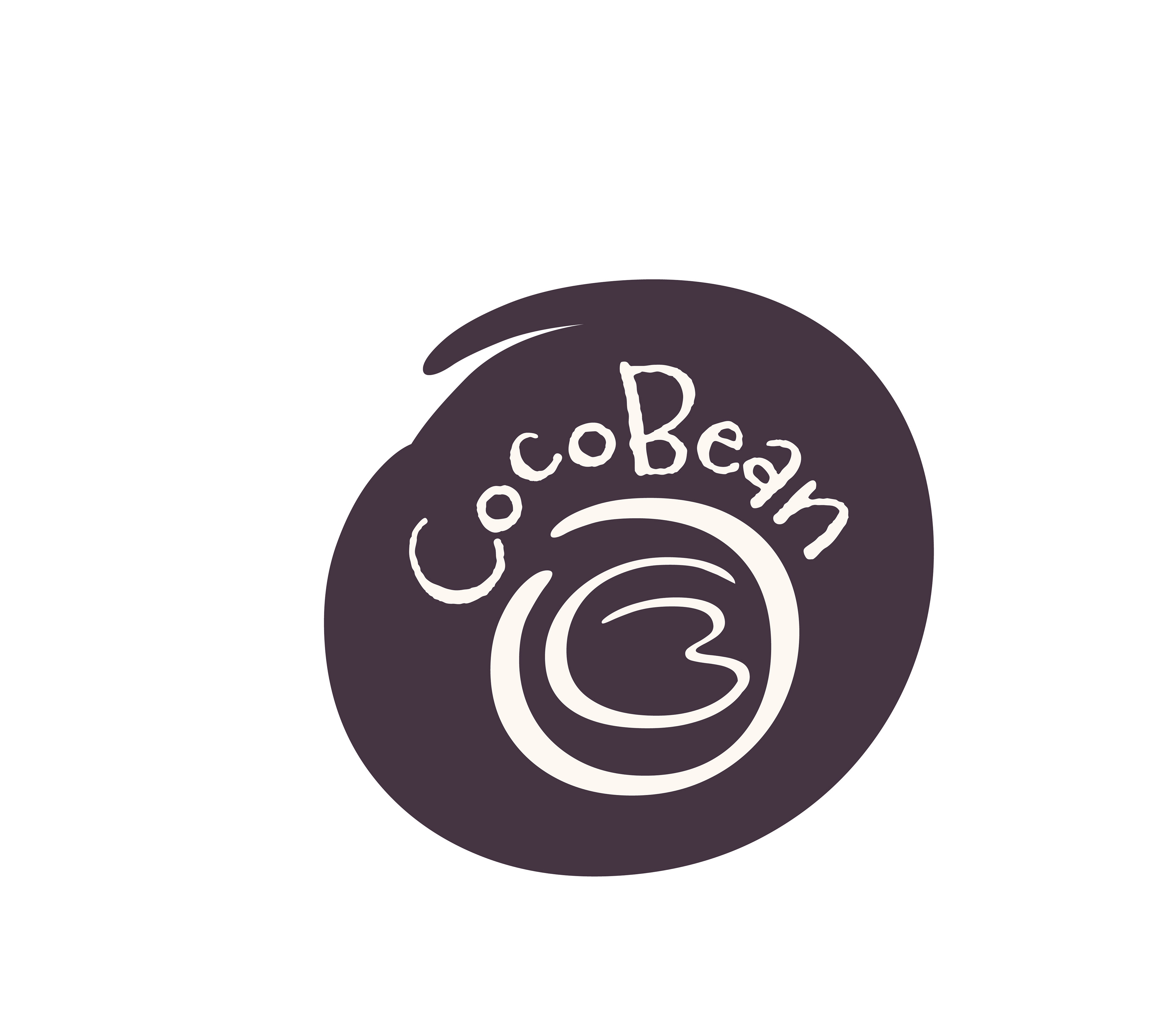
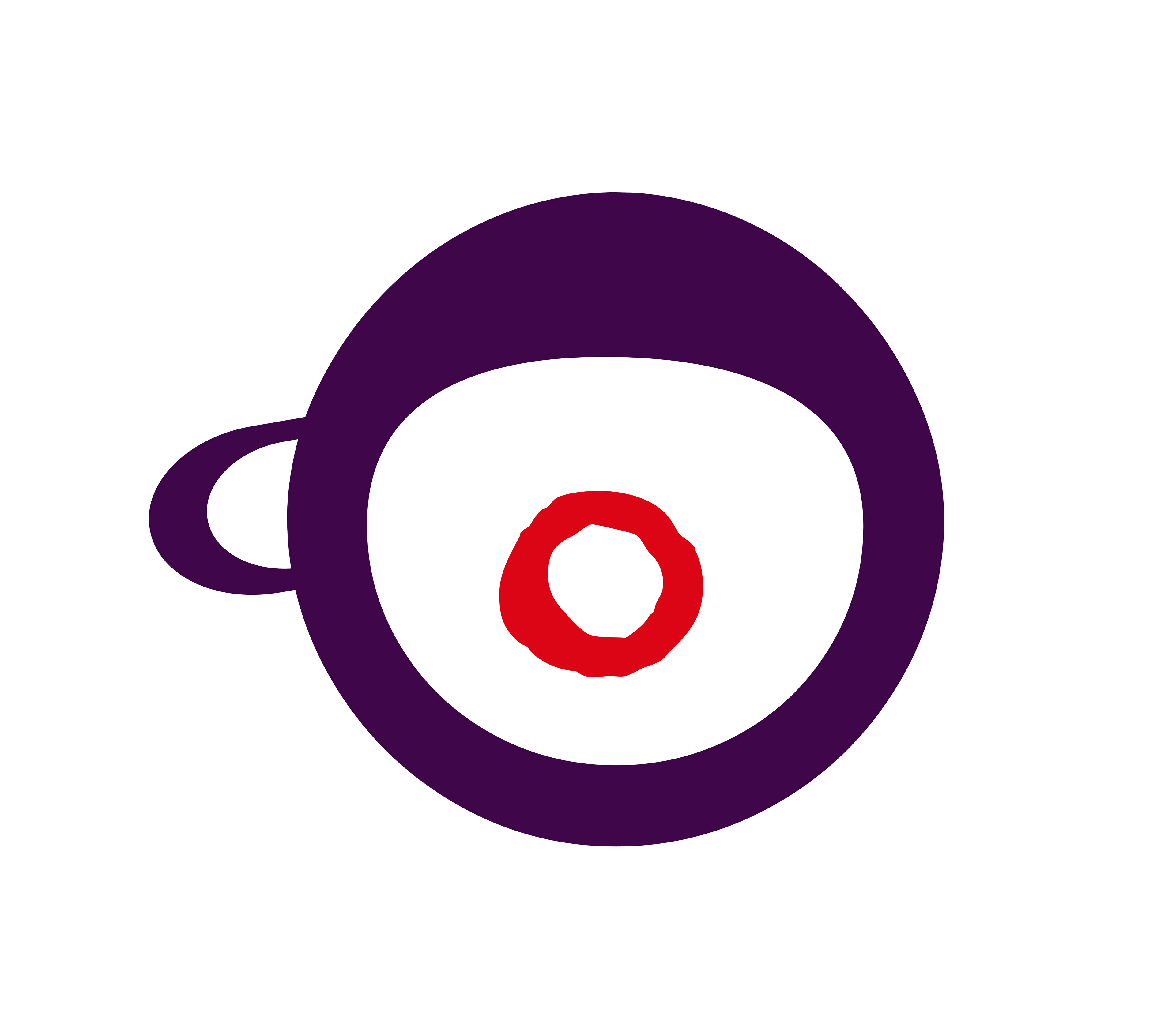
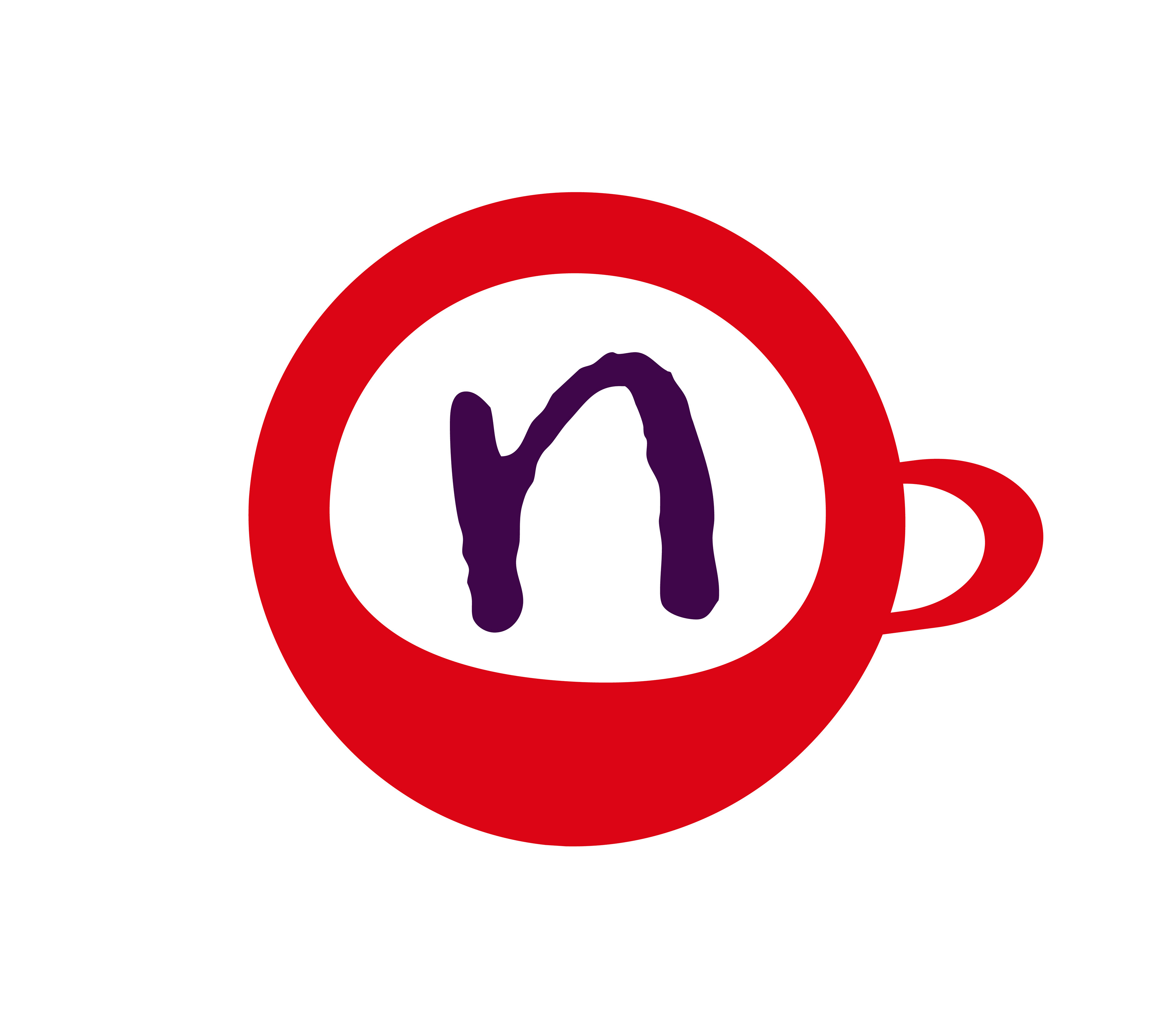
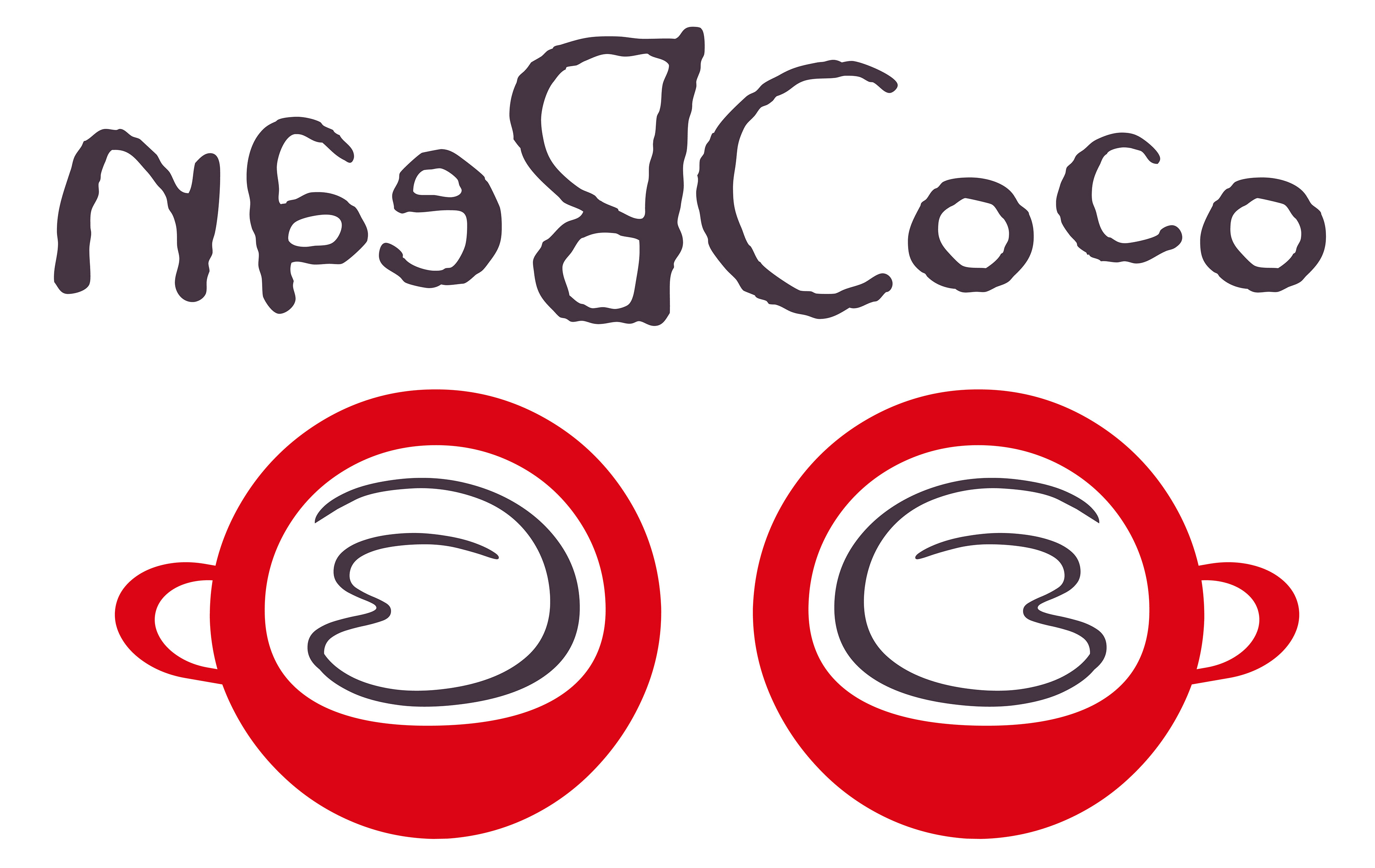
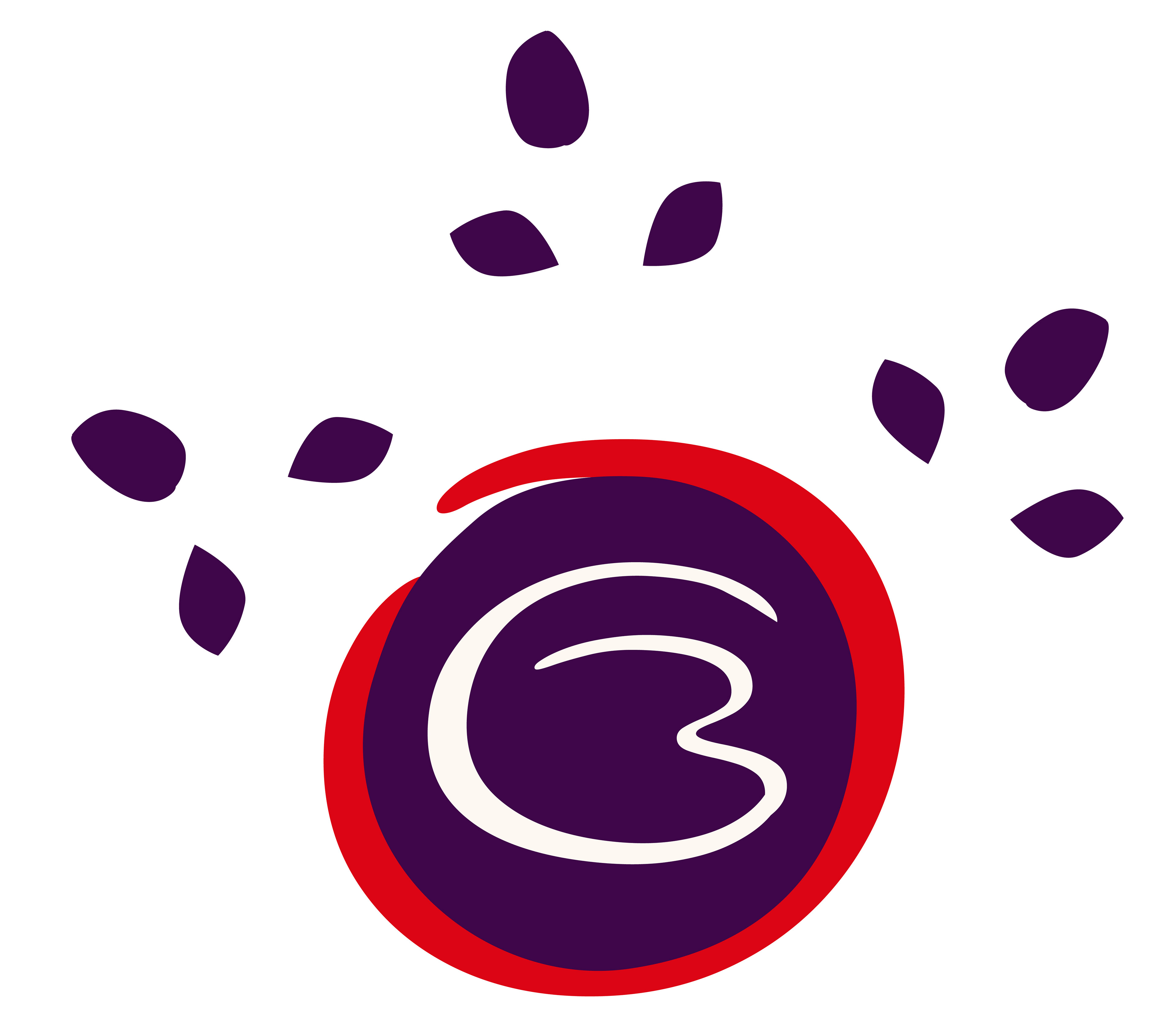
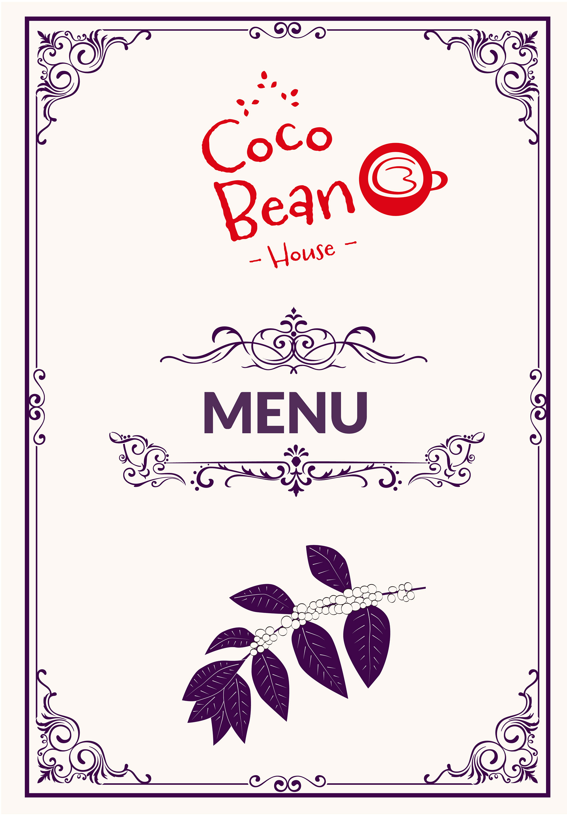
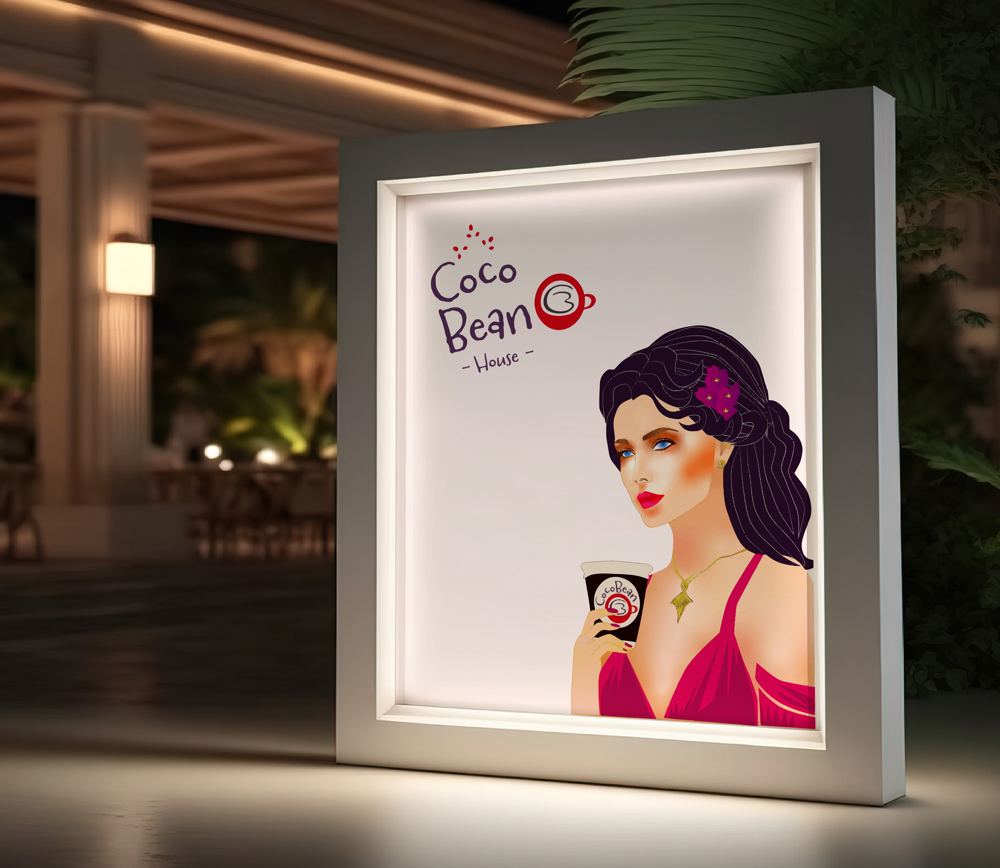
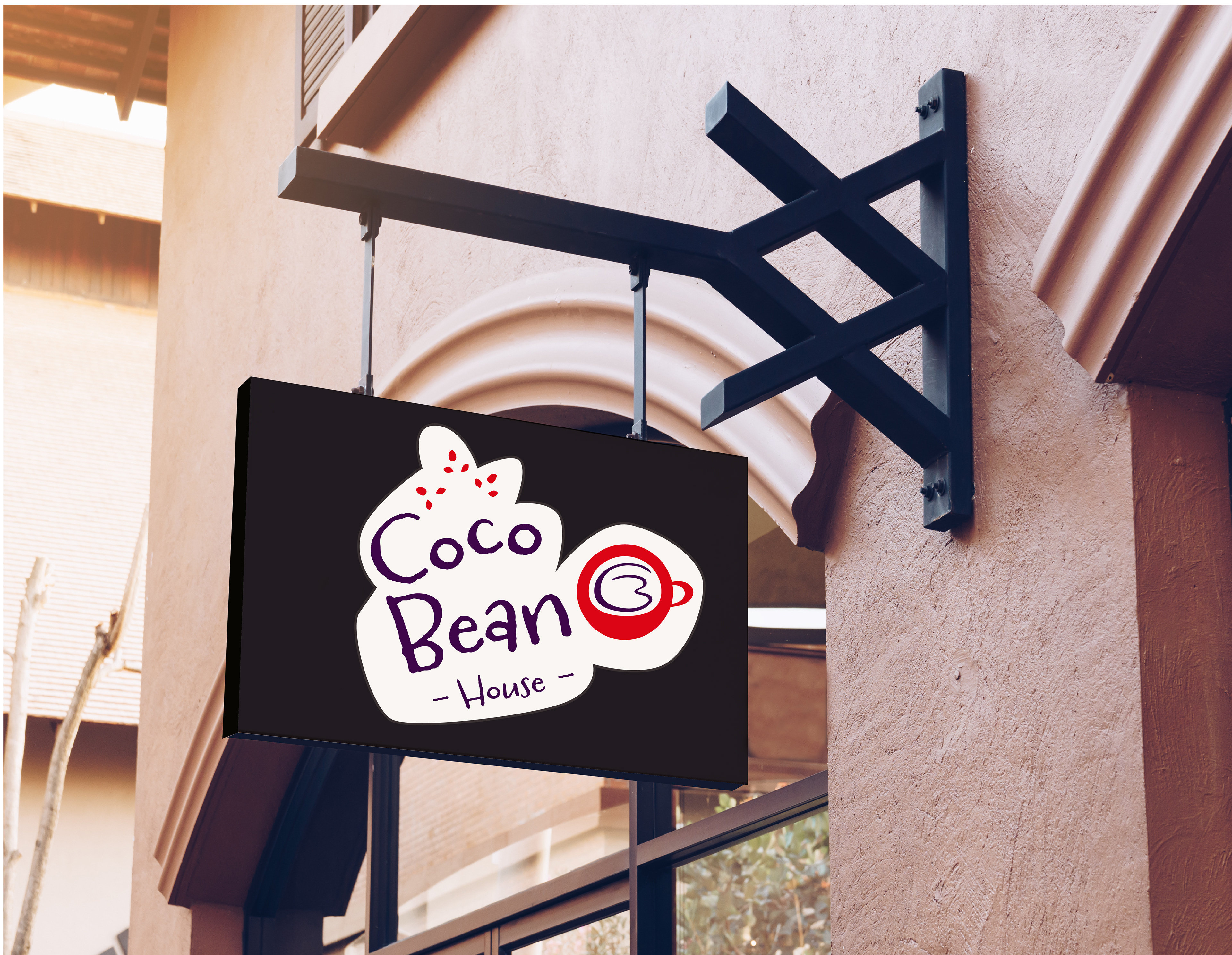
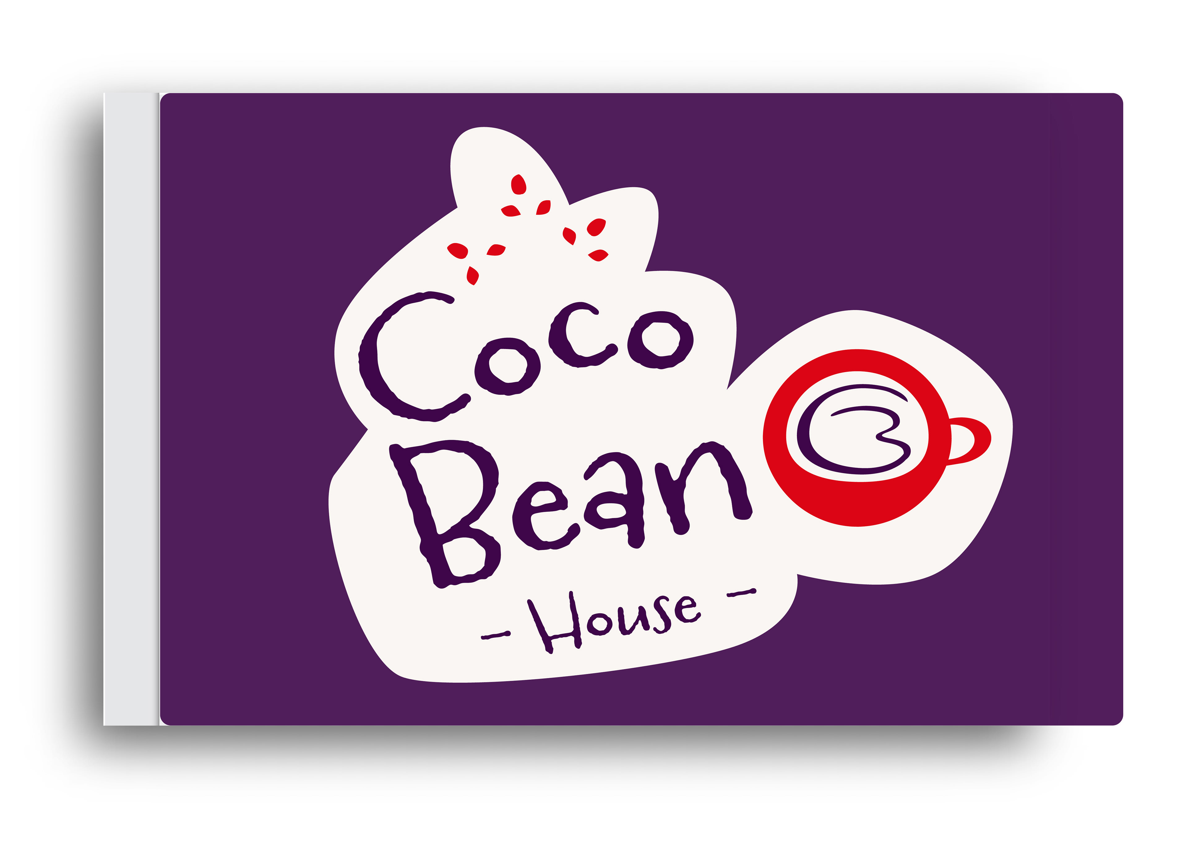
The CocoBean logo is playful and creative, with a coffee cup full of coffee at its center. The font feels warm and inviting, matching the brand’s friendly personality. Its fun design and eye-catching look capture CocoBean’s goal of giving customers a coffee experience they’ll remember.
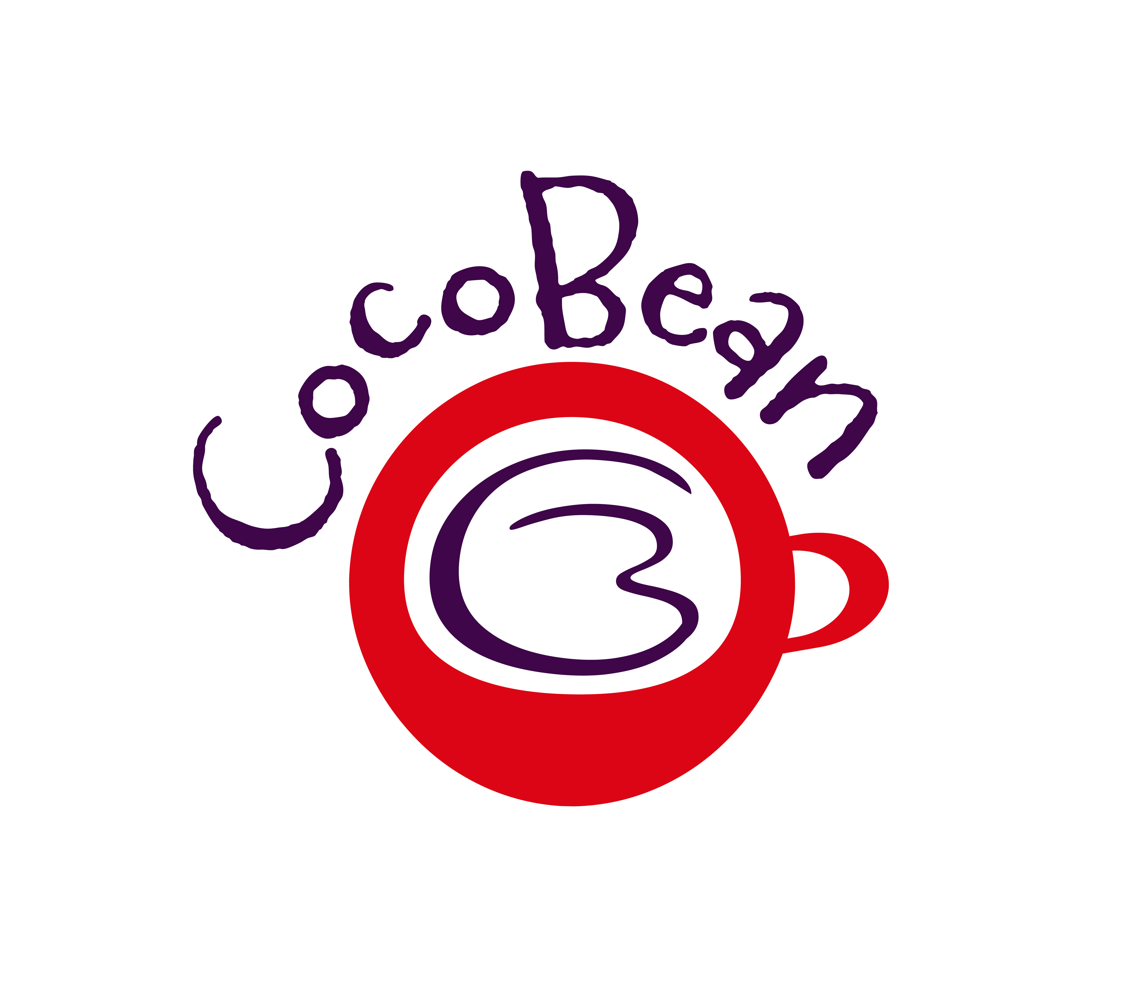


CocoBean’s look brings together colors and fonts that feel elegant, warm, and stylish. The main colors—silver, white, dark purple, and dark brown—give a modern and rich feel, while lighter blue, magenta, gold, and black add brightness and variety.
Primary Brand Colors
Secondary Brand Colors

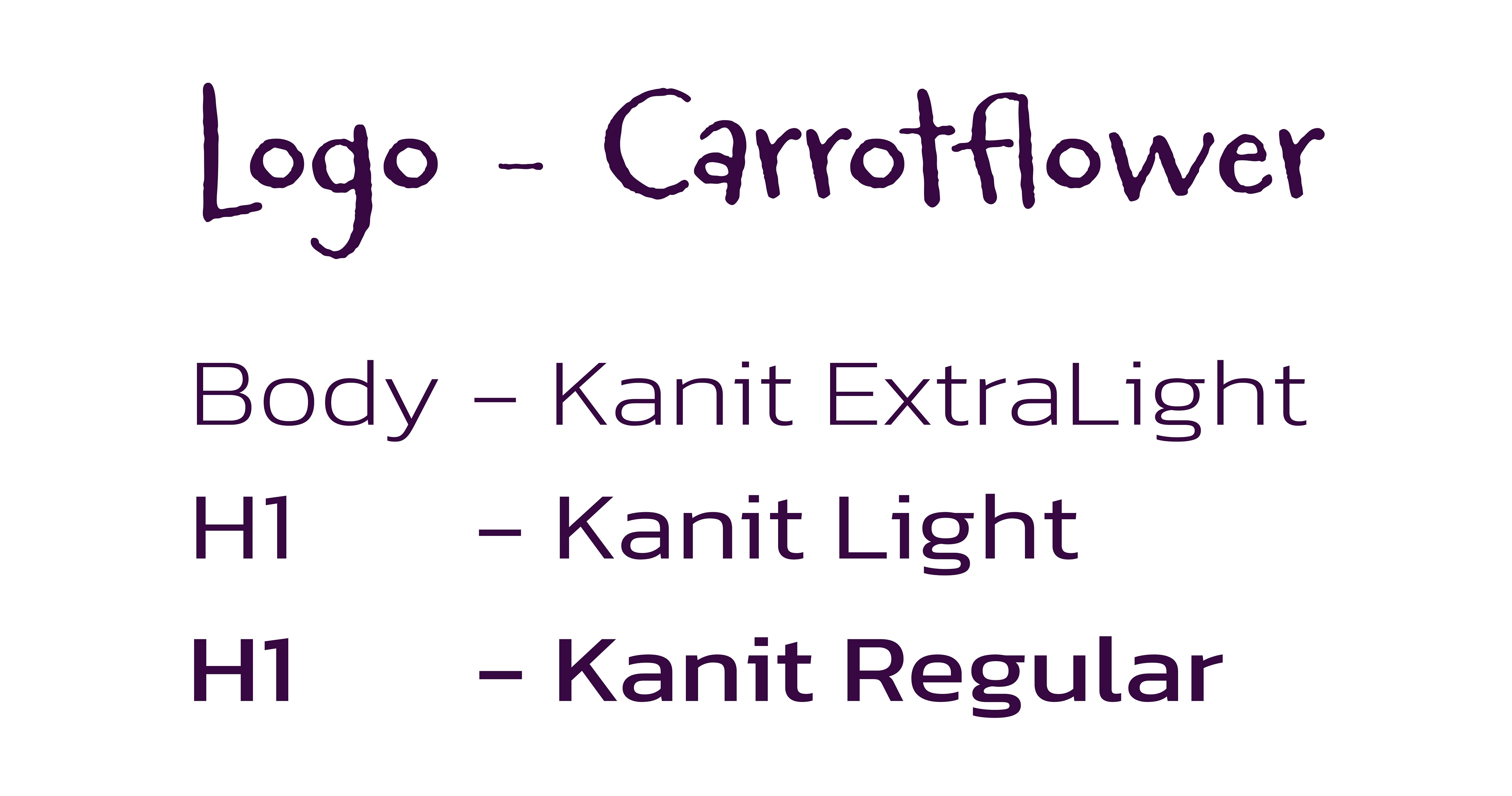
CocoBean uses Ballare Regular for the logo, blending a modern and classic feel. Kanit, in different weights, is used for all text to keep it clear and easy to read. Together, these fonts show the brand’s focus on quality, creativity, and fresh ideas.

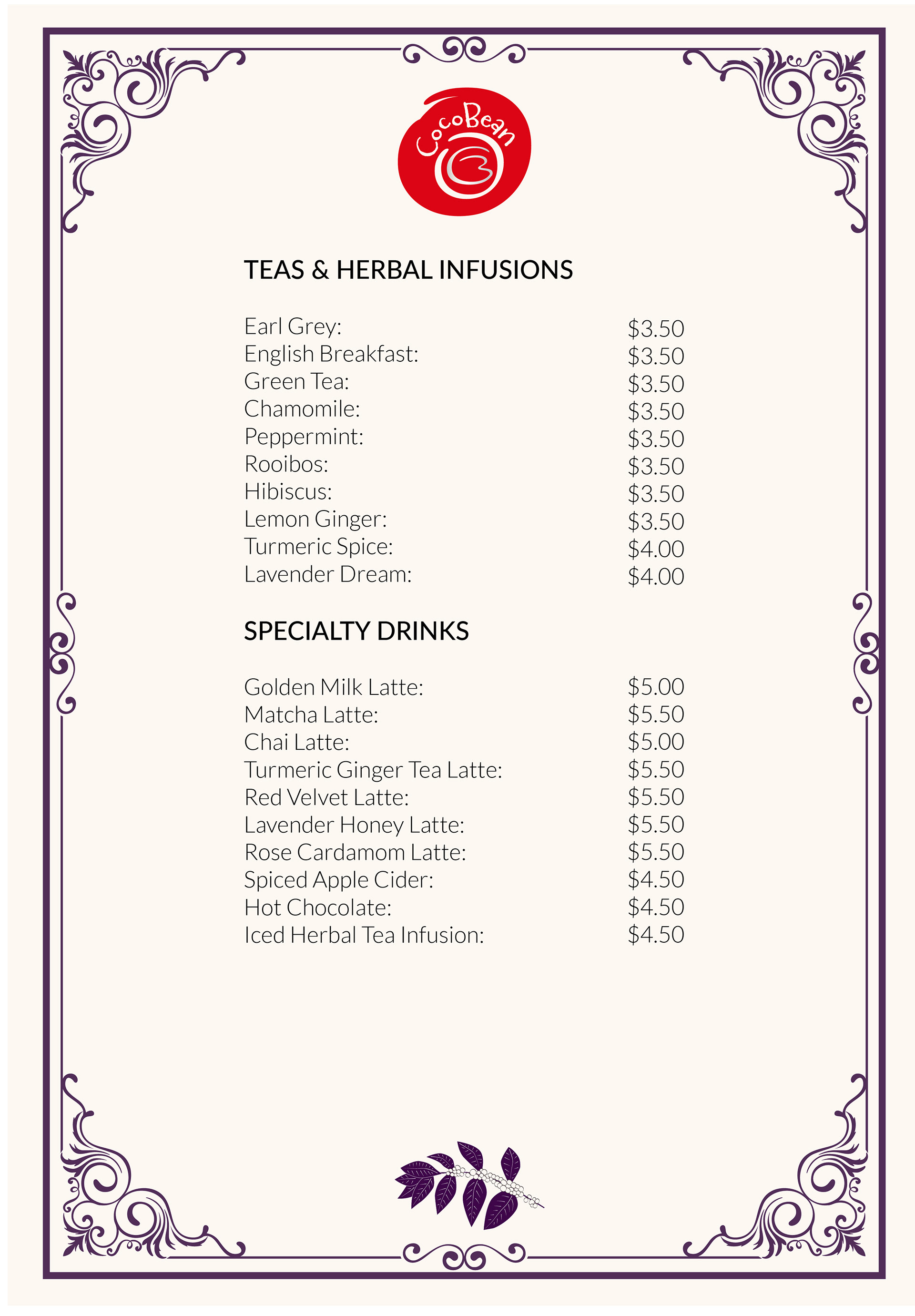
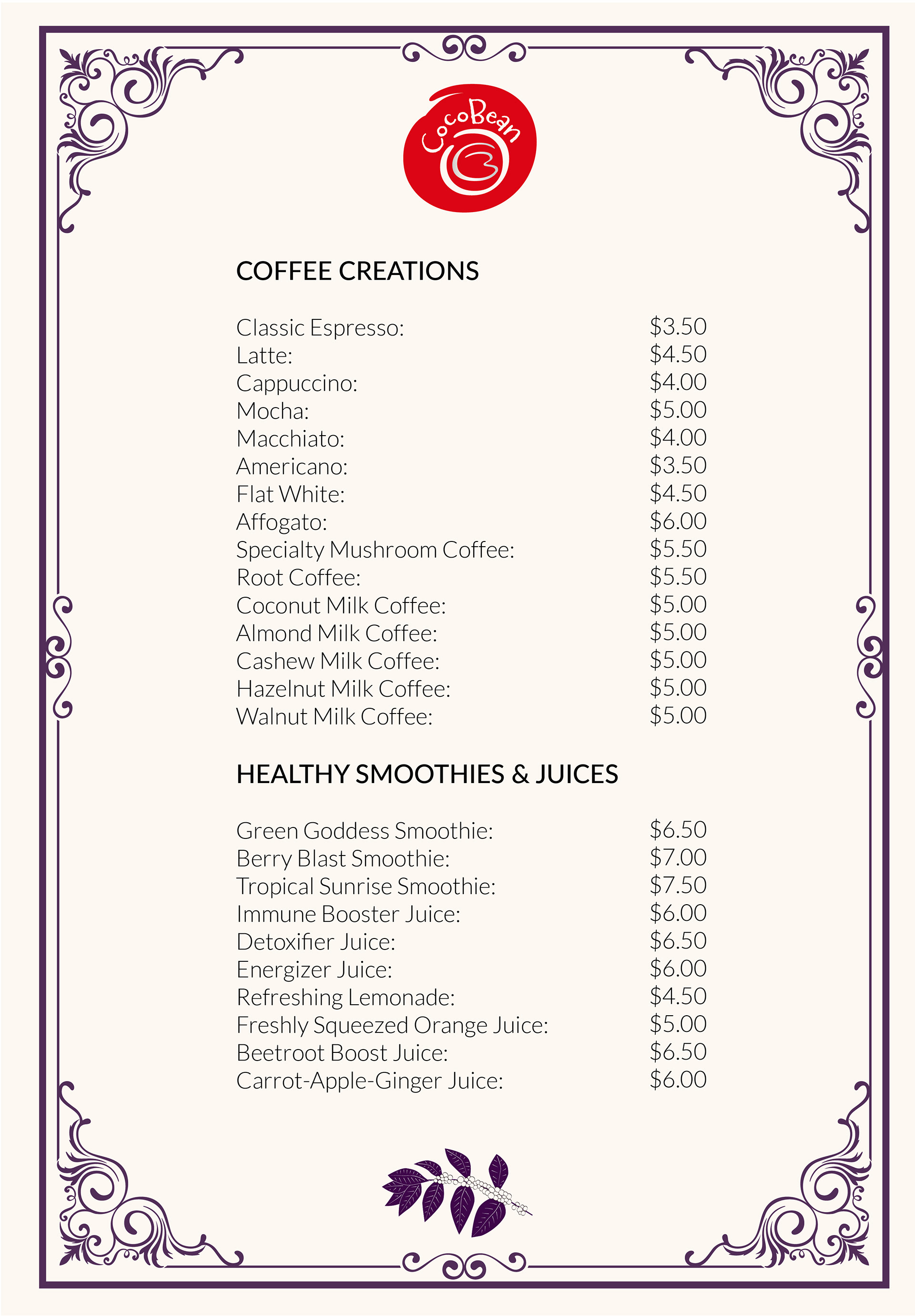
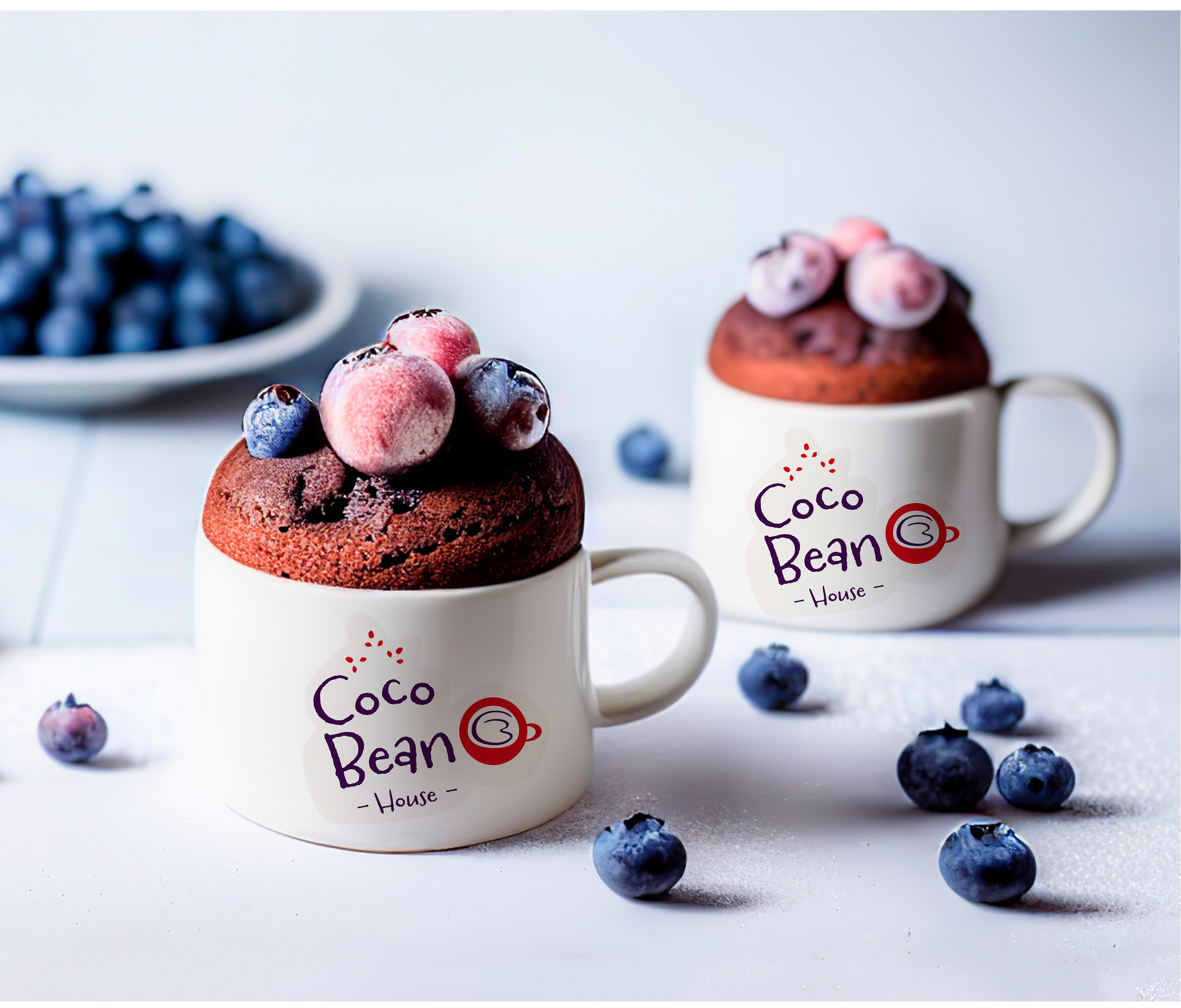
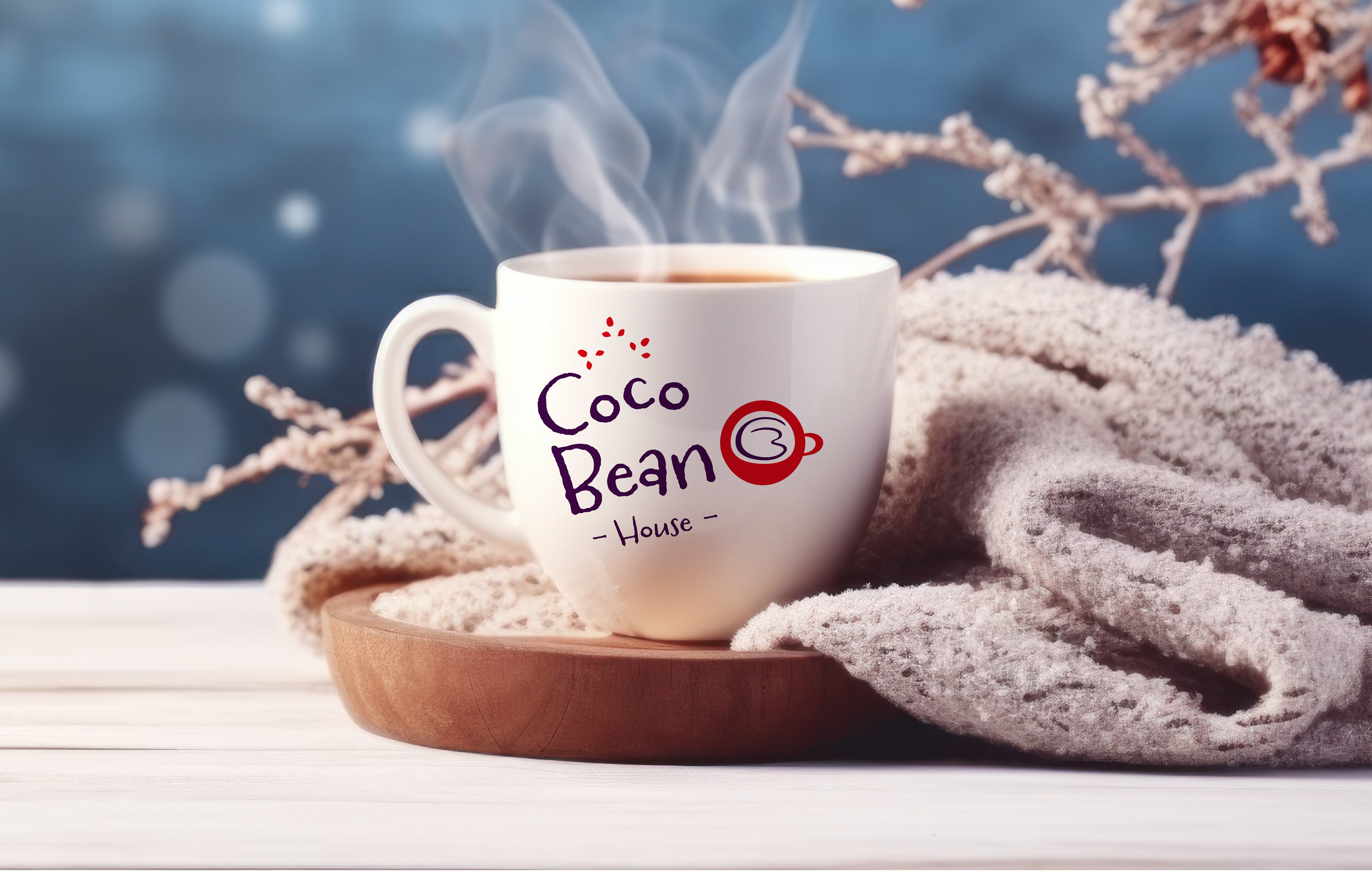
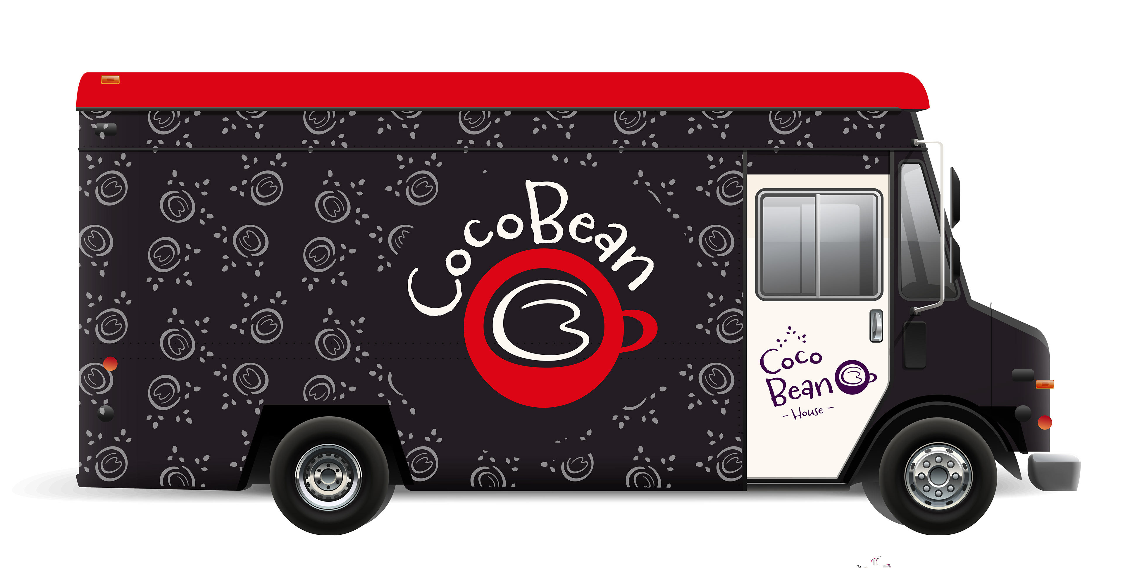
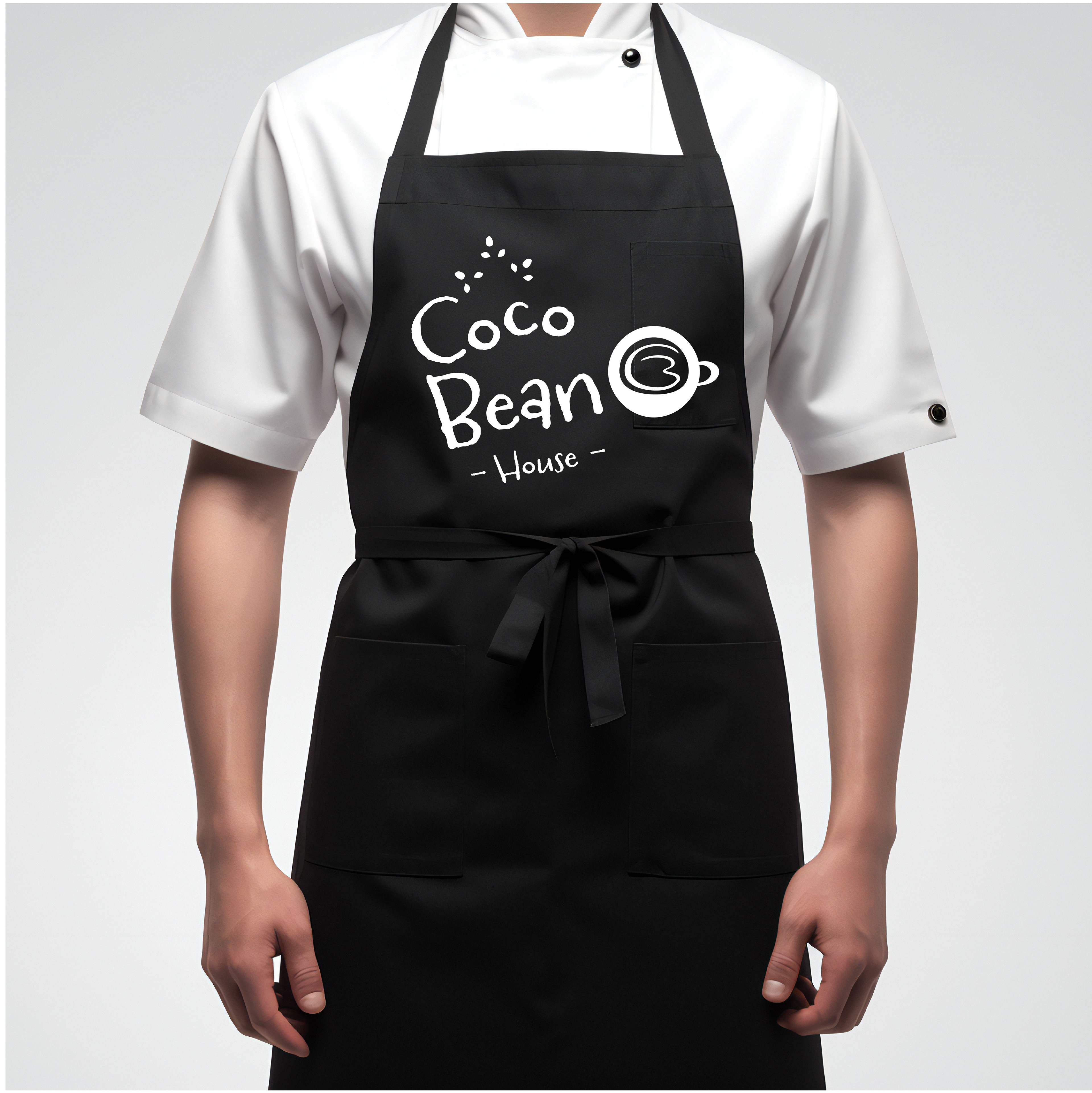
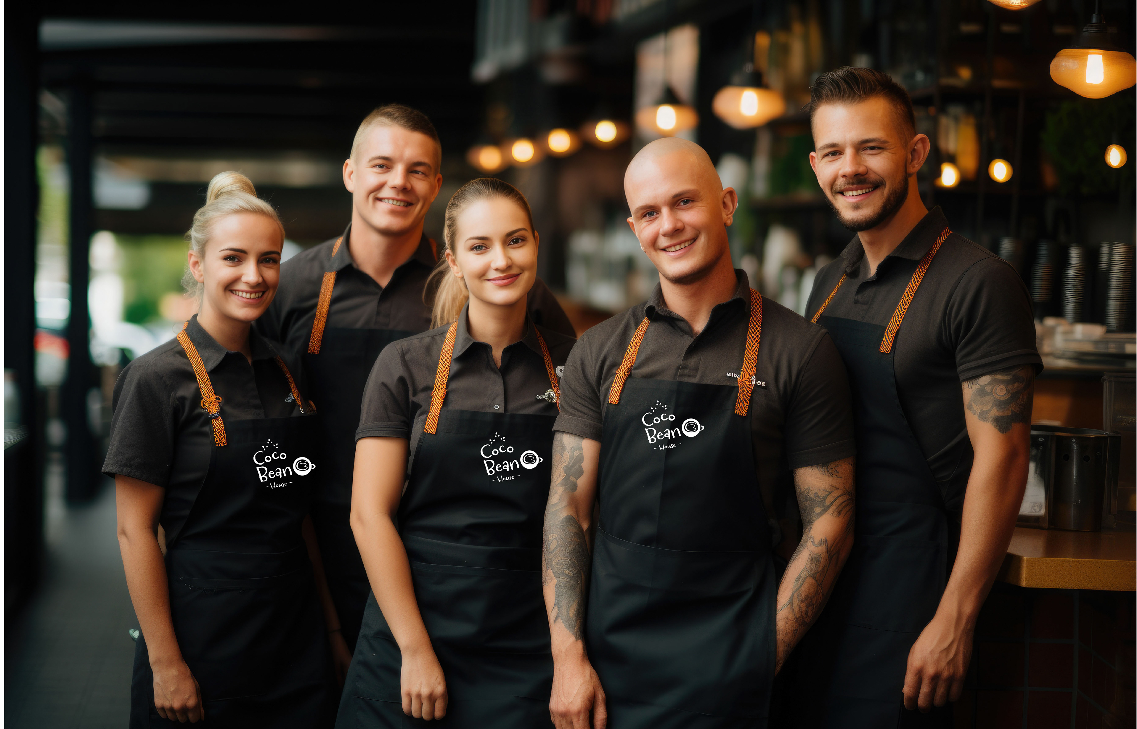
I’ve brought CocoBean’s brand identity to life across a variety of touchpoints, from menus and coffee cups to aprons, envelopes, notebooks, and entrance boards. Every piece reflects the brand’s personality through elegant typography, striking imagery, and the inventive use of the logo on coffee cups. The result is a cohesive, immersive experience that blends sophistication with versatility, leaving a lasting impression at every interaction.
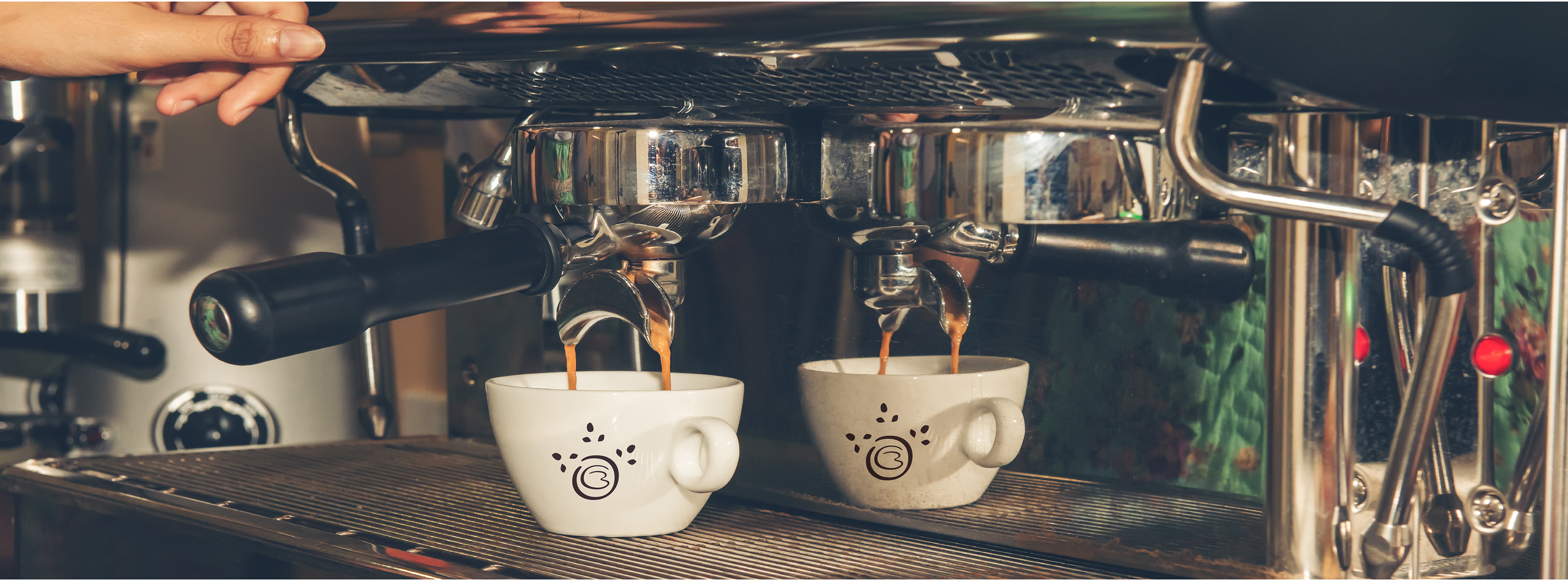
Business Strategy - Research Report
Photoshop - Illustrator
Concept Development
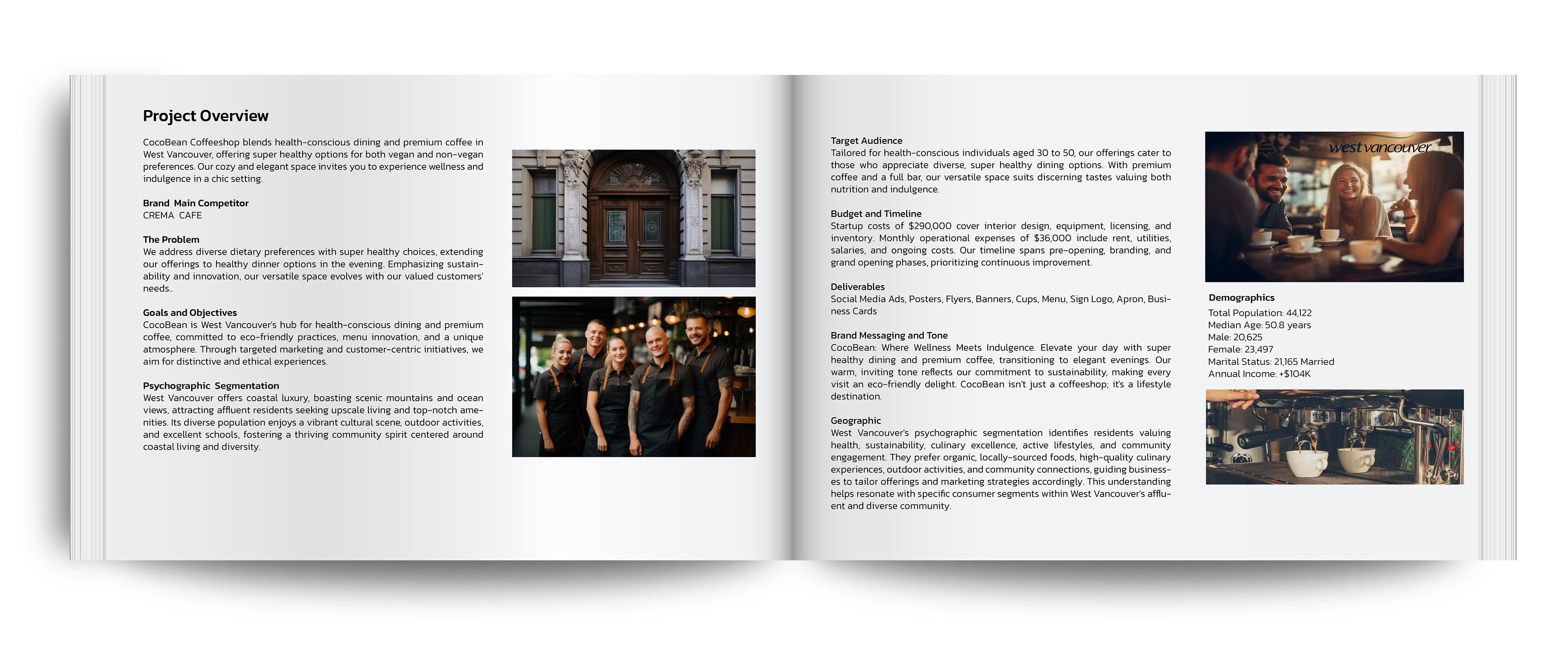


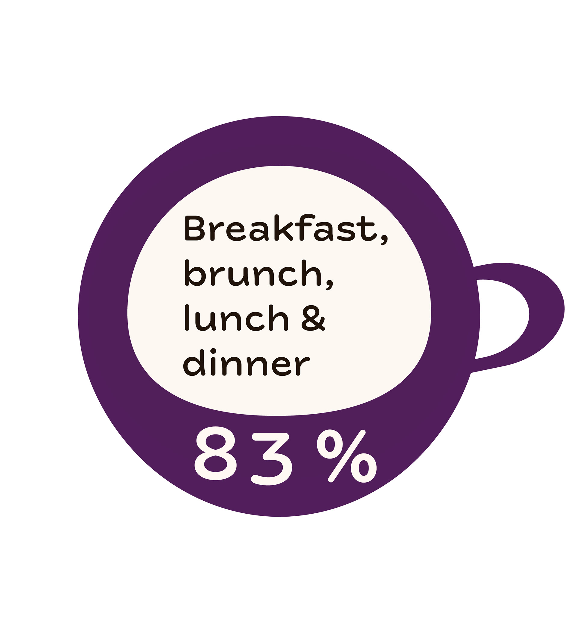
CocoBean Coffeeshop focuses on healthy eating and premium coffee in West Vancouver. The concept includes wholesome options for both vegans and non-vegans, with nourishing dinner choices in the evenings. The space is envisioned to be cozy and elegant, creating a spot where wellness and indulgence come together.
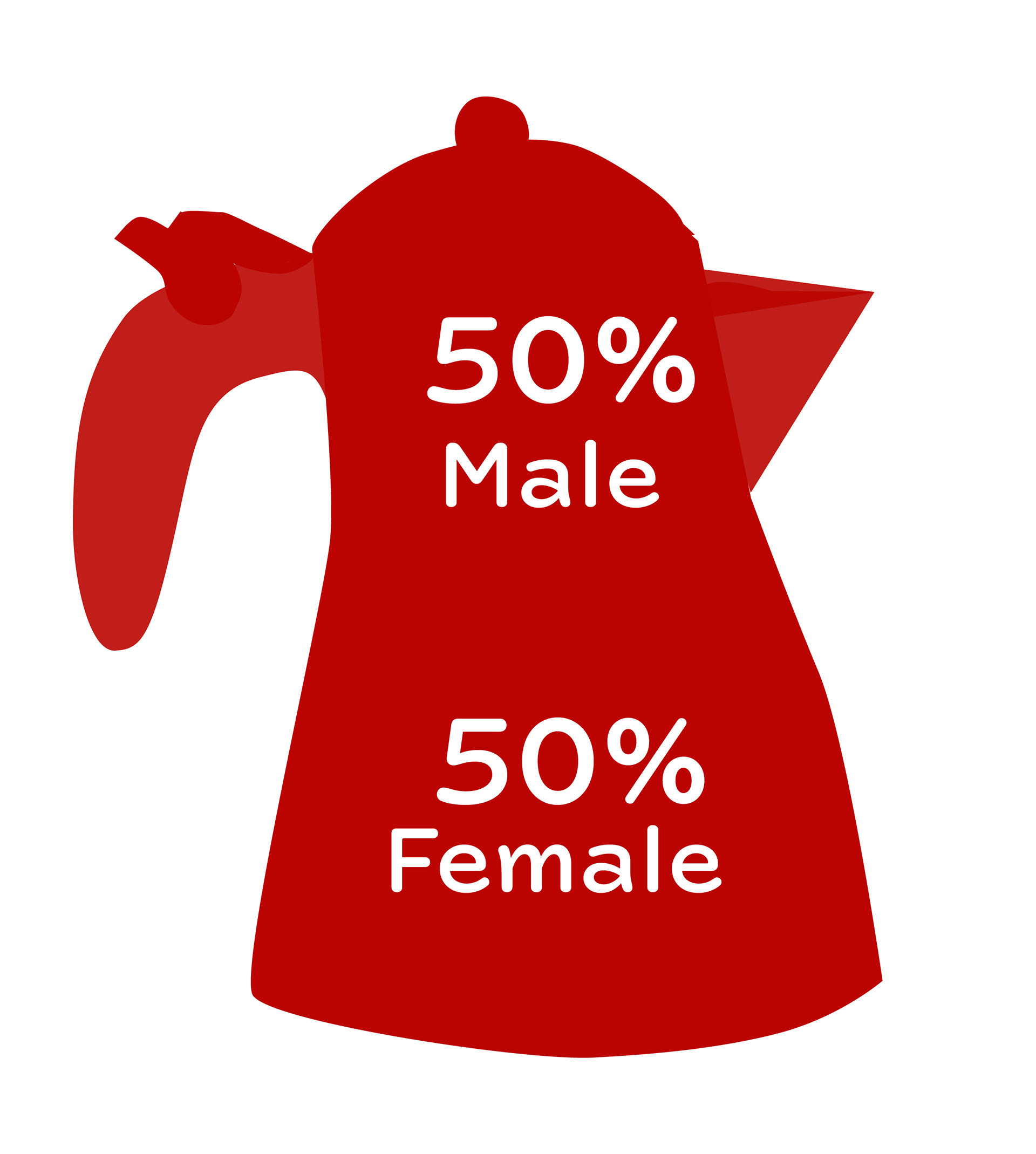
The project emphasizes sustainability, fresh ideas, and adapting to customer needs. The target audience is health-conscious individuals aged 30–50 who appreciate premium coffee, quality food, and a welcoming atmosphere. The goal is for CocoBean to become West Vancouver’s go-to destination for good food, good coffee, and a positive community vibe.
Set in a coastal, scenic community with active, affluent residents who value quality and local ingredients, the concept includes a $290,000 startup budget and projected monthly operating costs of $36,000. The research covers branding, pre-opening planning, and strategies for a potential grand opening.
The brand voice is warm and inviting, centered on the message: “Where Wellness Meets Indulgence.” CocoBean is envisioned as more than a coffee shop—it’s a lifestyle concept.
Crema Cafe in West Vancouver is a cozy spot for coffee and food lovers. It’s known for great coffee and tasty, locally made menu items like pastries and sandwiches. The cafe is also a place where locals can meet, relax, and enjoy the friendly community vibe of West Vancouver.
Bean Around the World is a popular coffee chain in West Vancouver, known for its cozy, globally inspired atmosphere and great coffee. It offers a range of specialty drinks and light snacks for people who want to work, relax, or meet others. The cafe also focuses on sustainability and connecting with the community, which makes it a favorite for locals and visitors.

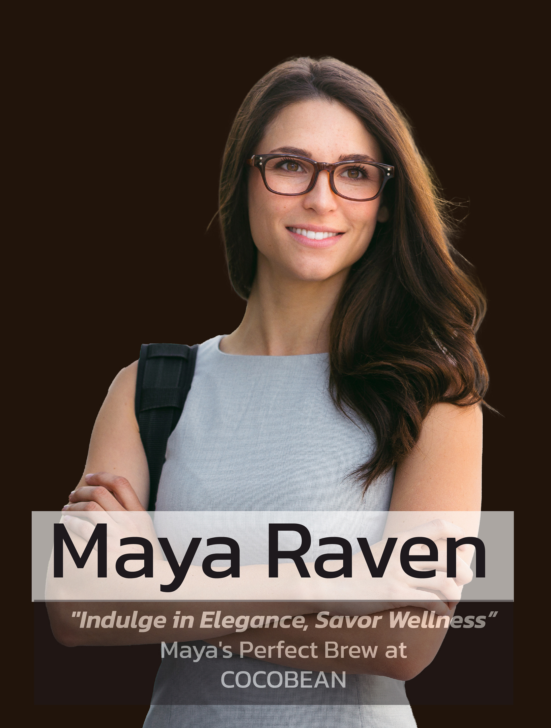
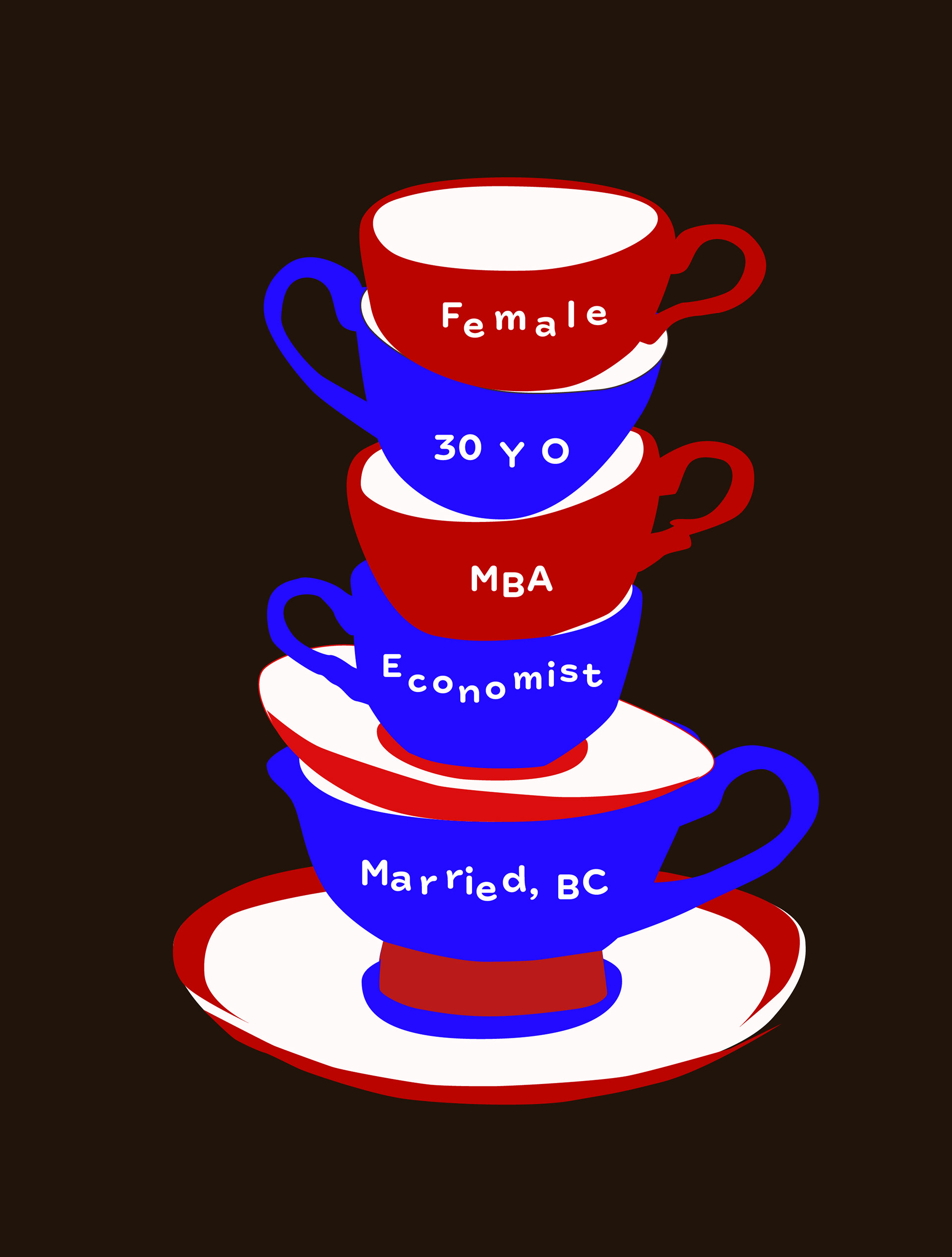
Maya Raven – Customer Profile
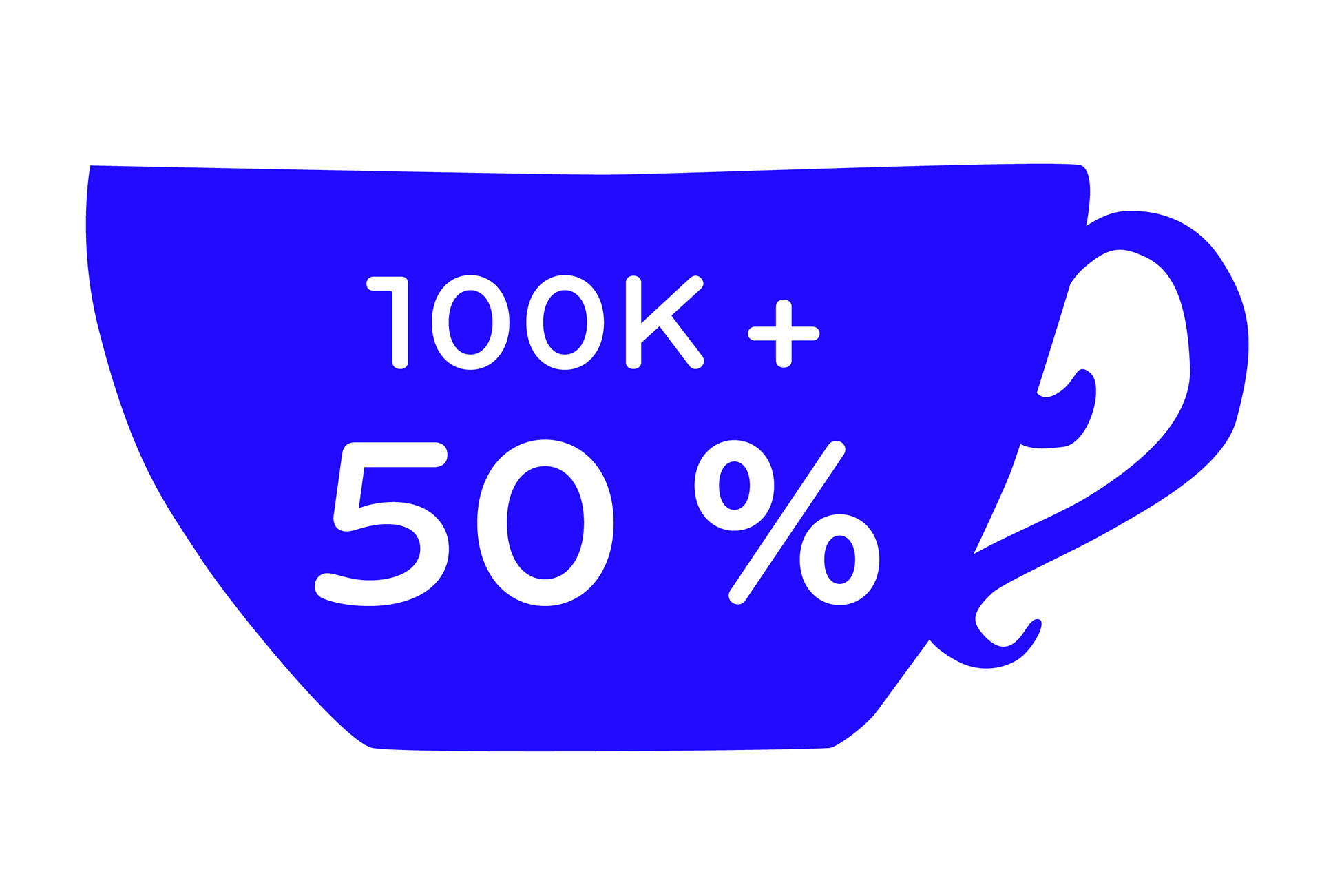
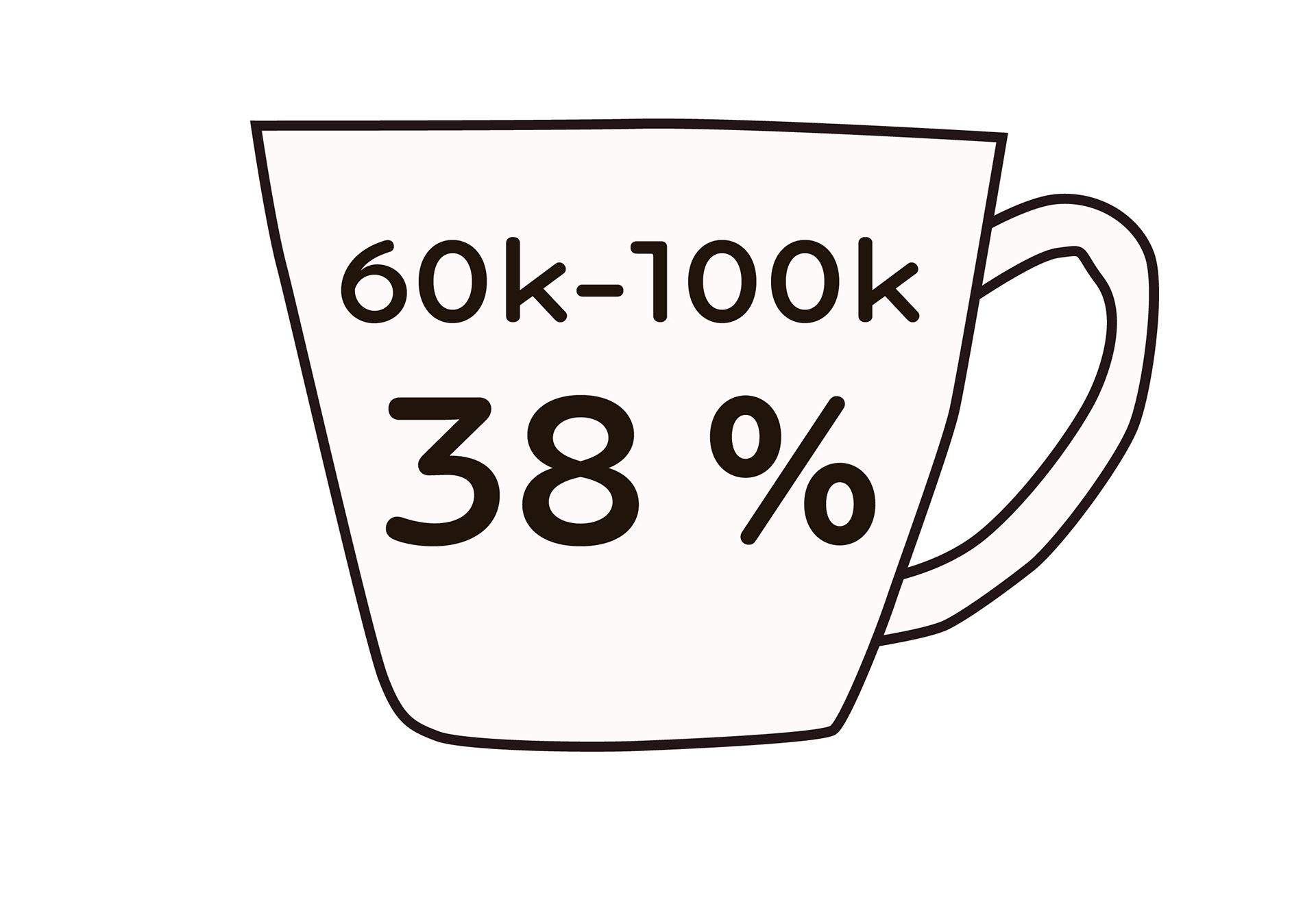
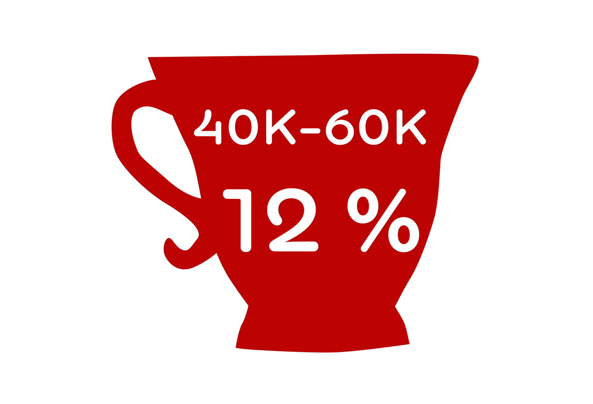
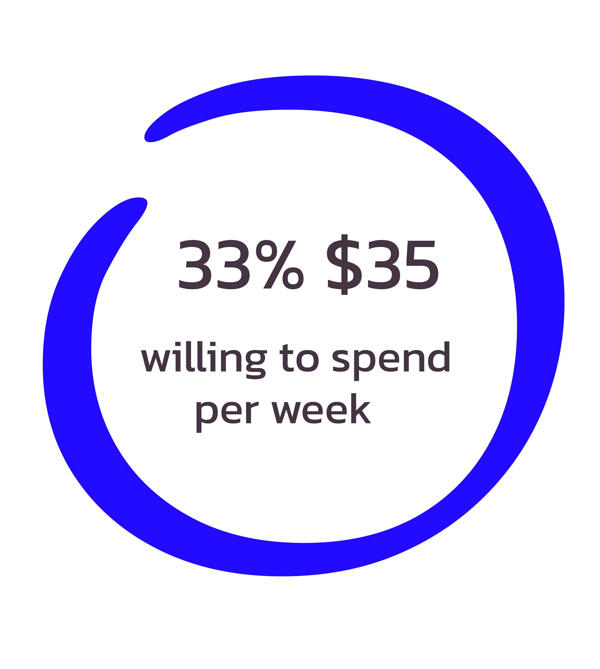
Maya is a 30-year-old professional in West Vancouver, earning $80K+ a year. She loves coffee, visiting shops 2–3 times a week, and spends $20–$30 monthly on her favorite drinks. CocoBean matches her tastes and lifestyle.
She looks for a coffee shop that’s cozy, has a workspace for work, offers healthy food like smoothie bowls, and serves high-quality coffee. She also appreciates a full bar for special events and loyalty perks.
Her challenge is finding a place that balances comfort, productivity, and a lively atmosphere. While loyal to CocoBean, she would enjoy occasional events for variety, seeking a complete, well-rounded coffee experience.


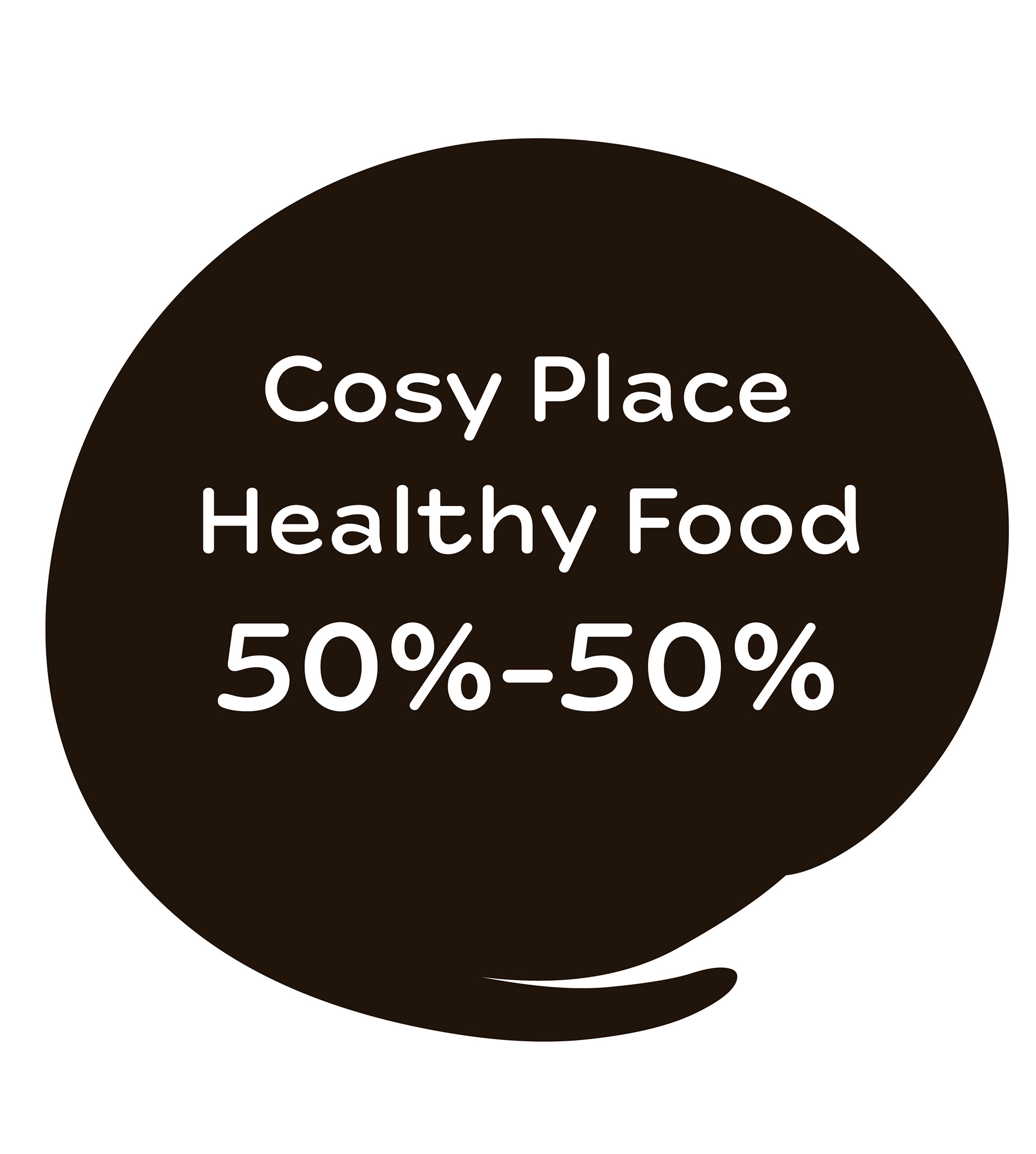

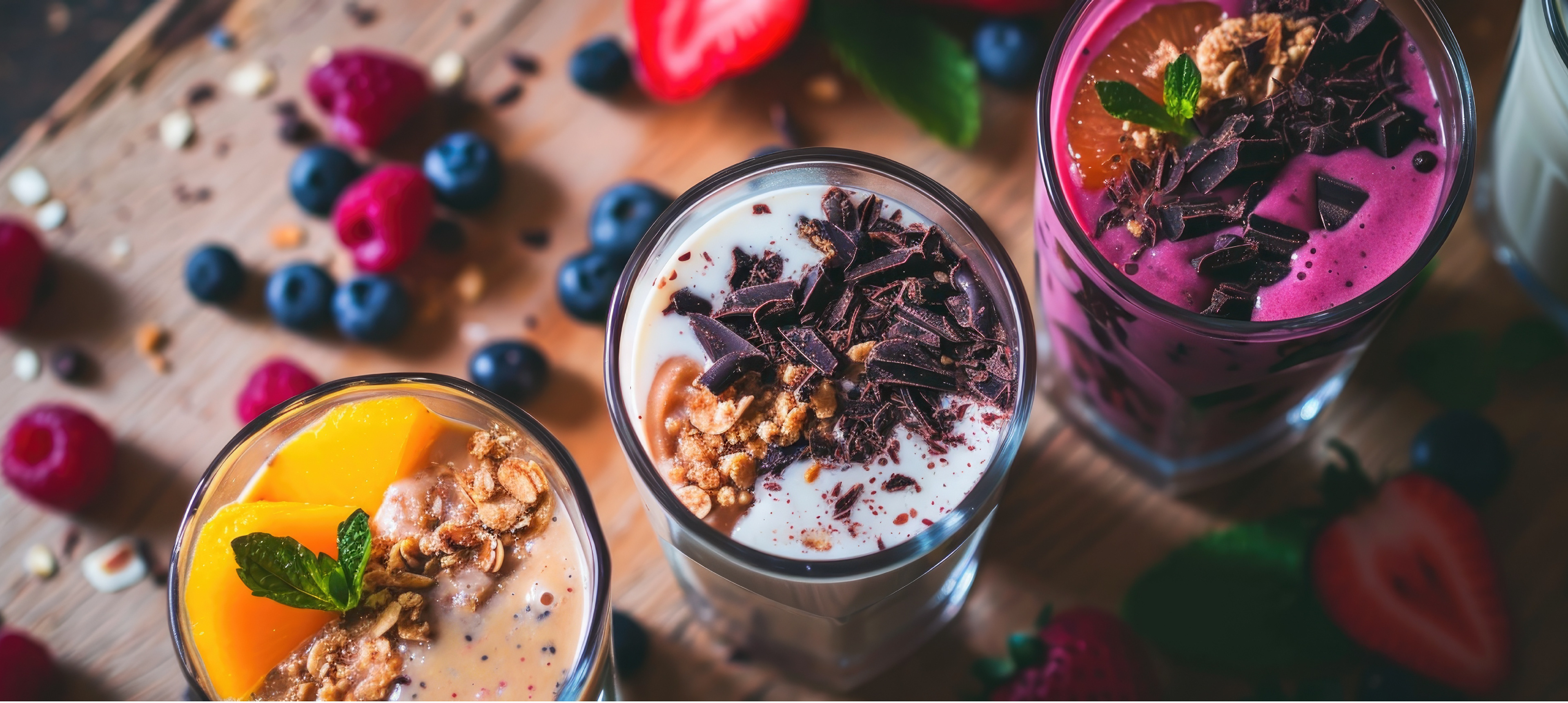
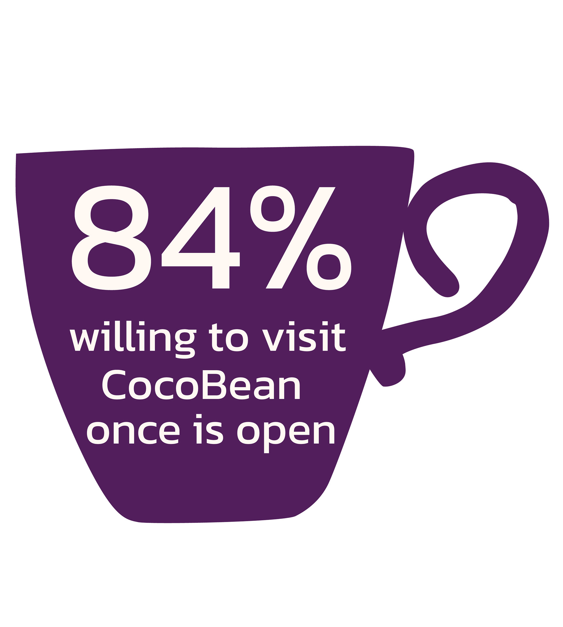


CocoBean Coffeeshop combines healthy food and premium coffee in a cozy, elegant space, creating a place where wellness meets indulgence. The brand focuses on sustainability, fresh ideas, and connecting with the community. With a menu full of super healthy options, eco-friendly practices, and high-quality ingredients, CocoBean aims to be West Vancouver’s top spot for health-conscious dining and coffee. It’s designed for people aged 30–50 who want delicious food that’s good for the body and enjoyable to eat.